Managing Poser Scenes (07. Rendering Quality)

Since mankind started cinematography, it was well understood that the human eye could not discriminate individual images when they passed by at a rate over say 18 a second. So by setting a 24 frame per second rate on film (or 25 (PAL) / 30 (NTSC) for video/television) a reduction of resources was derived without any meaningful loss of quality – referring to the visual experience of the spectators.

Next to chopping a continuous stream of light over time, we can chop it over space and divide an image into pixels. Again, this can be done without any meaningful loss of quality if we take the limitations of our eyes into consideration.

Very good and very healthy eyes have a discriminating ability of about 1 bow-second. One can’t do better than that. One full circle makes 360 degrees, 1/60th of a degree makes a bow-minute and 1/60th of a bow-minute makes a bow-second. When I’m looking forward in a relaxed way, I can oversee about 70° really well while say 150% of that (105°) is covering the entire range from left to right. This 70° makes 70*60*60 = 252.000 bow seconds (378.000 for the 105° field), so it does not make sense to produce anything over that amount of pixels which has to be viewed from the left to the right of our visual range.

Unfortunately, this is hardly a relief as I do not intend to render images with a width or height in that amount of pixels. Fortunately, our eyes and brain become of help. In the first place, we don’t all have “very good and very healthy” eyes, they just aged over time like we did ourselves. In the second place, the extremes occur with our pupils wide open which is not the case when viewing images under normal lighting conditions. In cinema and before a monitor (television) it’s even worse: the image is radiating light in a darker surrounding closing our pupils even further.

As a result, a standard used commonly in research on visual quality takes the 1 bow-minute (and not the second) as a defendable standard for looking at images on TV or in cinema. Then, the relaxed view range of 70° requires just 70*60 = 4200 pixels while the full range (for surround and IMAX, say) requires 150% of that, a 6300 pixels wide image.

This can be compared with analog film. IMAX is shot in 70mm (2.74”) film size and a film scan can produce about 3000 pixels/inch before hitting the film grain limits, so IMAX can be sampled to at most 2.74 x 3000 = 8220 pixels and fills our visual range completely. In other words, for a normal relaxed view 4.000 x 3.000 does the job, while say 6.000 x 3.000 does the job in the full left to right range, for anything monitor, TV or cinema.

This is reflected in current standards for pro cameras:

Standard Resolution Aspect Ratio Pixels
Academy 4K 3656 × 2664 1.37:1 9,739,584
Digital cinema 4K 4096 × 1714 2.39:1 7,020,544
  3996 × 2160 1.85:1 8,631,360
Academy 2K 1828 × 1332 1.37:1 2,434,896
Digital Cinema 2K 2048 × 858 2.39:1 1,757,184
  1998 × 1080 1.85:1 2,157,840

For print, things are not that different. An opened high quality art magazine with a size of 16”x 11” (2 pages A4) printed at 300 dpi requires an 4800 x 3300 pixel image, which brings us in the same range as the normal and full view on monitor, considering our eyes as the limiting factor.

Of course one can argue that a print on A0 poster format (44”x 32”) might require 13.200×9600 pixels for the same quality but that takes people looking at it from the same 8” distance they use to read the mag. From that distance, they can never see the poster as a whole. Hence the question is: what quality do they want, what quality do you want, what quality does your client want?

I can also reverse the call: in order to view the poster in a full, relaxed way like we view an opened magazine, this A0 poster which is 2.75 times as long and wide should be viewed from a 2.75 times larger distance, hence from 22” away. In this case, a printing resolution of 300/2.75 (say: =100 dpi) will do perfectly.

Thus far, I’ve considered our eyes as the limiting factor. Of course, they are the ultimate receptors and there is no need to do any better, so this presented an upper limit.

On top of that, I can consider additional information about the presentation of our results. For instance, I might know beforehand that the images are never going to be printed at any larger format than A4, which halves the required image size (in pixels, compared to the magazine centerfold) to 3300×2400 without reducing its visual quality.

I also might know beforehand that the images are never going to be viewed on TV sets or monitors with a display larger than say 2000×1000 (wide view), which reduces the required image size to 1/3rd in width and 1/3rd in height, hence 1/9th in the amount of pixels to be rendered, compared to the full wide view of 6000×3000 mentioned above for anything monitor or cinema.  Which might bring me the required quality in just 1/9th of the time as well, but … at a reduced visual quality. The resolution of our eyes is just better than the output device, and I might want to compensate for that.

Quality Reduction Strategies

Render size

The main road to get quality results efficiently is: not to render in larger size than needed. An image twice as large, meaning twice as wide and twice as high takes four times longer to render, or even more if other resources (like memory) become a new bottleneck during the process.

Render time

As said in the beginning of this chapter, not much more can be done when the renderer depends on algorithm, hardware and image size alone. This for instance is the case with the so-called “unbiased” renderers like LuxRender, which mimic the natural behavior of light in a scene as much as possible. More and faster CPU cores, and more and faster GPU cores sometimes as well will speed up the result, but that’s just it.

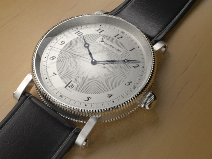
Let me take the watch-scene (luxtime.lxs demo file) on my machine, at 800×600 size. The generic quality measure (say Q) is calculated by multiplying the S/p number (samples per pixel, gradually increasing over time) by the (more or less constant) Efficiency percentage which refers to the amount of lighting available.

  • * Draft quality, Q=500, after 4 mins. Gives a nice impression of things to come, still noisy overall.
  • * Basic quality, Q=1000, after 8 mins. Well-lit areas look good already, shadows and reflections are still quite noisy
  • * Decent quality, Q=1500 after 12 mins, well lit areas are fine now
  • * Good quality, Q=2000 after 16 mins, shadows are noisy but the reflections of them look nice already
  • * Very good quality, Q=3000 after 24 mins, good details in shadow but still a bit noisy, like a medium res digital camera, shadow in reflections looks fine now
  • * Sublime quality, Q=4000 after 32 mins, all looks fine, hires DSLR camera quality (at 800x600m that is).

From the rendering statistics, render times at least can be roughly predicted for larger render results. LuxRender reports for the watch-scene, given my machine and the selected (bidirectional) algorithm, a lighting efficiency E of 1100% and a speed X of 85 kSamples/second. These parameters can be derived quickly, from the statistics of a small sized render (200×150 will do actually, but I used 800×600 instead).

From the formula

 Q = 1000 X*E*T / W*H, for image Width and Height after time T,

 I get

 4000 = 1000 * 85 * 11,00 * T / 800*600 so T = 2053 sec = 34min 12sec

And from that I can infer that a 4000×3000 result, 5 times wider and 5 times higher, will take 5*5=25 times as long, that’s: half a day, as long as memory handling does not hog up the speed. Furthermore, quality just depends on lighting. Lighting levels too low or overly unbalanced cause noise, like on analog films or digital captures. Removing noise requires more rendering time. Specular levels too high (unnatural) cause ‘fireflies’ which don’t go away while rendering longer. I just have to set my lighting properly. And test for it in small sized brief test runs.

Next >>

Managing Poser Scenes (08. Rendering Options I)

Some render engines, called Unbiased or Physics based, mimic the behavior of light and real materials for obtaining their results. There is not much room for tricks or compromises, such engines require loads of resources, heavy machinery and might be slow as well. Other render engines, called Biased, come with bags full of tricks to shortcut the resource requirements while getting reasonable results fast. Poser and Vue offer such biased renderers. Of course they offer maximum quality settings which come as close to the unbiased ones as possible. But it seriously pays off to understand the enormous benefits of a somewhat reduced quality, and a slight deviation from the reality of nature.

So let’s start to discuss the options for the Poser Firefly renderer.

Shadow handling

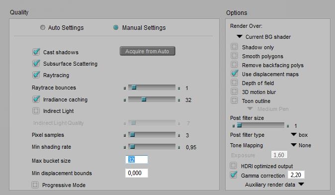
Individual lights can be set to warp shadows, individual objects can be set to cast shadows, but the Cast Shadows option can switch them all off. Or: only when it’s ON, all individual settings are taken into account. By switching OFF, a completely shadowless render result can be produced. This makes sense when the action is combined with a Shadows Only render. This combined action results in two images which can be merged in post, and enables me to set the shadow intensity afterwards. It’s the first step in rendering with passes, as discussed in a separate tutorial on this subject.

A shadowless render also makes sense when calculating shadows takes a lot of time (eg when the scene contains loads of lights), while the shadows are not the issue yet in that specific stage of the project. Then switching OFF Cast Shadows is a time saver.

Cast shadows          \ Shadow only NO YES
ON Default, render with shadows Shadows only pass
OFF No-shadows pass Empty result, meaningless

Polygon handling

Individual objects can be set to smooth, but the Smooth Polygons option can switch them all off. Or: only when it’s ON, all individual settings are taken into account. Switching OFF is a time saver at the cost of neat object shapes, which might make sense when precise object shapes are not the issue yet in that specific stage of the project.

Since the Poser renderer is clever enough not to take polys into account that do not contribute to the result anyway, the Remove Backfacing Polys option sounds like a manual override, which it is. Because it also disables the polys which are not facing the camera, but do contribute to the result in other ways. These might play a role in reflection (be visible in a mirror), refraction, indirect light emission, object shape and shadow via displacement, to name a few. Generally checking this option will cause a serious drop in quality while hardly saving rendering time, let alone exceptional scenes rendering on legacy hardware. So this might make sense when temporarily testing your main reflections and the like.

Displacement handling

Objects might use displacement mapping in their materials, but this only takes place when the Use Displacement Maps render option is checked. It details (subdivides) the object mesh and can increase memory requirements enormously. Displacement mapping is a good way of adding detail to objects at intermediate distances from the camera. Objects closer to the camera should have the details modeled in, objects further away can do with bump-mapping alone or – even farther away – without any mapping of this kind.

Displacement mapping might give the renderer some issues to handle, see the Divide & Conquer paragraph below.

Focal and motion blur

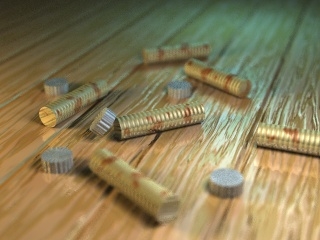
Focal blur, or Depth of Field (DoF) calculations, takes the Focal Distance and fStop diaphragm of the camera into account but does require an extra step in rendering which takes some additional time. Leaving it OFF puts the entire scene in focus, ignores the physical properties of a real-life camera lens, and contributes to the artificial, unrealistic feel of 3D renders. Of course, the DoF effect might be added in post as well.

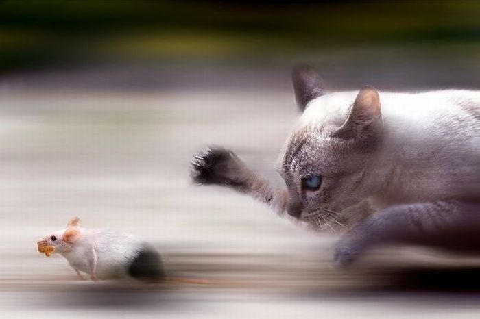
Motion Blur takes the shutter Start and Stop settings of the camera into account, and also introduces an extra step in rendering which takes additional time. Leaving it OFF puts the entire scene in a temporary freeze, suggesting infinite camera speeds or figures that can hold their breath and position for a split second, which by the way might be quite accurate for many situations. Also, switching it ON when the scene contains no animation at all only puts a burden on the rendering process without contributing to the result. On the other hand, do note that outdoor still shots with no blur at all on the tree leaves, grasses and animals around make quite an unnatural impression as well.

Scattering and Raytracing

A relatively new node in materials is the Subsurface Skin node, which adds some translucency effects to a surface as is present in muddy waters, human skin and waxy candles. It requires an extra render preparation pass, which is performed when a) such material nodes are present in the scene and b) the Subsurface Scattering option is checked. So, unchecking the option is meant for speeding up draft renders of scenes with scattering-intensive surfaces.

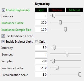
Raytracing addresses reflection and refraction of the actual surrounding objects by a surface, each pass or reflection of/onto a surface is called a “bounce”. Raytracing does not handle direct lights, does not handle scattering and does not handle reflection maps, but requires explicit reflection and refraction nodes in the material. When the Raytrace option is switched OFF those nodes are ignored, which is meant for speeding up draft renders of scenes with raytracing-intensive surfaces.

Note: using lights with raytraced shadows, and Indirect Lighting techniques also require Raytracing to be switched ON in Render Settings.

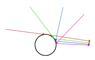
Each time a light ray bounces (reflects or passes a surface) it loses a bit of its energy, so it gradually fades out and dies. In real life, the number of bounces a light ray can make is quite large, and infinite in theory. To speed up (test) rendering in very bounce-intensive scenes (like a shiny car in the midst of glass and mirrors in an automotive commercial), I can set an upper limit to the Bounces. Poser will cut off the tracing of that ray when that limit is met, and of course this can introduce artifacts, black holes in the resulting render.

For final renders, the highest value is the best. It comes closest to nature’s behavior. It’s an upper limit for cut-off, so when no ray makes more than 3 bounces anyway, raising the value from 6 to 12 won’t make difference at all. You’re not forcing Poser into unnecessary raytracing, you’re just reducing artifacts, if any.

Indirect lighting

Caching

Irradiance caching is a technique which speeds up the calculations for Indirect Lighting (IDL) as well as self shadowing, or Ambient Occlusion (AO). A low setting implies a low number of samples taken from the scene (it’s a percentage, 0-100%). The colors, shadows and lighting levels for intermediate points are interpolated from them. This is faster, and less accurate. A high setting implies a more accurate result, at quite longer calculation times. For very high settings it might be better to turn off the mechanism completely to avoid the additional overhead of saving intermediate points and interpolating: just uncheck the option at all.

What are good values then? Well, have a look at the Auto-settings: values below 60 are not even suggested, which means Poser samples about every other point (just over 50%) for an initial draft result. Final renders take values up to 100, while any value over 95 could be better replaced by switching off the caching at all. Nature does not cache irradiance, so why should we?

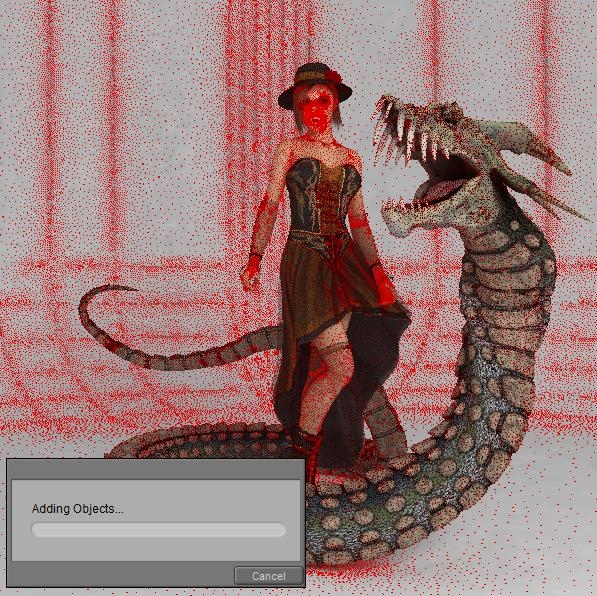
During the IDL pre-pass, red dots in the scene reveal the Irradiance caching.

When the density is too low, the value can be increased, and vice versa. When the option is switched OFF, the caching / red dots substep is skipped and the IDL is calculated directly, for all relevant points in the scene.

Lighting

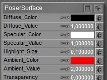
Indirect lighting (IDL) turns objects into light sources. Either because they bounce direct (and other indirect) light back into the scene, changing its color and intensity. Or because they emit light themselves, due to very high settings (> 1) of their Ambient material channel. The method mimics natural lighting methods at their best, but requires an additional – time and resource consuming – rendering pass. Unchecking the option speeds up draft renders, but you lose the lighting as a consequence.

Indirect Lighting requires raytracing to be switched on, and the Bounces setting is taken into account as well. A low Bounces setting make the light rays die quickly, resulting in lower lighting levels, especially in indoor scenes lit from the outside. Here again, the highest setting is the most natural but will lengthen rendering time. Also, Irradiance caching is taken into account: lower values render faster but use interpolated results instead of accurate ones.

Irradiance caching arranges for the ratio between determined and interpolated rays, but does not set the amount of them (or density, per render area). This is done with the Indirect Light Quality slider, higher values make more rays shot into the scene for IDL, with longer render (that is: IDL pre-pass) times accordingly. It’s a percentage (0..100%) of something. For final renders, one could say: just set 100 for quality. This certainly might hold for large stills. On the other hand, slightly lower values render much faster without reducing image quality that much.

Speed vs Quality

So I did some additional research, rendering a scene with various settings for Irradiance Caching as well as IDL Quality. My findings are:

  • * When either Irradiance Caching or IDL Quality is set below 80, the result shows splotches, while AO-sensitive areas (near hair, head/hat edge, skirt/leg edge, …) get too less light and produce darker shadows. These effects are noticeable for my eyes, I can tell them without knowing beforehand where they will show up in the result, and especially the splotches create low-quality impressions.
  • * When IDL Quality is increased, rendertime only gradually increases while the splotches disappear. So this is some low coast / high result kind of improvement. Until the value exceeds 90, then the improvements are not really noticeable anymore.
  • * When Irradiance Caching is increased, rendertime goes up fast, and say doubles till 90 is reached, and quadruples or worse when values get even higher. The main effect is on the quality of the (self)shadows in the AO sensitive areas, which I consider not the most relevant. So this is a high cost / low result kind of improvement, but for values up till 85 it also contributes to the splotch reduction.

So my preferred settings are 80 and up for both Irradiance Caching and IDL Quality, in any case. I tend to set IDL Quality to 90, and Irradiance Caching to 85 increasing to 90 depending on my findings in the specific render results.

The shorter render times can be relevant, especially when producing animated sequences. The best settings depend on the scene and require some experiments with a few frames, before rendering out the complete sequence.

Tips & Tricks

The Poser manual present some tips for handing IDL effectively.

  • * IDL means light bouncing around, and performs best when the scene is encapsulated within some dome, or room, or enclosure. Especially the SkyDome might offer self-lighting as well.
  • * Reduce the amount and intensity of (direct) lights, especially under SkyDome lighting conditions. One main light and one support light might be sufficient.
  • * Smearing indicates the IDL is short of detail, so increase Irradiance Caching. Watch the red-dots prepass.
  • * Splotchiness indicates the IDL takes too many samples, so reduce Irradiance Caching and increase Indirect Light Quality for compensation
  • * Use Raytraced shadows instead of shadow maps, increase Blur Radius to say 10 (and shadow samples to 100, I like to keep the 1:10 ration intact).
  • * Ensure Normals Forward is checked for all materials (this is the case by default, but anyway)
  • * When using IDL in animations, render all frames in the same thread on the same machine. As said in the manual. Apparently, some random sampling and light distribution takes place when rendering, and this random process is seeded by thread and machine ID for various good reasons (as in: to avoid apparent pattern tiling and repetition within the render result). Unfortunately, multi-threading and multi-machine network rendering are essential for producing animations. So actually, the manual says: do not use IDL for animations. That’s a pitty, isn’t it? So I suggest to experiment with the settings, raise the Quality, consider to switch off Irradiance Caching (that eliminates at least one IDL related random sampling process, although it might be a rendertime killer), and evaluate some intermediate test runs. Things might be not that bad after all.

Some additional tips from my own experience:

  • * Direct lights with inverse linear attenuation, and especially with inverse square attenuation, can create hotspots when put close to a wall, ceiling or other object. Those hotspots propagate through the scene presenting “light splotches” all around. Increasing Indirect Light Quality, raising (or unchecking) Irradiance Caching and taking light absorbing measures around the lights are some ways to go.
  • * Sources of indirect light, being too small or placed too far away from the relevant objects in the scene, will produce lighting levels which are too low. This can present “shadow splotches” all around. Using large light sources nearby the object, and using direct lights instead, are ways to go.
  • * Indirect Light works on Ambient and Diffuse only, and produces a serious amount of all-around ambient lighting, including Ambient Occlusion. But it does not work on Specularity, and it’s not very good in producing specific, determined shadows from objects. Using direct lights for those specific purposes instead is the way to go. As is “photography is painting with light and shadow”, IDL is a mighty tool for painting with light. For painting with shadow, use direct lights instead.
  • * Lots of objects are completely irrelevant for bouncing indirect light around, they will not illuminate neighboring objects anyway. Test unchecking the Light Emitter option for those objects. Especially check on
    • * Skin. In various material settings, some ambient is added to mimic translucency (subsurface sampling) in older versions of Poser or to speed up the rendering. As a result, the skin will act as a light source under IDL. Switch it off.
    • * Hair. Lightrays can bounce around forever; it takes loads of time and resources, and accomplishes nothing. Switch it off, to speed up the IDL pre-pass. However, taking those surfaces out of the IDL loop might produce flat, dull results. In this case one either has to take the long render-times for granted, or one has to seek additional measures like adding in some extra AO for depth somehow.

Next >>

Managing Poser Scenes (09. Rendering Options II)

The Poser Firefly renderer presents us a shipload of additional settings, in order to sacrifice the resulting quality (a little bit) at the gain of better resource utilization (a lot). Do keep in mind that the renderer – based on the Reyes algorithm, from the last decade of the previous century – had to perform well on single threaded PC’s, running at a 100MHZ clock and memory banks in the sub-Gb range. Current machines run at tenfolds of those numbers, in all areas.

Image sub-resolution

Anti-Aliasing

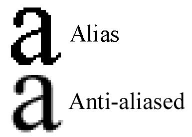
Anti-aliasing (or AA for short) is a well-known technique to avoid jagged edges made by the individual pixels along a skewed line in the resulting image. AA introduces additional sub-pixels to be calculated around the main one, and then the color of the main pixel is derived from itself and its neighbors.

The Pixel Samples setting determines the amount of neighbors for each pixel, higher settings make better quality:

  • 1, only the main pixel is taken into account, no Anti Aliasing takes place
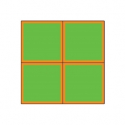
  • 2, the four neighboring pixels are taken into account, it requires 2 times as much pixel renders
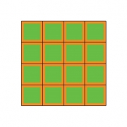
  • 3, eight neighboring pixels and the main pixel itself are taken into account, it requires 4 times as much renders This choice delivers “pretty good” results for any kind of electronic publishing (TV, Web, …)
  • 4, sixteen neighboring subpixels are taken into account, requiring 8 times as much pixel renders
  • 5, twenty-four neighboring pixels plus the main pixel itself are taken into account, requiring 16 times as much pixel renders. This one is blowing up your render time, and delivers “extremely good” result of any kind for high end printing. Especially in this area one has a choice between
    • a high pixel count (high dpi number, say 250) with modest AA (say 3) and
    • texture filtering (say Quality) settings, and a modest pixel count (say 125) with high settings for AA (say 5) and texture filtering (say Crisp).

The first can be expected to render longer with lower memory requirements: more render-buckets with less sub-pixels per bucket. Actually, I never use 5 for high end printing results: I prefer to render at a larger image size. So, the default value 3 is considered one that hardly needs adjustment: it does do AA, it takes the main pixel itself into account and is fit for all electronic and most print publication. Use 1 for draft renders, switching off AA in the results.

Micro polys

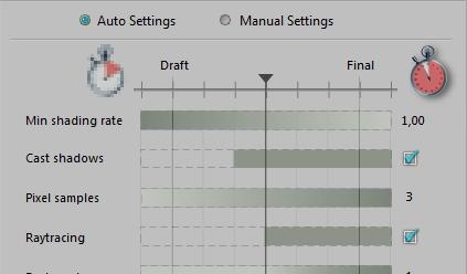
The basic routine of Firefly is to break a mesh down to micro-polys, which then are assigned a texture fragment, and are rendered accordingly. The Min Shading Rate denotes the minimum amount of pixels in the final render result that are covered by a single micro-poly. In other words, this setting sets a minimum size for the micro-polys and stops Poser from subdividing any further. Lower settings make better quality, and blow up memory use while rendering.

So, the value 0.1 implies that each micro-poly is (at least) 1/10th of a pixel in size. At most, so this 0.1 relates quite well to the default “3 Pixel Samples” setting for AA. It does not make much sense – very specific scenes excluded – to keep the 3 pixels for AA while reducing the Min Shading Rate to 0.01 allowing at most 100 microploys per pixel in the final render. The extra information is not going to be used while taking up a lot of memory for the micropolys. Inversely, it does not make much sense to keep the 3 pixels for AA while increasing the Min Shading Rate to 1 allowing for at most 1 micropoly per pixel. Where is the extra information for the Anti-Aliasing coming from then?

Reasonable combinations seem to be:

  • Pixels = 1, Min Shading Rate = 1.00 to 0.50 – good for drafts
  • Pixels = 3, Min Shading Rate = 0.10 to 0.05 – the default
  • Pixels = 5, Min Shading Rate = 0.02 to 0.01 – the extreme

Note that the Shading Rate relates the size of micro-polys to the size of pixels in the render result. This implies that when we set larger render dimensions, each original poly and object in the scene will get broken down to a finer granularity automatically.

Texturing considerations

Say, I’m rendering out to a 1000×1000 image result. In the middle, I’ve got a head, or a ball or any other object, which takes say 500 pixels in the render. To surround that object with a texture, that texture needs to be 1000 pixels in size to match the output resolution. Half of the pixels will show in the image, half of them will be hidden facing backwards. From information theory (Nyquist etc, sampling statistics) it is known that one should have a texture quality for input which is at least two times the quality of the output. Hence, the head needs a texture map of 2000 pixels in size, at least. And anything over 4000 might be overkill.

If the head takes a smaller portion of the resulting render I might not need such a large texture map, but when I consider to take a close up facial portrait, I might need more. Because when the resulting render of 1000 pixels shows only half the head (or more precise: 25% of the head as it shows half of the visible part facing the camera), then I’ll need 2 (Nyquist) x 4 (the 25%) x 1000 = 8000 pixels for a good texture map, which runs into the Poser limit of 8192 for texture sizes.

Also, when I consider larger render results, I might need larger texture maps as well. How does all this relate to the other findings above?

The 3×3 Anti-Alias requirement will subdivide the 1000×1000 render result into 2000×2000 subpixels, and this two-folding neatly matches the Nyquist pixel-doubling requirement for good texture maps. So the AA and the texture mapping are on the same level of detail. Since 5×5 Anti-aliasing can be seen as a limit, resulting in 4000×4000 subpixels, the fourfold texture sampling can be seen as a limit too. That’s why I said above: anything over 4000 might be overkill in that situation.

When an object is broken down to micro-polys, and one micro-poly matches more than one pixel in the texture map, and/or more than one pixel in the resulting render, we can imagine some loss of quality. So I want a few micro-polys per pixel in both cases. A Min Shading Rate of 0.5 gives me micro-polys of half the size of an output pixel which can be considered Low Quality (draft), but a value of 0.1 gives micro-polys of 1/10th the size of an output pixel, which is enough to support a serious 3×3 AA requirement. Since a decent input pixel (from the object texture map) is 50% to 25% the diameter of an output pixel, I’ll have 4 to 16 input pixels covering the output pixels. A Min Shading Rate of 0.1-0.05 will generate say 10 to 20 micro-polys covering an output pixel. Good match. So this value is enough to support good texture mapping and offers a few micropolys per texture-map-pixels without being overkill.

Conclusions on Resolution

  1. 1. The default settings for Pixels (3) and Min Shading Rate (0.1 – 0.05) are good for all quality results. Settings could be reduced to 1 / 0.5 for draft renders. Settings could be increased to 5 / 0.01 for high-end printing when increasing render size is not considered.
  2. 2. However, for high end printing, increasing render size is the preferred route over raising the settings.
  3. 3. Object texture maps should offer at least 2, at most 4 times the render resolution. That is: an object which takes 50% of the render width / height should be surrounded by a texture which offers at least twice as much pixels (width/height) as the resulting render.
  4. 4. This way, Render resolution, Texture resolution, Anti-alias rate (pixels) and Min Shading Rate are mutually balanced, all supporting the same quality level.

Divide & conquer

In order to handle the rendering by a multi-core, multi-threaded machine, each render is chopped in pieces; the buckets. Each bucket delivers a square portion of the result, say 32×32 pixels, although at the edges of the render the buckets might be less wide, less high, or both (in the corner). Each bucket is handled as a single thread CPU process with its own set of memory, addressing its own set of objects in the scene. And when there are either too many threats running in parallel, or each thread takes too much memory as it’s too crowded or too textured, on might face memory issues while rendering.

Max bucket size

In order to address these issues, one can either reduce the amount of threads running in parallel (in the Edit > General Preferences menu, Render tab) or the Bucket size. One might expect that halving the bucket size reduces memory requirements to 25%, while quadrupling the amount of threads required to perform the render. The latter won’t make a difference as each thread handles just 25% of the previous render size. In reality, neither will be the case, because the bucket-rendering takes some objects from neighboring buckets into account by adding a (fixed width) edge around it: the bucket overhead.

For example: Say the bucket-edge is 8 pixels wide, and I consider a 64×64 bucket, then it will render (64+2×8)2 instead of 642 pixels, that is 156% of its contribution to the result. But when I consider a 32×32 bucket, it will render (32+2×8)2 instead of 322 pixels, that is 225% of its contribution. So resource requirements will be 225/156=144% higher than expected. Memory demands will not drop to 25% but to about 35%, while rendering will take say 45% longer due to overhead increase. When I consider a 128×128 bucket instead, it will render 126% of its contribution, memory requirements will go up 4*126/156 = 324% instead of 400% while processing will take 126/156 = 80% of the time – that is for the rendering part of it, not the preparation passes for shadow mapping, and SSS or IDL precalculations.

So reducing bucket size should be done when facing memory issues only, and even then the question is whether such should be done manually. This is because the value entered in Render Settings is a maximum value. Poser will use it as a limit, but will reduce the bucket size dynamically when facing excessive resource issues. So altering the value is a manual override of the Poser behavior, which only makes sense when Poser itself falls short.

On the other hand, increasing bucket size will have some flaws too. When the rendering is chopped in too few pieces, you will soon run out of threads to load your CPU cores, and they remain idle till the last one is finished. In other words: your CPU resources are used less efficient.

My recommendations:

  • * On a 32-bit system, use 32 for most renders but reduce to 16 for very crowded scenes or increase to 64 in scenes with just a few figures and props.
  • * On a 64-bit system, double those values, and double again when there is plenty of RAM available.

A note on render hotspots

Some renders present a spot in the image where rendering takes all the time, that one bucket is slowing down the entire process. Reducing bucket size maybe of help then, when it concerns an area that can be distributed over multiple threads. When it really concerns some kind of small spot, even the smallest bucket will hold up everything, and reducing bucket size is not the solution. It’s not causing harm either, though, for that render.

The question is: what is causing the hotspot, and are other cures available? Sometimes, object- or material options might be reconsidered:

  • * When it concerns hair, conforming or dynamic, it should have its Light Emitter property checked OFF This might affect the quality of the rendered hair, in which case compensation-method should be considered. Something which adds in AO for a bit extra depth, perhaps.
  • * Some shiny surfaces, like teeth, could do with specular only and don’t need full reflection

Things like that.

Max displacement bounds

Displacement mapping might change the size of an object. Poser has to take this into account in order to determine whether or not an object is relevant for the rendering of a bucket, even when the object itself resides outside the bucket area. The object-size should be increased a bit, then. Poser does a decent job in doing so, using the material settings, and using the bucket edges as discussed above, but might fall short in cases. In those cases, the details of the displacement seem to be chopped off at the boundaries between buckets.

This can be fine-tuned in various ways, and increasing bucket size is one of them. Similarly, decreasing bucketsize increases the risks for the mentioned artifacts. Another measure is blowing up the object size a bit extra. The Min Displacement Bounds in Render Settings does so for all objects (with displacement mapping) in the scene. The Displacement Bounds in the Object properties do so for the individual object specifically. And the first overrides the second when the latter is less. As a result, the object or all objects take a bit more space, and I’ll have more objects per bucket on the average which might increase memory requirements and render time a bit. Setting a value is relevant only when the artifacts pop up, as Poser does a good job by itself except for very complex shader trees (material node setups). But setting any (small!) value does not do any harm either except from the additional resource consumption.

Note that both Min Displacement Bounds and object Displacement bounds both are in Poser Native Units, whatever your Unit settings in the General Preferences. 1 PNU = 8.6 feet = 262.128 cm, or: 1 mm = 1/2621.28 = 0.0003815

Image handling

Toons

The Poser Firefly render and material system offer loads of options to produce photoreal results: Subsurface Scattering, Indirect Lighting, Focal and Motion Blur to name a few. On the other hand, the shader tree offers a Toon node, and the Render settings offer an outline function. In my personal opinion, mixing the Toon and the Photoreal options gives some misplaced feelings. One might need reflections, and some softening of shadows and highlights in a toon render. But does one need Subsurface Scattering and Indirect Lighting? Your render, your call.

Sharpening

Of course one can sharpen render results in post, but the filter presented here is applied in an earlier stage: while the result is build up from subsamples, like anti-aliasing. Anti-aliasing will blur the render a bit to take the jags out of the edges, but that affects the fine textured areas as well. The filter brings back those details to some extent.

The values mean:

  1. 1. no filtering
  2. 2. limited sharpening, fine for female skin, rough outdoor clothes and textures with mild detail
  3. 3. stronger sharpening, fine for male sin, fine indoor clothes, short animal fur, lots of detail and the like
  4. 4. extreme sharpening, disadvised

As the purpose of sharpening is: to bring back the details and color contrasts from the texture maps into the resulting render, the SINC option performs best.

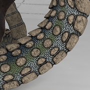
SINC, filtering 1 SINC, filtering 2 SINC, filtering 3 SINC, filtering 4

Snakeskin texture, from not filtered (left) to overly sharpened (right).

Tone mapping and Gamma Correction

Correcting images for Gamma and Exposure is a world in itself; I dedicated a special Understanding Corrections tutorial on this.

Exposure Correction, or: Tone Mapping, can be done in post as well for still images, and in most cases it’s not used. Doing it in Poser is a benefit in animations, as it’s applied to all frames on the go.

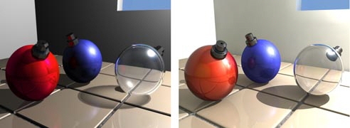
Gamma Correction, available in Poser Pro 2010 and up, and Poser 10 and up, is a different story. It works rather different from alike processes in post. It hardly affects the main colors in the render result but it certainly softens the highlights and shadows from lighting and shading the objects around. To some extent, Gamma Correction (GC) as implemented in Poser is a way to deal with the far too strong effects on shadows and highlights from the infinitely small direct lights, as used in 3D renders. But so is Indirect Lighting (IDL). This leaves the question whether two steps in the same direction are not just one too many. Should GC and IDL be used in combination, or should one use either the one or the other?

Well, in scenes using IDL, additional direct lights usually provide specularity (as IDL cannot provide this). They also provide local lighting effects, like photographers are using flashes and reflectors to brighten up their shots. In those cases, GC does have a role too. Also, IDL mainly affects the overall lighting level in the scene when large objects, especially a SkyDome, are emitting light all around. In those cases, GC might not have a role. So, the extent to use GC in IDL lit scenes is up to you. You might go for the full amount (value 2.20), or for none at all (switch it off, or set the value to 1.00), or for somewhere halfway (set the value to 1.50 then, or try 1.20 or 1.80 instead).

Saving results

Poser stores its render results in 16-bit per color (48 bit per pixel + transparency) EXR files, in
C:\Users\(your account, might be admin)\AppData\Roaming\Poser Pro\10\RenderCache

Poser can translate those when exporting to the 8-bit per color BMP, TGA, JPG (all without transparency) and the TIF, PNG or even PSD (all with transparency) format, and the 16-bit per color HDR or EXR format (Poser Pro only). Lossy formats like JPG are recommended only when the render does not require any additional post processing anymore, otherwise the lossless TIF, PSD and hires HDR or EXR are recommended instead. Saving to lossy formats should be the final step.

After rendering, the final result is dithered a bit to eliminate banding in subtle gradients and various antialias situations. For the results exported in HDR/EXR format, this is something unwanted, as it might intervene with additional processes in post. The render setting HDRI-optimized output skips this dithering when checked. Note that this will lead to suboptimal results when exporting in any 8-bit per color format.

Poser Pro also can export various aspects of the render separately, like Diffuse, Specularity, Depth and more. This is behind the Auxiliary render data option. This way, all those aspects can be merged in post. Merging in the shadows was already discussed above in this tutorial. More on this in my separate tutorial on Poser Render Passes.

Other options

Presets

One can define a series of settings for various steps in the workflow (draft, intermediate, final for web, final for print), and for various types of result (Toon, Photoreal, …). And then save and load those settings as presets.

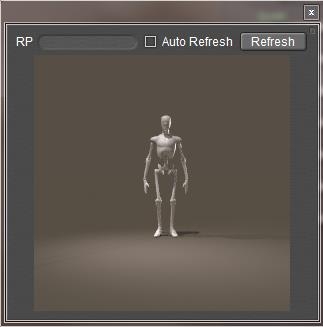
Raytrace Preview

Progressive Mode is a new option to Poser 10 / Poser Pro 2014. It greys out various options from the render settings, and leaves a few which affect the result of the Raytrace Preview window. The ones greyed out will get a standard setting or value, the manual does not tell us which.

Do note that the Raytrace Preview will use those standard values even when they’re not greyed out by the Progressive Mode switch. The switch is just an aid in managing the behavior for this new Preview window.

Do note that when Progressive Mode is left switched ON when rendering, those standard settings are used for the render result as well. This presents you a result which is a larger version of the contents of the new Raytrace Preview window. Switch Progressive Mode OFF to enable the other options again.

My personal observation is that this Raytrace Preview does not work out very well with IDL lit scenes. It does give some clues on the lighting levels, but the result itself is far too coarse for anything else. It does work out great in diret lighting though, and… it’s a Raytrace Previews after all, not an IDL Preview.

Launch

From the Render Settings window one can call for the Render Dimensions (= size of the result) dialog, as the similar Poser menu option is out of reach when the Render Settings window is active. Also the rendering can be sent to Background or to the Queue (Poser Pro), instead of running in the foreground. Or the settings can just be saved. That is: to be used when clicking the Render button at the top right of the Document window.

Next >>
Managing Poser Scenes (10. Rendering Alternatives)

Firefly by the camera icon in the Document panel, or via the Render Settings menu, is not the only way to get renders out of the Poser scene. Poser itself offers some alternatives, and other programs can be called upon as well.

Toon and Sketch

In the “good old” days I had a Toon Render, which now is replaced by a Toon node in materials (Lighting Diffuse group), and an Outline option in Render settings. And I’ve also got a Sketch Render, which still is around and can turn my renders into something artistic. Of course, I can do all that in post, using Photoshop, or GIMP or alike. But Poser can apply those techniques to all frames in an animation as well, supporting me to create artistic looking movie shots as well.

Render Script

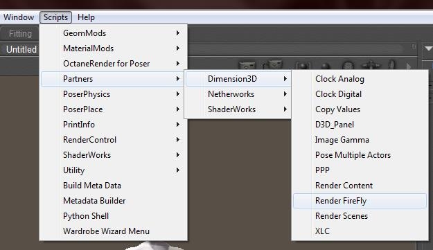
Something completely different is the ability to launch Firefly via the Scripts > Partners > Dimension3D > Render Firefly menu.

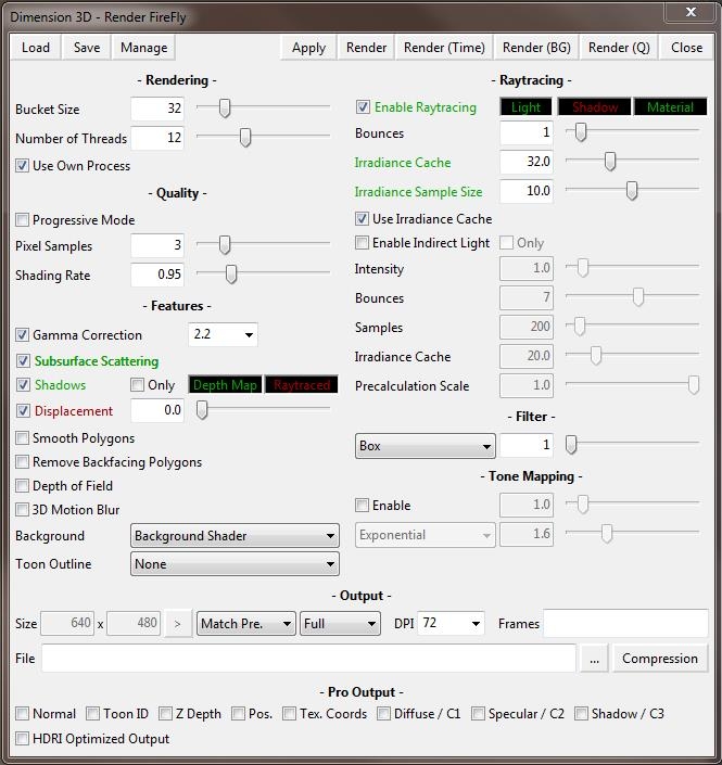
This presents a window where all available options are presented, and a few more are added too.

  • * The Load / Save / Manage buttons handles Setting Presets
  • * The Close button just closes the window, while Apply closes the window too, but will apply the settings when clicking the camera icon on top of the Document panel.
  • * Next to rendering in foreground, background or in queue (some of these are Poser Pro only), the Render (Time) option will start rendering in foreground while reporting rendertime afterwards. Nice for benchmarking, and for testing the effects of parameter settings on performance.
  • * Bucket Size (max value) comes from the regular Render Settings, Nr of Threads and Use Own Process both come from the General Preferences, the latter one as Render as Separate Process.
  • * Progressive Mode greys out several options, Pixel Samples (the AntiAlias setting) and Shading Rate which regulates the (minimum) size of the micro-polys all come from Render Settings.
    • * Also most other options can be found in Render Settings, though some come from Movie Settings, the File (and its compression settings) are especially meant for Queue / render to disk handling, including the HDRI-optimized output option at the bottom row. Just above that you’ll see the Render Pass options (Normal… Shadow/C3) as can be found as Aux Render Data in the regular Render Settings.
    • * More interesting is that Indirect Lights has its own Bounces and Irradiance Cache parameters, leaving the others for reflection and AO I guess.
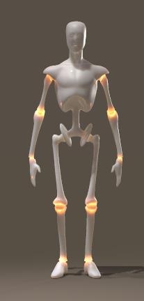
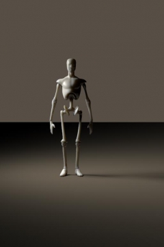
    • * Like the regular Render Settings, I can type in values instead of using the corresponding slider. But this time, the values are not bound to the same limits. So while in Render Settings the (max) Bounces are limited to 12 for slider and value as well, I can enter 99 as a value in here. Which, for whatever reason, can produce surprising results when entered for both Raytracing and Indirect Lighting (see Andy’s joints).

External Renders

Poser scenes can be transferred into other 3D programs, and rendered in there, either by using a common 3D format, or because the other program can read Poser scenes directly. Some of them offer special import modules, or even offer complete integration.

The issue in using any of those external renders is: generally I lose my Poser camera and light settings or have to redo them at great extent, while I also lose many advanced Poser material features and have to exchange the materials for the ones native to that specific program. The gain is: better results, sometimes faster, or just having Poser stuff put into another scene.

Daz Studio (www.daz3d.com) – Posers’ main competitor according to many. I’ll have to redo camera, light and anything materials but the basic stuff.
Bryce (www.daz3d.com) – one of the first affordable raytracers, and landscape builders, enabling me to place characters in some environment. But results keep having that typical “3D look”, while Poser itself improved on Indirect Lighting and so on.
Carrara  (www.daz3d.com) – a complete integrated 3D modeling and 3D painting pack nowadays, including landscape building and quite good environmental lighting. It really places Poser characters in some context, I’ve not much experience with it myself but user notes tend to be quite positive. Some other 3D modeling packs (e.g. LightWave) might offer similar functionalities, and some users apply 3DS MAX to access the famous V-Ray render engine.
Vue (www.e-onsoftware.com) – an advanced landscape builder which can deal with indoor scenes as well, the Pro versions are used in Big Screen Cinema (Pirates of the Caribean etc). It has very good environmental lighting and a surplus on vegetation. It can read Poser scenes directly, but also it can integrate which means: using the Poser dials from Vue to modify and animate poses (expressions, morphes, etc) and using the Poser material tree directly. Actually this requires Poser and Vue running in parallel on the same content, which requires all the additional resources (memory!) for doing so. Poser cameras and lights are ignored, I’ll have to deploy the Vue ones (which includes area lights).

PoseRay (https://sites.google.com/site/poseray) – is a freeware importer to the good old POVray renderer (www.povray.org), and the KerkyThea renderer (www.solidiris.com) as well – which are both freeware too, by the way. It does translate camera, light and basic materials and both renderers produce quite neat results. Actually, POVray was about the first, free, raytracers available for PC but suffered from the lack of a decent graphical user interface and additional modeling capabilities. Later on, MoRay closed that gap a bit for the modeling aspect but then Bryce had already entered the stage…
InterPoser (www.kuroyumes-developmentzone.com) – is an advanced importer for Cinema4D.

Pose2Lux (freeware, www.snarlygribbly.org) and Reality (www.preta3d.com) – are both importers for the (free) LuxRender (www.luxrender.net) physics based / unbiased renderer. This means that glass, metals etc get the optical properties of those materials in real life, while also all lighting is dealt with according to all laws of physics. Camera and most lighting are taken into account, many Poser material features are covered but it’s very recommended to exchange them for “real” Luxrender materials. Next to its very realistic results, LuxRender supports some rendering in the Graphics Card (GPU) using the OpenCL protocol, which might speed up things on both nVidia as ATI cards.

Octane (www.otoy.com) – also is a physics based / unbiased renderer, rendering completely in nVidia Graphics cards (ATI not supported, it uses the CUDA protocol), which is supported by a Poser-importer-plugin which also handles camera, lighting and material transitions. Next to its very realistic results, it integrates with Poser giving me just an additional viewport which responds almost immediately (!) to any alterations in materials, lighting, camera properties, pose etc. This interactivity just depends on the power of the video cards, the faster the better. Although this kit costs as much as Poser itself it’s the perfect way of balancing materials and IDL lighting interactively.

Recommendations

Of course, it depends…

When you’ve already got Vue or Carrara, you can experiment with these instead of installing and learning extra kits. But it does not make much sense (at least to me) to purchase any of them just for rendering Poser scenes.

When you’re on a tight budget, the LuxRender route (either via Pose2Lux or Reality) is worth considering but also the PoseRay/KirkyThea route might be worthwhile. Except from reality (about $50), the rest is in the freeware zone.

When you can afford the extra hardware, extra software costs ($200 for Octane, $200 for Plugin) and you like the almost-real-time responses, the Octane route is the one for you; it does come with a (limited) demo version for your trials too.

Some considerations for selecting videocards:

  • * Octane is based on CUDA processing, this requires nVidia, it does not run in ATI cards
  • * The CUDA process puts a limit on the amount of texture maps. Poser puts a limit on the size of texture maps. Hence Octane for Poser makes it unlikely that you’ll ever need extreme amounts of videoram. This marks the GFX Titan card (6Gb) as overkill, especially since the amount of videoram is the major price driver for cards. Since 2Gb can be considered “low spec”, your main choice will be: 3Gb or 4Gb (per card).
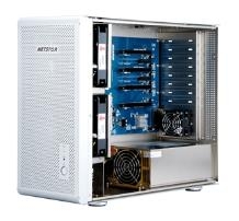
  • * Multiple cards can be used, SLI is not required (or should even be turned off). Multi-card configurations do need the extra space in the box, the extra power and cooling capacity. For more than two cards one can consider PCI expander boxes ($2000 without cards), like netstor NA255A (www.netstor.com.tw).
  • * Videoram between cards is shared, so a card with 2Gb plus a card with 4Gb make a configuration with 2Gb effective. Note that dual-GPU cards like the GFX 790 might advertise 6Gb, but actually offer two 780’s with 3Gb each so you’ll get 3Gb effectively.
  • * Processing power between cards is added up, power is determined by (amount of CUDA’s) times (clock speed) for single GPU cards, and say75% of that for dual-GPU cards which turn out to be less effective with that respect. But they require the same space in the box as a single GPU card, that’s their benefit. Generally, overclocking videocards does pay off a lot.

The ultimate alternative of course is to master Poser lighting and materials. That might take a lot of time: high end handling of Indirect Lighting, and setting up shaders trees to properly match the characteristics of glass, metals and the like, really do require a learning curve and preferably an engineering background to grasp the details of optics.

And still, Firefly will present some limitations, it just cannot do things. Like light passing through a volume of glass (or water, …) is not colored nor reduced through the volume, but at the surface only. Likewise, shadows from colored glass objects remain black.

This is why the new products are that popular, despite of the costs or having to learn some new software: you don’t need your Master in Poser Materials or an engineering degree in Physics, you can get better results (KirkyThea, POVray) or even real-life ones (LuxRender, Octane) and in some cases: you get them faster (Octane).

Next >>

Managing Poser Scenes (11. Lights Intro)

Generally, lighting 3D scenes can be done in two ways: direct / lamp based or indirect / image based.

Direct lighting requires “lamps”, light emitters without size or shape. Direct light produces strong shadows and highlights, which give depth to an image. Poser supports: Infinite lights, Point lights and Spotlights. Although their lighting is very controllable and can be good, their infinitely small size results in unnatural, hard and sharp shadows which do not take environmental (walls, ceilings, …) and atmospheric effects into account. Even in real life photographers prefer softboxes over halogen spots.

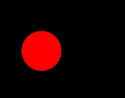
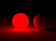
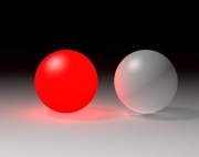
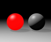
Indirect lighting in Poser supports: SkyDomes, light emitting objects (scifi clothes, neon signs, …) and radiosity (the red ball producing a red shine onto its neighborhood, a white wall brightening a dark alley). This kind of lighting is much harder to control, is hardly visible in the Poser preview, but the lighting itself is much softer, shadows are softer, blurred, brighter and sometimes about absent which gives a more natural impression especially in outdoor situations. But indirect light does have issues producing defining shadows and highlights, and might flatten the image.

As a result, we see mixtures of both in real life, and should do so in Poser as well. Indoors, without natural lighting, softboxes and light reflecting planes (umbrellas, dishes) help us to get a more natural look. Outdoors, additional flashing helps us to adjust the lighting levels and to get some highlights in place.

Infinite Lights, Lighting sets and General Light handling

The Infinite light is the oldest lighting concept in Computer Graphics. It imitates the sun, so far away that all rays run in parallel so the only thing that matters are color, intensity in the scene, and the angle to the scene. Effectively, Infinite lights always are directed towards to 0,0,0 center of the scene. There is no intensity falloff over the distance through the scene either, and it can produce dark, hard edges shadows like sun does at noon in the tropics.

All Poser direct lights have an indicator (quasi-object in the scene, presented in outline style), and a Scale parameter which does nothing to the light itself but alters the size of the indicator for easier interactive handling in the preview window.

Those light also have a similar set of properties:

  • * Include in OpenGL preview OpenGL unfortunately can handle a limited amount of lights only. For most current systems, this limit is 8, at least from a Poser point of view. The preview takes the first 8 lights (in order of creation) but I can prioritize them by ticking this property. So, the preview takes the first 8 in order of creation which have this box ticked. On the other hand: why do I have so many lights in your scene? Am I just softening shadows or trying for omnipresent lighting? Then Indirect lighting might be a better choice. Am I lighting up dark areas? Then using Gamma Correction (Poser Pro, or Poser 10 up) and/or Exposure Correction might help me more. Or perhaps using another renderer (e.g. LuxRender, Octane) instead might be the thing I’m looking for. Your image, your call.
  • * Visible switches the light indicator on/off in the preview. By default, the light indicators are visible when selected for parameter change. When setting up my lighting rig it might be handy to see the non-selected lights too.
  • * Animating when ticked Poser will create animation keys when I change color, intensity or more. But when I am just re-establishing a lighting setup for the whole period, this key-creation is quite annoying as other moments in time just keep their light setting. Then I un-tick the box to switch this key-creation off.
  • * On the ability to switch a light ON/OFF just prevents me from dimming intensities to get rid of the light for a while. Especially when I’m using Indirect Lighting in my render (which will not show up in the preview) I need some extra light just for the preview. Or perhaps I want to make separate renders for each (group of) light(s), to add them up in post. Here I can switch them off before rendering.
  • * Type indicator well, Poser starts each new scene with a colored infinite light, two spot lights and one IBL, and the light control panel defines each new light as a spotlight. From Poser 9 and up that is, earlier versions are different. So here I can change the light type. When creating a light from the menu (Object \ Create Light) I’m offered the choice immediately.

Shadowing

The interesting part of direct lighting is: shadowing. The main shadowing routines are: Raytraced shadowing and Mapped shadowing. In both cases, the shadow intensity is set (or more precise: multiplied) by the Shadow parameter, ranging from 100% (full shadow) to 0% (no shadow).

Raytraced shadowing is straightforward: it’s determined at rendering time, and it requires Raytracing to be selected in the Render Settings. This can either be done in the Manual Settings or in the Auto Settings from the second half of the options on.

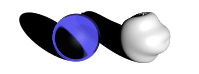
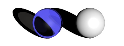
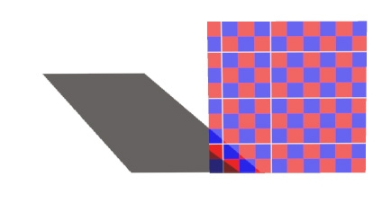
The use of Raytraced shadows becomes clear when I’m dealing with transparent objects. Shadow maps are generated from the objects mesh, independent of the material, while raytraced shadows take transparency into account. Well, to some extent that is. Mapped shadows do cater for displacement maps, while raytraced shadows do not handle the refraction color. As a result, light through a stained glass church window will produce a black and white shadow on the floor.

Shadow map:

Shadow map doing displacements:

Raytraced shadows:

Raytraced shadows, stained glass:

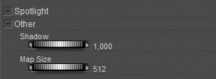
Mapped shadows were (and still are) used to save render time, at the cost of some loss of quality. The controlling parameter is map size, ranging from 64 to 1024, the default 256 sitting in the middle (of the 64 – 128 – 256 – 512 – 1024 series). Since Poser 10 (Pro 2014) there is a separate parameter for shadow maps in preview.

Map size 64:

Map size 1024:

Poser recalculates the shadow maps before each render, and for another speed-up this can be switched off: check Reuse Shadow Maps in the Render menu.

This makes sense as long as position and orientation of objects and lights don’t change, for instance when I’m sorting out materials or camera position. I can do animations though, as shadow maps are calculated on a per-frame basis. When I have made changes that affect shadowing I can just Clear the current set of shadow maps, but leave the Reuse check on for further work. As long as I don’t forget to switch things off before the final render.

Wrapping up: when in draft mode, building up the scene, low to medium resolution shadow maps are fine. Reusing them makes no sense as figures, props and lights all move around in this stage of development. Gradually, increasing map size makes sense, eventually with the Reuse option. Raytracing might be on already to care for refraction and reflection, but one can add raytraced shadows only in a semi-final stage as well.

The next step in shadow quality control addresses the properties Shadow Blur Radius and Shadow Samples (Light properties panel). Both work for Mapped as well as Raytraced shadows:

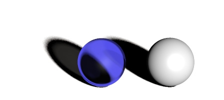
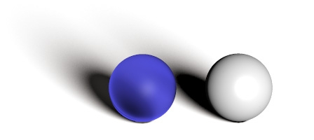
The first is just feathering the edges of the shadow. Hard edges are the result of tiny light sources, or tropical outdoor sunshine. When light sources grow in size, or when outdoor lighting becomes more arctic, shadows become soft edged and eventually less dark as well (so, reduce the Shadow parameter). The effect of enlarging the Blur radius depends on the map size (when shadow mapping of course). A radius of 2 blurs a 64-pixel map far more than a 1024-pixel map: the blur is apparently absolute, measured in pixels or so. Enlarging the blur also introduces graininess in the shadows; this can be dealt with by enlarging the number of samples as well.

Blur Radius 2, Sample 19 (default) – small, noisy edges on the shadows:

Blur Radius 16, Sample 19 – broad, noisy edges on the shadows:

Blur Radius 16, Sample 190 – broad, smooth edges on the shadows:

Next >>
Managing Poser Scenes (12. Lights Advanced)

Poser lights have their shortcomings, when I want to use them as lamps in real life. Poser lights are extremely small, therefore they produce very hard shadows, and they lack the atmospheric scattering which is always present in real-life environments. And… real-life behavior takes lots of resources when rendering. All this can be compensated for.

Shadow Bias

Then we’ve got the magical Shadow Minimum Bias property, what does it do and why?

Well, technically it takes a shadow casting surface, shifts it a bit towards the light, calculates the shadows onto that uplifted surface, and then assigns those shadows onto the actual shadow casting surface in its original position.

The advantage comes when handling displacement maps and small scale surface detail. Without the bias, every detail has to be taken into account as it warps a tiny shadow onto the surface. Those shadows are quite unnatural, such minor irregularities don’t warp shadows at all. The light bends around them, and the scattering in the atmosphere will make the thin shadow fade away. Besides that, it’s an enormous job for the shadow calculations. With the bias, only details that rise (or sink) more than this value will be taken into account. This enhances the natural feel of the shadows and it saves processing effort as well.

The downside is: it creates an artifact as the shadows themselves are somewhat displaced relative to the objects. To a minor extend, this is acceptable but larger values produce notoriously incorrect results.

Actually, the default 0.8 is quite a lot already so in my opinion one should never exceed 1. On the other hand, 0 cracks the renderer so 0.000001 is the real minimum here and will make shadows from every surface detail. Perhaps 0.1 would be a nice setting.

Ambient Occlusion

Direct lights warp direct shadows, either mapped or raytraced. Indirect and Image based Skydome lights generate an omnipresent ambient lighting which hardly warps shadows at all. But that is incorrect, as in my room the lighting level under my chair is much higher than that under my PC cabinet. Objects and surfaces close to each other hamper the spread of ambient lighting, they occlude each other from the ambient light.

In the early days of Poser, this Ambient Occlusion (or: AO) was dealt with as a material property, hence the Ambient_Occlusion node in the materials definition. Actually this is weird, as AO is not the result of a material but the result of the proximity of objects or of object elements (hence: the shape of an object). Above that, AO is mainly relevant to Diffuse IBL lights which generate the shadow-less omnipresent ambience.

More on that later.

Light arithmetic

In real life, when light shines on my retina or on the backplane of my camera, one light shining at a surface fires some percentage of the light-sensitive elements. A second light then fires the same percentage, of the remaining elements. As a result the non-fired elements reduces to zero when adding lights, and the captured lighting level increases to 100%. Photoshop (or any other image handling program) does a similar thing when adding layers using the Screen blending mode.

Poser however just multiplies and adds up. A 50% white light on a 50% white object results in a 50% x 50% = 25% lighting level. A 100% white light plainly lighting a 100% white object results in 100% lighting level. Two of those 25% lights make a 50% lighting level, or in the second case: a 2x 100% = 200% lighting level in the render. And this latter will get clipped (back to 100%) when establishing the final output, resulting in overlit areas. As in the first case, five lights on a grey object will cause overlighting too.

Things will be slightly different when Gamma Correction is applied. Then, first, all lights and objects will get anti-gamma-corrected (darkened), let’s say the 50% reads as 20% then, but 100% stays at 100%. In the latter case, nothing changes: one light on a white surface makes 100%, two lights make an overlit area in the render. The first case however produces a 20% x 20% = 4% lit area, two lights make 8% (Poser still just adds up), and now that intermediate result is Gamma Corrected to say 35% instead of the 50% without GC.

But even 24 lights add up to 24 x 4% = 96% which gets Gamma Corrected to 98% in the final result, in other words: Gamma Correction prevents – to some extent – severe overlighting. Actually it dampens all effects of lighting and shadowing.

Light materials

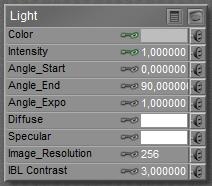
Poser direct lights appear in the Material Room as well, having Color, Intensity, Diffuse and Specular as the main parameters. Other parameters mainly serve legacy situations and can be discarded.

Color and Intensity team up (multiply) to fill the Preview, and give me light on my work. While rendering, the Diffuse and Specular channels kick in as well, and multiply with the Color x Intensity just mentioned.

This implies that blacking out the Diffuse make it turned off for diffuse lighting in the render, while still lighting the preview, and making specular in the render as well. This is great when working with IDL lighting which caters for all diffuse lighting itself, but fails to light the preview and does not produce specularity either. Similarly I can produce lights that make diffuse light only, with the Specular channel blacked out. Or lights which contribute only to the preview, having both Diffuse and Specular blacked out.

I also can have strong lights in the preview but have them dimmed in the render, by having reduced intensities (grays) in the diffuse and specular channels. And I can confuse myself a lot, by using some white hue in the preview but using some color while rendering. I never do that, though.

Next >>

Managing Poser Scenes (13. Direct Lighting)

Poser offers several types of direct lights: Point Lights, Spot Lights, Infinite Lights and ImageBased Lights. Poser does not offer Area Lights, nor shaped lights like neon texts, as a direct lighting source. These can be emulated by Indirect Lighting techniques, which are discuscced in a later chapter.

Point Lights

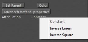
A Point light differs from an Infinite light in just a few ways. First, is has a location X,Y,Z and so it has a distance to figures and props in the scene. As a consequence, attenuation and distance related intensity falloff can be supported. In the light properties, for a start. Constant means: no drop, like the infinite light. Inverse Square means an 1/x2 or: following physical reality for a singular light bulb. Inverse linear means 1/x which is just somewhat in between, a bit like the falloff from a lit shopping window or a long array of street lanterns.

The Constant attenuation works with the parameters Dist_Start and Dist_End.

These imply that the intensity drops from full to zero – linearly – in the given distance range. In this example, a 100% light remains so until 5mtr, and then drops with 20% a meter till after another 5 mtr there is no intensity left.

Note that this distance-drop works for Pointlights as well as Spotlights (even if the title says: Spotlight), and works for Constant attenuation only. Inverse Linear or Inverse Square attenuations remain as they are, they do not respond to this extra distance drop. When Start as well as End are set to 0, there is no drop, which is the default.

Spot Lights

In addition to Point lights, Spot lights have an additional “light beam width”. The light is equally intense in all directions, then drops off (linearly) from the Angle_Start to the Angle_End.

Personally I don’t understand the default, who wants a gradual falloff from the heart of the beam to 70°? When the flaps could open up to 180° then the spot would turn into a point light, but they can’t: 160° is the max. In reality, 80° to 90° might be a decent maximum. I guess real light dims within 20°, so flaps at 80° would suggest an angular dropoff from 70° to 90°.

Spotlights are the ultimate candidates for making beams in fog and other atmospheric effects. This is dealt with in the chapter in Poser Atmospherics, later in this tutorial.

Bulbs and Window Panes

In the real world, lamps are not infinitely small. Lamps may come as bulbs (say half to one inch radius), but also might be as large as a shop window, or even a street full of shop windows.

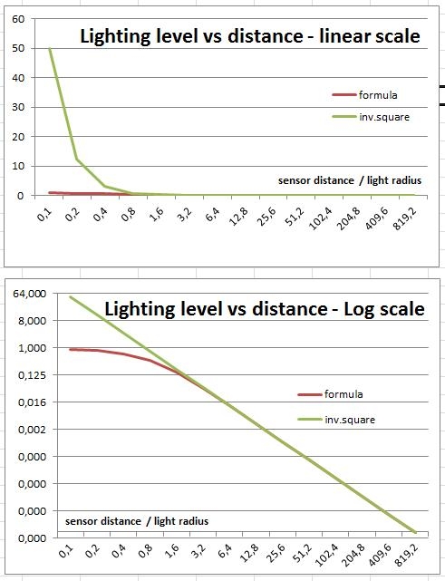
Very close to the light, there won’t be any falloff when we move gradually away. Very far from the light, every lamp becomes a point light and will have inverse-square falloff. This is illustrated in the graphs, the green one presenting inverse square, the red one a lamp with some real size.

For a disk-shaped light source (as a point light with some size at a distance) with radius R lighting and a sensor at distance d, the light captured by the sensor is directly proportional to

{ 1 – 1 / sqrt[1+ (R/d)2] }

From the graphs it becomes apparent that when the distance becomes more than twice the radius of the lamp (value 2.0 on the horizontal axis), this falloff behavior becomes about the same as ideal inverse square falloff (red and green curves match), and hence the lamp can safely be considered a point light.

Window panes – although not circular – will not be that different. I can use half the average of width and height for “radius”, and I can use a distance : size ratio of at least 3 or even 4 to be on the safe side when I want to. But at least I do know that for distances larger than say 3 times the window size, the inverse square law holds pretty well, while for distances smaller than say half the window size, any falloff better can be ignored.

Light Strips and Softboxes

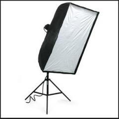
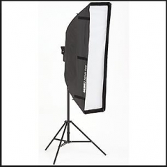
Photographers use softboxes (square-ish) or lightstrips (quite elongated softboxes) instead of flashes, for the simple reason that the larger the light, the softer its shadows will be. So softboxes are a nice way to simulate environmental, ambient lighting while flashing under studio conditions.

Something similar holds for Poser lighting as well, and one might like some softbox equivalent in the 3D scene. Unfortunately, Poser does not support Area Lights, which would be ideal for this.

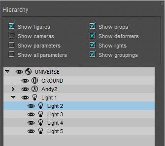
This leaves two alternatives: I can make one from a glowing rectangle under IDL conditions, or I can stack a series of direct (spot)lights together in a row or matrix. Indirect or direct lighting, that’s the question. The first option will be investigated later in this tutorial. The second option takes one spotlight, flaps wide open, in the middle and four around it at the corners. Of course one can make up larger constructions, but it’s doubtful whether that pays off. Parenting the corner-ones to the middle one enables me to use the shadow-cam related to the middle one for aiming the entire construction.

Middle spot only at 100%

5-spot rig, 2×2 mtr wide

The result, 10% + 4x 22,5%

Then I’ve got to adjust the lighting levels, and make sure the sum of the intensities matches the original intensity (or just a bit more, to compensate for the corners-lights at some distance of the main one). Like 10% (middle) + 4x 22,5% to make 100%, or 15% + 4x 30% = 135%. Next to that, I adjust the shadowing (raytracing, blur radius 20, samples 200) to soften the lighting even further, as I can reduce the shadow parameter itself to say 80%.

What is a good size for softboxes? Well, photographers are quite clear about that. A good box is at least as large as the object to be pictured, and placed at a distance at least once, at most twice the size of the box itself. So, for the mildly zoomed out result above, the 2×2 mtr software actually is too small, and probably a bit too far away as well.

Should I set attenuation for the lights? Well, an object so close to the softbox should be considered as a person standing in front of a shopping window. And in the paragraph above on window panes I argued that the range between one and two window-sizes meets the transition area between no attenuation (till say half the window size) and neat point-light-like inverse square attenuation (from say three window sizes). So I can pick inverse-linear as a go-between or use the Dist_Start and Dist_End parameters for each lamp to ensure the softbox is working on the object only, and is not lighting the background, as is done in real life too.

Diffuse IBL

This technique is a first attempt in the graphics industry to make a) better environmental lighting and b) create lighting in a 3D scene which matches the colors and intensities of the light in a real scene. The latter is required to make a smooth integration of 3D elements into real-life footage.

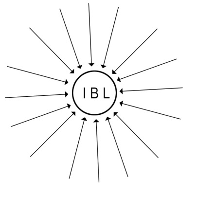
First, this technique uses an “inverse point light”, that is the light rays in the 3D scene will be treated as generated from an all-surrounding sky dome – which is not really present in the scene – towards the IBL Light. Or: the IBL-light is the “source’ of light rays which are treated as travelling inward. Whatever view fits you best.

Second, all those light rays get their color and intensity from an image map. When this image map is folded around a tiny sphere at the place of the light, then each point on the sphere presents the environment, sky as well as ground, when looking around from the center of the sphere. The image map can be obtained by taking a picture of such a (very reflective) spherical object in the real life scene.

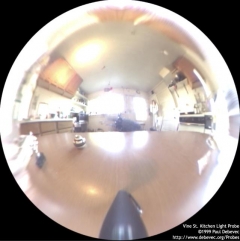
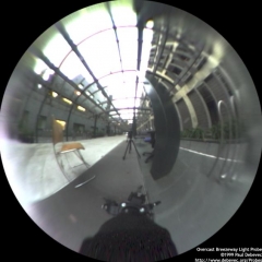
Indoor sample Outdoor sample

So one also can say: the IBL light projects the image map onto the (imaginary) sky dome in the 3D scene which then re-emits that light back to the IBL.

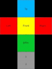
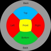
In the meantime, the industry has developed the concept further, and especially tried to replace the reflective ball by panorama photography and multi-image stitching, or by other types of mapping the obtained images onto the IBL, aka the virtual sky dome.

Cube mapping Panorama Angular map Mirrored ball

Poser Diffuse IBL (Image Based Lighting), works in the Diffuse (Reflection, etc) channels but not in Specular (nor Alternate_Specular): Poser IBL lights cannot produce highlights, I need one of the other direct lights for doing that.

Poser IBL is quite good in creating an ambient, environmental lighting in a fast way. As a result, it’s not so good in creating a similarly improved, matching shadowing. This introduced the need for AO, Ambient Occlusion, the shadowing of ambient, environmental lighting which makes it darker under tables and cupboards, and generates self-shadowing in objects with a complex geometry.

In Poser, and in lots of other programs, the developments continued. And so did the processing power in our PC’s. This introduced IDL, Indirect Lighting, with sky domes or other scene-enclosures which radiate light by themselves into the scene, and which can be textured in the regular way. Fading out IBL as a lighting solution.

Next >>
Managing Poser Scenes (14. Indirect Lighting [IDL] )

Indirect Lighting, aka IDL, is a computational intensive lighting strategy which can be considered the successor of IBL, Image Based Lighting. The use of it can be switched on/off in Render Settings. The basic principle of IDL is that loads of light rays travel around through the scene, hitting objects, and be re-radiated by those objects again usually with an adjusted color and intensity. This supports ambient lighting, indoor lighting from outdoor sources, radiating objects, radiosity (colors spilling over to neighbor objects) and proper mild shadow levels.

For a start, just a collection of notes and remarks:

  • * IDL is a successor of IBL, easier to use but far more computational and memory intensive. So, when IDL is not really working for you in a specific scene or on specific objects, consider re-introducing IBL as an alternative.
  • * Like IBL, IDL is working on Diffuse channels only, including Reflection, Refraction, Alternate_Diffuse. It is explicitely not working on Specular (and Alternate_Specular, and any specular material node wherever in the shader tree).
  • * IDL lights do not show in preview. As a result of this, and of the previous point, consider to use direct light in the scene with the Diffuse disabled (blackened out). And eventually, with Specularity blackened out too.
  • * IDL renders best (for final results) with Irradiance Caching ON, value at least 80 at most 90, and with IDL ON, Quality at least 80 at most 90. Lower values introduce noticeable splotches all-over the image, and overly dark shadows in self-shadowing areas. Higher values take a lot of time and resources while not adding noticeably to the result.
  • * It should be clear then that IDL does require raytracing to be active. This also introduces another mechanism to let the light rays die: when the limit for bounces is met, as set in Render settings, Poser cuts off any further handling of them. This will darken the ambient lighting, might introduce artifacts, and is explicitly meant for speeding up draft renders. Please set Bounces to the max when making your final render.

An interesting point is: I can launch the rendering from the Dimension3D menu too, and get access to additional settings. Indirect Light does have its own Bounces and Irradiance Cache, next to the generic ones for AO and reflection / refraction.

  • * IDL renders best when the scene is enclosed by a sky dome, walls of a room, or anything alike that traps the light rays and keeps them bouncing around.
  • * IBL comes with AO (Ambient Occlusion) to improve on shadowing from ambient, environmental lighting. Any other direct light should have AO switched off. Also, AO should be off under IDL conditions as IDL generates its own shadowing. Again: AO is for IBL only.
  • * IDL lighting can be switched off per object, by switching (off) the Light Emitter property of that object. This is worth considering: * for Skin, as Ambient is used sometimes to mimic translucency and subsurface scattering in a fast way, for the older Poser versions. Don’t let your characters be a light source, switch Light Emitter off. * for Hair, as light rays will bounce around forever requiring about infinite render times without adding much to the result. You will then lose the ambient lighting and additional shadowing for that object; it might look a bit flat. Think IBL + AO as an alternative.
  • * As the environment is supplying a lot of light, either by bouncing direct light around or by adding light from glowing objects (and especially: all-surrounding sky domes), I need far less lights and far lower intensities compared to non-IDL scenes. As a consequence, all the advanced lighting rigs constructed for non-IDL scenes – emulating environmental lighting with lots of direct lights all around, won’t serve very well any more. All I need is a glowing dome for sky, an infinite light for sun, and perhaps one or two spots for support and flash.

Radiosity

Objects which catch light, re-emit light after merging in their own colors, and reducing intensities. This makes a bright red ball warp a reddish light around, noticeable on white floors etcetera.  This is the basic principle of Indirect Lighting and served automatically when this lighting mechanism is enabled. The re-emitted light then is used in all further IDL lighting as well, the light rays either die from energy loss or from being captured by the camera (or by being killed by Poser when Bounces is set low).

Light Emitting Objects

In order to use IDL, I need at least one light emitter which sends out rays. This can be a regular direct light, like point, spot or infinite. Such a light is required anyway for creating specular effects and additional shadowing, but for (diffuse) lighting itself I don’t need direct lights at all.

I can make an object glow, by assigning it a high level of Ambient as a material, and it will serve as some lamp immediately. The larger the Ambient_Value, the higher the intensity of the light, the stronger the lamp.

Two balls, one glowing, IDL off, no direct light Same scene, IDL on Same scene, IDL, extra direct light on Same scene, IDL off

Note the strong shadows in the rightmost image, which lack in the third where the white floor is bouncing the direct light, reducing the shadows at the lower back/right side of the white ball. The second image shows shadows from the right ball onto the floor caused by the glow/lighting from the red ball at the left, and also demonstrates the lack of specularity (highlights) in IDL lighting.

Sky Domes

IDL works best when the entire scene is embedded in some kind of enclosure, like a box (walls, floor, ceiling for indoor shots. For outdoor shots, the answer is: a sky dome. I could use a normal (hires, half a) ball at a large scale, but dedicated sky domes have even a larger resolution (more polys to reduce smoothing artifacts) and have their normal pointing inward which generally is not the case with regular objects. And I can apply a texture to the dome to obtain the lighting conditions as were, or could be, present in a real life scene. Large shots from landscape generating software, like Vue, serve pretty well here too.

Note that the Diffuse material channel will “reflect” the regular lighting in the scene, and the Ambient channel will make the dome glow by itself. The latter is the usual response to sunlight, scattering through the atmosphere. The sun itself is best represented by an infinite light, within the dome. Then I raise Ambient_Value to get the proper intensity for this generic atmospheric lighting.

When the sky dome is used for color and intensity of the indirect light, scattering all around, the resolution of its texture map is not an issue. But that leaves the question: is the texture on the sky dome fit for purpose as a background image? Usually, it’s not.

Consider a camera at normal lens settings, that’s 35mm focal length and 40° Field of View (see table below), taking a shot (render) of 2000 pixels wide. The full sky dome, being 360° all around, then would require 360/40 = 9 times my view. And good texturing practices require at least double the resolution of my render. So the sky dome should be assigned a 2x 9x 2000 = 36.000 pixels wide texture, at least. Note that Poser takes 8.192 for max texture size, and you know you’re stuck.

Note that the size of the skydome – or any other 360° environment – does not matter. The Field of View matters, as a shorter focal length (typical for landscapes, say 20mm) increases FoV to 60°, and reduces the required texture to a 2x 360/60 x2000 = 24.000 pixels width.

Focal length (mm)

10

20

30

35

40

60

90

120

180

Field of View (°)

90

60

45

40

30

22,5

16

12

8

So the bets are that you’ll end up with say 8000 pixel wide panoramic image for the skydome, which is too low a resolution for proper background imaging, plus some background image prop holding another 2x 2000 = 4000 pixel wide portion of the high-res version of the panorama just covering the left-to-right edges of the rendered view.

Since this billboard prop might block the skydome lighting considerably (ensure it does not cast shadows, highlights etc) when placed nearby the dome it might need to serve as an active light emitter, the same way the skydome does. When the prop resides at some distance from the dome however this might not be necessary, so you’ll have to test for this a bit.

Next >>
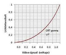
Managing Poser Scenes (15. Atmosphere)

The Poser atmosphere has three aspects: Depth Cue, Volume (both through the Material Room, Atmosphere Node) and Lighting (through the Properties of a Direct Light (Spotlight, eventually Point light). Depth Cue and Volume can be set independently, the Lighting works with the Volume settings. Material Room also has a big button (Wacro): Create Atmosphere. There are various standard options to choose from:

So, let’s take each element apart, and combine them later. Before I dive in: these effects are visible only against objects, reflecting light towards the camera which then is filtered through the atmosphere. Just having a set up a background image and the Poser ground won’t help. You do need a real ground object, and a real backdrop object even when it’s painted black.

Depth Cue

The Atmosphere Node, accessible in the Materials Room, presents for DepthCue: On, Color, StartDist and EndDist.

Depth Cue adjusts the color of objects towards the DepthCue_Color, such that all objects less that StartDist from the camera are not affected, all objects more than EndDist are fully effected and take that specific color only regardless of its materials, and everything in between is effected linearly (so an object at 30% between Start and End gets 30% of the DepthCue Color and 70% of its own.

This reflects the presence of damp or fog, which colors objects slightly towards bluish grey (large outdoor scenes) or to white (real fog, smaller outdoor scenes). It is also a great way to mimic environmental (indirect, IBL) lighting without the rendering costs, for instance sliding colors towards green in a deep forest, and it’s also great for creating under water scenes, coloring towards dark bluish / greenish cyan.

A common trick is the use of “black fog” making objects fade into the dark. Great for evening shots. Or use dark blue, for graveyard and gothic effects. The main thing is: Depth Cue relates to the camera looking into the scene, independent of the lighting.

Thanks to the on/off switch it can be activated independent of other effects to ease setting and evaluating the proper values, and to make atmospheres with volume without depth cue, or the other way around.

Volume

As Depth Cue relates to the camera, so does Volume relate to the lights. Volume effects can be switched on/off themselves too, so they can be set independent of the Depth Cue effects.

The main parameters are Volume Color, and Density. When a direct light illuminates a volume in the scene, that volume acts like a transparent fuzzy object with that specific internal color. The lower the Density the more transparent it seems. On the other hand, each light can have its own Atmospheric Strength parameter:

So some lights can interact more than others. For example:

One infinite white light, Atmospheric Strength as low as 0.000010 plus one white spotlight, angular falloff from 10 to 20, Atmospheric Strengths as high as 0.100. From the different settings of the lights one can discriminate the spotlight from the overall scene lighting. The bluish color is from the Volume settings.

I noted that especially Volume effects take some time to render. A larger stepsize speeds up the calculations at the cost of quality and detail. Increasing the Noise parameter helps to improve on the quality especially at larger stepsizes.

Volume and Depth Cue together

As said: like Depth Cue relates to the camera, so does Volume relate to the lights. But atmospheres of course do both: light rays travel through the atmosphere before they hit an object, and then travel through the atmosphere again to hit the camera. So, let’s add up Depth Cue and Volume:

Which gives me:

The art of making atmospheres now focusses on mixing the proper colors and balancing the other parameters, Volume Density versus Depth Cue Start/End. This happens when I just brighten the Volume Color:

The beam stands out more, but I’ve lost the two balls in the back.

Introducing some structure however (assigning a clouds effects to the Volume):

Given render times, it might be an idea to construct the atmosphere in a simplified version of the scene. Then build the scene with the atmospherics switched off. Ultimately, switch on the atmospherics in the final, detailed scene. From the examples above we learn that we should not spend too much time in tweaking the details of the far away objects.

Standard Atmospheres

The Create Atmosphere Wacro button in Material Room presents four standard settings, as a start for my own:

Fog

Just assigning its own specific Cloud node to an existing Atmosphere node, which does not have any parameters changed.

Smoke

This Wacro changes the atmospheres Volume Color and Desity, and adds a serious set of nodes to both of them. Which does have an interesting effect:

It’s really different, isn’t it? Looks great as a morning fog above the water too, it looks as moving upward.

SmokeyRoom

Does a similar job, except it replaces the Fractal_Sum function by an extended set of nodes, resulting in:

Different structure in the beam of light, this kind of smoke seems to build up, thanks to the ceiling in the room.

Depth Cue

This option leaves all Volume settings as they are, but alters the Depth Cue Color, Start and End parameters. The latter two are determined by the positions of elements in the scene itself. A larger scene gets larger values, quite convenient.

The three Volume choices replace each other when selected, all are independent of Depth Cue. The Depth Cue option adds to either Volume setting.

Next >>
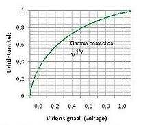
Managing Poser Scenes (16. Background)

Since the Poser virtual world can’t be filled with objects to infinity, I’ve got two ways to define the far away portions

  • A background shader – this chapter
  • A defined object with a color or texture (usually a photograph) attached – next chapter

The background shader

As light rays travel from all lights via all objects onto the view plane of the camera, some pixels will hardly, or never, get lit. This is where the “background shader” kicks in, and fills the emptiness. The Poser background shader can be set for the Background notion in the Materials Room. Background is not an object, like the atmospheric Volume is not an object either.


The actual working of the elements is a bit confusing, as you can see there are

  • The “Current BG Shader” of Background root node (root nodes don’t have an output connector at their upper left)
  • The BG Color node
  • The BG Picture and BG Movie node
  • The Black node

Now I’ve got the Preview and the Render, and the question: which one is showing what?

The Preview is arranged for in the Display menu:

When an image is loaded into the BG Picture node, either by assigning one as the Image_Source parameter or by loading one via the Import \ Background Picture menu option,

the Show Background option in the Display menu becomes available. That is: the BG Picture node should be connected to the Color parameter of the Background node. Then, when the menu option gets checked, the picture is shown in the preview. The image, and hence the content of the Image_Source parameter in the BG Picture node can be deleted by using the Clear background Picture menu option.

A similar scenario holds for displaying a movie in the preview: load one in the Video_Source parameter of the BG Movie node, or import one via the Import \ AVI Footage menu. The Show Background Footage option becomes available and can be checked. Again: the BG Movie node should be connected to the Color parameter of the Background node.

When nothing is checked, or the checked Picture / Movie option is not connected to the Background node, you’ll get the BG Color node contents in the preview, whether it’s connected to the Background node or not.

The Rendering is arranged for in the Render Settings:

The first three options pick the contents of the BG Color, the Black and the BG Picture node, the latter has to be connected to the background node’s Color parameter. The last option: Current BG Shader, picks up whatever is connected to the Color parameter, and multiplies with that color swatch too!

Again:
In Material Room I’ve got the background root node, and four basic nodes: Black, BG Color, BG Picture and BG Movie. I can connect any of these to the Color channel of the Background node.

In the Display menu, I’ve got options like Show Background Picture, Show Background Footage and Use Background Shader Node. Only when the BG Picture node is connected with Background, the Show Background Picture option becomes available to turn showing the background picture in the preview on/off. Only when the BG Movie node is connected with Background, the Show Background Footage option becomes available to turn showing the background movie in the preview on/off. The Use Background Shader Node menu option has not shown any effect on anything up till now. Sorry for that.

From the File menu, I can Import either a background picture or background footage. When importing Background Picture, Poser loads the BG Picture node, connects this node with Background (hence dims the Show Background Footage option) and switches Show Background Picture to ON. When importing Background Footage, Poser loads the BG Movie node, connects this node with Background (hence dims the Show Background Picture option) and switches Show Background Footage to ON.

Do note that I can set the BG Color from the Document panel directly, using the (second) color-swatch option at the bottom-right. So, for handling backgrounds, I don’t have to enter Material Room at all.

In Render Settings, I can select the render background almost independent of my choices for Display, or the node-connections in Material Room. That is: I can render against Black or Color even when the preview is showing Picture or Footage, with Picture / Movie node connected and the Display menu option switched ON. I also can render against Picture or Footage while the preview is not showing it, having the Display menu option switched OFF. But in order to use Picture or Footage in either preview or render or both, the corresponding node must be connected to Background in Material Room. To the Color swatch.

The other way around: how to rotoscope against a movie.

First, I go File > Import > Background Footage. This will load the BG Movie node, connect it to Background en switch ON the Show Background Footage option in the Display menu, so the footage will be visible in preview.

Then, in Render Settings, I have to select Render against: Background Picture (or Current BG Shader), and the footage will appear in the render results as well. That is: provided I use a save / export format without transparency: a series of PNG’s will not show any background anyway!!

Next >>