Managing Poser Scenes (17. Backdrops)

Instead of filling the empty space and non-rendered pixels in the result by a background image, I can put objects in the scene. From simple planar billboards or screens like the backdrops in a real-life photographers studio, walls of a room, to varied setups representing outdoor scenes with more depth. Cycloramas, dioramas, environment balls and more – supported with additional partial billboards and images with alpha channels – all serve the purpose of building a partial environment in the scene.

The one question that comes up every time is: what’s a proper size for images used on those backdrops? Simply stated, the amount of pixels that can be seen on the result should be at least twice (and at most four times) the amount of pixels in the result itself. This has to do with texture sampling and pixel processing statistics, a simple one-to-one ratio might result in loss of quality. As Poser puts a 8192 limit on texture sizes, this implies a 4096 limit on good quality render results – as far as backdrop images are concerned.

And what about full 360° environments like a sky dome?

Consider a camera at normal lens settings, that’s 35mm focal length and 40° Field of View (see table below), taking a shot (render) of say 2000 pixels wide. The full sky dome, 360° all around, then would require 360/40 = 9 times my view. And as good texturing practices require at least double the resolution of my render, the sky dome should be assigned a 2x 9x 2000 = 36.000 pixels wide texture, at least. Note that Poser takes 8.192 for max texture size, and you know you’re stuck. Note that the size of the sky dome – or any other 360° environment – does not matter. The Field of View matters, as a shorter focal length (typical for landscapes, say 20mm) increases FoV to 60°, and reduces the required texture to a 2x 360/60 x2000 = 24.000 pixels width.

Focal length (mm)

10

20

30

35

40

60

90

120

180

Field of View (°)

90

60

45

40

30

22,5

16

12

8

So the bets are that you’ll end up with say 8000 pixel wide panoramic image for the sky dome, which is too low a resolution for proper background imaging, plus some background image prop holding another 2x 2000 = 4000 pixel wide portion of the high-res version of the panorama just covering the left-to-right edges of the rendered view.

Object versus Shader

Using a background object instead of a background shader (picture, footage) does make a difference.

  • * In order to make proper use of atmospherics, Volume as well as Depth Cue, I do need a background object. Atmospherics don’t show against voids, even not when they are textured using a BG Picture.
  • * In order to make proper use of Depth of Fields or: focal blur, I do need a background object. The background shader will always be presented sharp, as it replaces empty space. This might give gradually blurring objects against a sharp background, so weird. But of course I can use a blurred background picture for shader, which then remains blurred in renders without Depth of Field set.
  • * Wherever you turn the camera to, the background shader image will always be the same. Great for stills but not for camera-moving animation.

Not every picture can or should be used for background under all circumstances: it should match the scene, or the other way around. The first issue usually is: brightness, contrast, saturation or: light and color intensities should match. The second issue then is: shadowing. Both issues are best addressed by a complex balance of lighting (position and intensity), materials, sometimes even atmospherics and pre-processing the background image or footage. And please do note that shadows in a background image do suggest the positions of the main lights, so you might have to flip the image to establish a match with the lighting in the scene. And please turn off shadow casting for the background object itself.

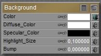
Other material aspects “just depend”, usually they are absent. No specular / highlights, no bump let alone displacements, no reflection nor transparency or translucency. But when the background represents a real wall, it just might benefit from specular, highlights and some bump.

Perhaps the backdrop object shouldn’t even respond to Indirect Lighting (switch off its Light Emitter property then), or the other way around: it should emit light from its Ambient channel to compensate for blocking the environmental lighting from a sky dome.

There is no single best way, but perhaps these notes might serve as a checklist. Happy Rendering
Managing Poser Scenes (01. Intro)

Badly lit or rendered images are like vampires: they’d better stay out of the daylight.

Download this tutorial in PDF format (3.5 Mb).

Introduction

Working with Poser is like working in a virtual photographer’s studio. And in order to master the tools of the trade, I enter my empty virtual studio early in the morning, with no models or products to be shot around yet. This leaves me

In this series of tutorials, I’ll discuss them one by one.

Next >>

Creating Hair in Poser (Paula Sanders)

Introduction

A decade ago, Paula Sanders wrote her “Creating Hair in Poser 5” tutorial. She investigated on the styling of medium to long hair, without using the Calculate Dynamics features.

This single webpage tutorial, plus four webpages with hints on creating such hair effectively, can be found here:

http://www.perpetualvisions.com/articles-and-graphics/tutorial-poser5-hair.htm

while also Paula’s other works (www.perpetualvisions.com and http://www.perpetualvisions.com/tocs/toc-articles.htm) are definitely worthwhile looking into. At least they have helped me a lot during my journey through 3D image creation.

As Poser Hair Room is concerned, hair can be styled (turning you and me into a virtual hairdresser), or hair can suffer (or benefit) from dynamics like wind and fierce movements, or both. The latter has its issues, as most women do know from reality: severe dynamics can completely ruin the costly efforts of a talented hairdresser.

Before considering dynamics, it’s good to realize what can be done by styling alone. This is exactly what Paula presents in her perfect tutorial on this, which follows right here. I only can add value in two ways:
  • Bundle the various webpages into one PDF
  • Annotate her tutorial and hints, to give some extra depth and background information.

All with Paula’s consent, in case you wonder.

So let’s give the stage to… Paula Sanders. Either check the link above (Paula’s web), or download the annotated PDF (1 Mb).

Case Study: Dressing Up (1 Intro)

Alyson gets dressed, and plays the Marilyn game

Download this tutorial in PDF format (0.5 Mb).

Introduction and Preparation

This Case Study presents some basics for handling the Poser Cloth Room.
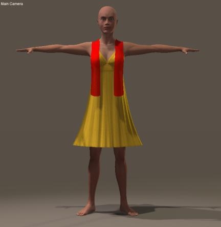
I’ll present a Poser girl wearing a simple dress and a scarf, animated to take some poses.

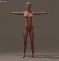
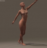
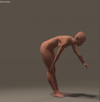
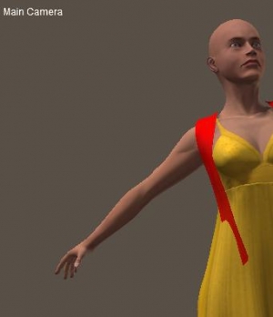
The girl is Alyson, lives in the Poser standard runtime (People \ Alyson section), and comes undressed to this tutorial session. She’ll take the following poses:

  • T-stand, in frame 1
  • Reaching01 (People \ Alyson \ Standing), in frame 30
  • Reaching03M (ditto), in frame 60

While she’s still undressed I step frame by frame through the animation to inspect on clothing issues. Bodyparts should not intersect, and should not tough in places where any cloth has to pass through. Cloth does need some room to maneuver.

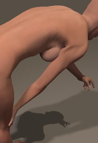
The last frame presents some issues with the right arm. The upper arm intersects with a breast and the hand rests upon the knee. Both cases will prevent any future dress to flow gently around the body. On top of that, the shoulder part just looks ugly. From an animation point of view the whole sequence can be improved such that the ball of the right foot stands still, so she’s slightly stepping back in the first part, and bending forward in the second.


After fixing that, I step back to frame 1 and load a dress and a scarf for Alyson (Props > … Clothing > Alyson Clothing > Dynamic). Both are simple props, which fit her neatly. I give the scarf a reddish color to make it stand out.


I save this intermediate file.

Case Study: Dressing Up (2 First Simulation)

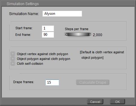
Now I enter Cloth Room, click [New Simulation] and enter a name (eg “Alyson”), set the end frame to 90 (1 sec after the last pose), put 15 into Drape frames and click [OK].


In that panel 1 Cloth Simulations I can come back to this settings with the [Simulation Settings…] button.

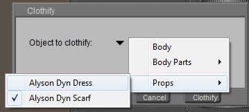
Next I step into the 2. Cloth Objects panel, click [Clothify…], from the props I select the Dress and confirm with [Clothify].

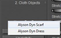
Then I do the same with the scarf. As a result, when clicking the small triangle in panel 2, both should show up.

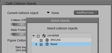
In the same panel, I use [Collide Against…], the [Add/Remove] and check Alyson to tell that scarf and dress will collide to her. And to the ground, if I want to. Given the poses that won’t be the case but when she kneels or lies on the ground, it’s required to prevent the cloth from falling through it.

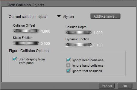
The small triangle should show both, if that’s what I want. Now be sure to check Alyson, and check Ignore head and ignore feet collisions, as the dress will not collide with them anyway.

I’ll skip panel 3 for the moment, I don’t need more details for the clothing, and I also leave all the values in panel 4 as they are. By selecting the scarf and the dress in panel 2, I can see both have slightly different parameter settings in panel 4. These parameters define their physical behavior.

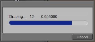
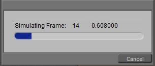
The only thing I’ve got to do now I click [Calculate Simulation]. This shows a progress bar, that first tells me it’s draping (those 15 frames I asked for in the Sim Settings, they take place before frame 1 of the animation), and then simulating (the 60 frames from the animation).

The progress bars tell me that the last finished frame took about 0.6 sec.

Case Study: Dressing Up (3 Analyzing and Improving)

For analyzing the result, I step framewise through the resulting animation.


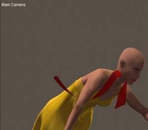
During frames 6-32 I see the scarf passing through the dress, and around frame 50 the scarf passes through the head, to land on the ground later on.

To repair for that

  • I open the sim settings in panel 1, and check the Cloth self-collision option (lowest from the three offered). Although dress and scarf are separate objects, they are both clothified in the same sim. That is meant by “self”. Not only dress-to-dress and scarf-to-scarf but dress-to-scarf as well.
    Every time there are multiply objects clothified in the same sim, this option should be checked to prevent on passing through another.
  • I open the collision settings in panel 2, for Alyson. I had checked the Ignore head collisions since I guessed that I could afford that, but I was wrong. So I uncheck this one.
    Note that when the scarf lands on the ground someway, I’d better uncheck Ignore feet as well to prevent the scarf from falling though them.

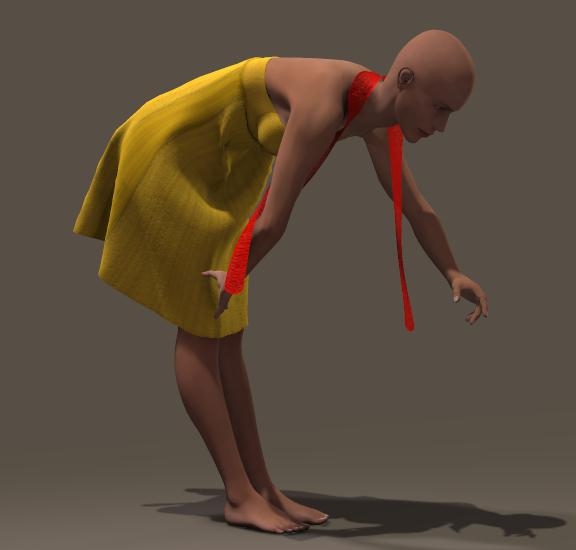
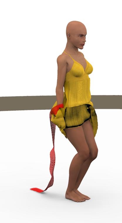
In panel 4, I [Clear Simulation] and [Calculate Simulation] again. In the result I see the dress coming at rest soon after frame 60, the free swaying scarf dangles a bit even at frame 90.

This is my result at frame 75.

Case Study: Dressing Up (4 Girls have more fun)

Now let’s have some more fun. I [Clear Simulation], and back to Pose Room to set the animation cursor in frame 90 and give Alyson an extra pose: Standing02, plus some extra bend through the knees. And I check the added range for unwanted intersections of body parts.

WARNING: in Poser 9 / Pro 2012 the Wind Generator seems to be broken, it won’t affect the cloth sims any more. It’s not you, it’s a software bug.

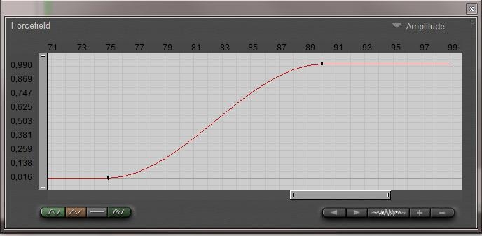
Back to frame 1, and I choose menu > Object > Create Wind Force. A wind machine drops on the floor, and xRotate=90° makes it point upwards. I move it under her right foot, set the Range to 0.35 (it measures in Poser native Units, 1PNU = 262 cm so 0.35 makes it to her hips) and I set the amplitude to 0. Then I set the animation cursor at frame 75 and click [+] to enter a keyframe, and in frame 90 I set the wind amplitude to 1, while increasing the animation length to 120.


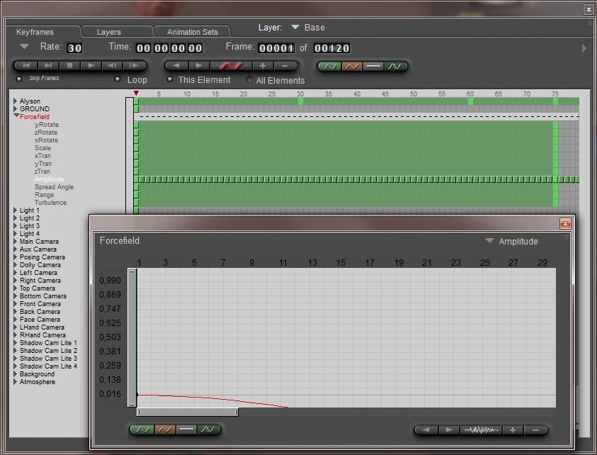
For more precision, I open (menu > Window>) Animation palette, find the Wind Forcefield and its Amplitude and open the Graph.

Back to frame 1 I set this graph to Linear, which guarantees me a wind speed 0 till frame 75, a gradual ramp up till 90 and a constant after that.

Time to save again.

Back to Cloth Room, and I open the Sim Settings to elongate the sim to 120 frames, 30 after the latest pose in the animation. Time to [Calculate Simulation].

Not satisfied? I changed:

  • The wind amplitude from 1 to 1.5 (more wind)
  • Selecting the dress in panel 2, the Air Damping from 0.02 to 0.2 (dress responds stronger)
  • And Fold Resistance from 30 to 3 (dress deforms easier)
  • The simulation length to 150 frames

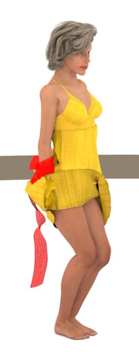
and with some altered lighting and a hairdo…

Case Study: Covering Up (01 Intro)
Covering objects, removing the cloth covers, and playing with the wind.
Cloth Room without Clothes.

Download this tutorial in PDF format (1.7 Mb).
Download a set of Bagginsbill’s cloth squares (X-tris only).

Introduction and Preparation

In this Case Study I’ll present some basics from Poser Cloth Room. I’m going to use pieces of cloth to cover objects, and to use as flags and banners. I also will introduce some animation, like moving objects, waving flags and using wind.

To save you the time finding or making decent pieces of cloth, I’ve included some in the package that also contains this PDF. Credits to BagginsBill who presents a far larger package for study purposes on his own site

http://sites.google.com/site/bagginsbill/free-stuff

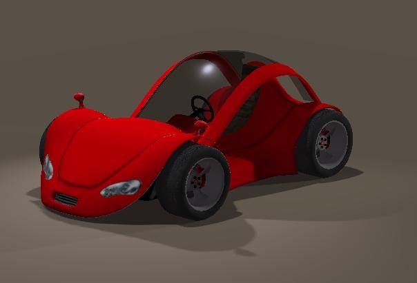
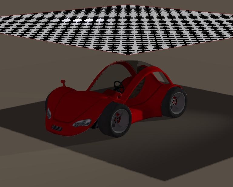
To start, I’ll open Poser, delete the default figure (select it and click [Del]), and ensure I’ve got a ground plane and some light. Then I add an object to the scene, say a car.

To add a piece of cloth, I can just open the (Windows) Explorer, pick the piece I like and drag it into the scene. I like the 3m sized cloth with a 20mm resolution, which contains (300cm/2cm)2 = 22,500 vertices. When you experience performance issues on your machine, you can take a smaller cloth with a lower resolution (as the 2m cloth at 40mm contains (200/4)2 = 2500 vertices, a tenfold less. Which of course will give you coarser folds and wrinkles.

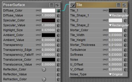
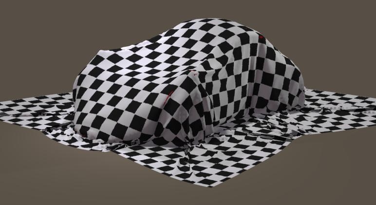
I scale the cloth to 250% to ensure it can cover the car properly, and I give it a blocked texture to reveal to folds and wrinkles.


I put the cloth somewhat above the car, I’m done with preparations, and enter Cloth Room.

Case Study: Covering Up (02 First Drape)

In Cloth Room, I create a [New Simulation…] (panel 1), give it a meaningful name and accept all other default values.

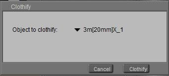
With the cloth selected, I click [Clothify…] (panel 2) to define the cloth object,

and I click [Collide Against…] to define the collision objects.

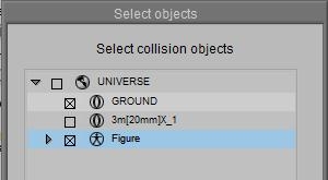
I use [Add/Remove…] and check Car and Ground, accept with [OK]

and continue with [OK] to accept all other default values. Now I [Calculate Simulation] (panel 4).

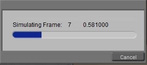
I see the cloth fall onto the car (the message tells that while calculating frame 8, the previous one took about 0.6 sec), and I can start to analyze this first result. Save your file.

Case Study: Covering Up (03 Second Drape)

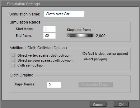
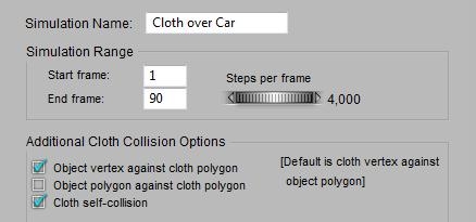
From the first result I see that the cloth needs more time to settle, and in [Simulation Settings…] (panel 1) I extend the 30 frames (1 sec) to 90. And I [Calculate Simulation] again.

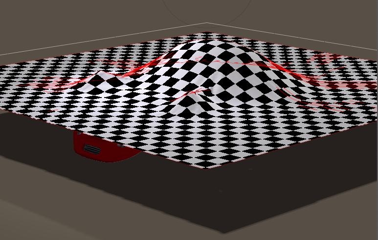
Now I see the car poking through (some red spots), and I do have my doubts about the quality of the folds.

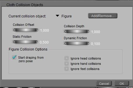
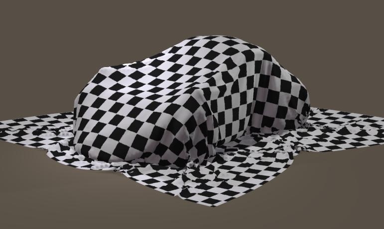
So I adjust the [Simulation Settings…] another time. By checking the first (Object vertex…) option – always the first step in improvements, by checking the third (Self-collision) option to prevent the cloth to fold into itself, and I double she Steps per Frame from 2 to 4 to refine the calculations. That’s fine, I did not need the 2nd option. The more options I check the more time it takes to complete a proper simulation. The collision options don’t need a change at all. Let’s peek behind the [Collide Against…]. The little triangle lets me choose between the collision objects Figure (aka the Car) and Ground. The Offset reads 1, that is: the cloth will remain 1 cm from the car. The Depth needs attention only when the cloth and car are moving rapidly towards each other which might introduce artifacts (not the case now), Friction is meaningful when cloth and car slide along each other, and the options are meaningless as the car is not a character, and hence has no ‘zero pose’ nor a head, hands or feet. Save your file.