Poser Render Passes (7 And more…)

And more…

Adding shadow or light

Reducing effects was simple, I just had to turn the opacity slider down for a shadow or light, or ambient or reflection or else. But how about enforcing an effect? More light, stronger shadow, more reflection?

Well, each layer or group in screen mode acts like an additional projector beaming an additional image onto the result, and each shadow layer in multiply mode does something similar for the lack of light. So, I only have to add copies of the layers to add an extra light or shadow, or a stronger reflection of something else.

And for creating say 1.5 times the effect? Well, I just add a duplicate layer and set its opacity to 50%, so I’ve got 1.5 layers for that effect. Now, let’s reconsider re-combining the passes to one Photoshop result.

Combining Shadows and Light

It was stated earlier, that adding a shadow to a shadow-less layer required a Multiply blending mode for the overlaying shadow layer. But what to do when there are more of those layers, say on a per-light basis?

Actually, in that case the relevant sub-passes should be grouped on a per-light basis, having the shadow on top within the layer (multiply mode), and having the group itself in screen mode to blend it properly with the other light-groups. So underneath the shadow sub-pass we’ll find the diffuse, specular, reflection and all other sub-passes for that light. The bottom one in Normal mode, the others in Screen mode.

Now, I’d like to reduce the intensity and alter the color of that light. This should not be done at the group level, as that will alter the shadow as well. And dimmed reddened lights still produce non-dimmed black shadows. But as long as the group really addresses one single light, and don’t include additional IDL from other sources, all the other passes for that light must change. So either I can alter them in sync (tedious), or I can put them in an additional “illumination” subgroup. See the image.

When I want to alter the color and intensity of the light, I can put a filter in front of it. This will make a new layer, on top in the Illumination group. Like I did with a Red, 50% brightness layer. And since it takes light out, it’s set to Multiply blending. Note that reducing the Opacity of this layer just reduces the filtering: the light gets less red and less dark. I also can put in a Red, 100% layer, and reduce the Opacity of the Illumination group. Take your pick.

Some engineering stuff

Let’s look at the Photoshop layering presented in the chapter on Light: the examples put all shadowing at the top and all lighting under them. For total light L, total shadow S, light and shadow L1, S1, L2 and S2 from lights 1 and 2, the math goes:

L * S = S1 * S2 * L thanks to the Multiplying of shadows,
and (1-L) = (1-L1) * (1-L2) or: L = L1 + L2 – L1 * L2 for the Screening.
This combines to : result L * S = S1 * S2 * L1 + S1 * S2 * L2 – S1 * S2 * L1 * L2

Now, let’s look at the layering just presented above.
( 1 – L * S ) = (1 – L1 * S1) * (1 – L2 * S2) so result L * S = S1 * L1 +S2 * L2 – S1 * S2 * L1 * L2

So in the first approach, the contribution S1L1 from light 1 is additionally reduced by S2, and vice versa for the other light. In other words: there is too much shadow in the first approach.

First approach,
one light is not softening the   shadow of the other light.
Second approach,
one light is softening the shadow   of the other light.

Breaking combinations

Some render passes or sub-passes give a combined result, like Diffuse + Ambient + Shadows, and a separate Ambient pass, but no separate Diffuse pass. Hence the question: can I create one? Not for the sake of it, but for enhancing that particular aspect of the image.

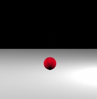
Well, since shadows are added to the result by multiplication, and since Photoshop supports a Divide blending mode, taking shadows out is a no-brainer. Add the shadow layer (B) on top of the compound layer (A), set the shadow layer to Divide blending, and done (D). Unless you’re experiencing edge-effects (C). This indicates that the shadow layer does not line up exactly, and you might move it a pixel vertically and/or horizontally. BTW: this happens all the time to me, I don’t know if its Photoshop or the render pass creation itself but in general, passes move one pixel (to the left and down) when putting them together. Moving them back gives me the desired result.

A B
C D

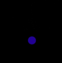
This intermediate shadow-less result still is the combination of Diffuse and Ambient. Since this combination is made in Poser, it’s the result of a plain addition. And since Photoshop supports a Subtraction blending, this is what I have to do to get the Ambient (E) out to get the required Diffuse-only (F). Again, watch the edges and if necessary, move the layer a bit.

E F

So Multiply and Screen are the ways to combine passes into a result, while Divide and Subtract are the ways to break combined passes into singular ones. Note that Photoshop supports Subtract-blending and Difference-blending. You need the first, not the second.

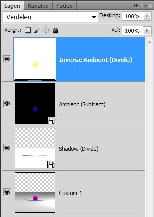
With a remark: Subtracts works well on Poser results because Poser itself uses plain addition (instead of screening) to make its results. When other applications (Vue perhaps) use screening instead, one has to find a way to un-screen. Photoshop does not support this un-screen blending mode directly. The trick: if you want to un-screen Ambient out of a Diffuse & Ambient combination, then you’ve got to Subtract and then to Divide by the inverse of the Ambient layer (in Photoshop: Ctrl+I). So you need the Ambient layer twice, first in Subtract blending, then its inverse in Divide blending.

The math:

  • Say, C is the combination of Ambient A and Diffuse D, by Screen blending. That means: ( 1-C ) = ( 1-A) * (1-D ) – multiplication of the inverses, that’s the definition of Screen blending
  • So, by rewriting, D = 1 – (1-C)/(1-A) =(*) [ (1-A) – (1-C) ] / (1-A) = (**) [ C-A ] / (1-A) and this last statement says: subtract Ambient from the Combi, and divide the result by the inverse (***) of the Ambient.

(*) substitute the first 1 by (1-A)/(1-A) (**) just rewrite (***) the inverse of A is: 1-A, black turns white, red turns cyan, blue turns yellow, etc on a per-pixel basis. Ctrl+I does the job.

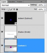
For more perfection: be aware of color bleeding when dealing with images rendered under IDL lighting. When you take the Ambient out, then also the color-bleeding of the Ambient must be taken out so you need to look for a pass that offers the Ambient plus its color-bleeding. In some cases, this pass is available as a Custom1 sub-result of the Occlusion pass from the RenderPasses script when used in PoserPro; it might be required to render that pass without a SkyDome in the scene.

So when you’ve got a combined Specular & Reflection pass, and a separate Reflection Pass, you can separate out a Specular pass as well. Now you know how to do it: when they come from Poser – just Subtract.

Material complexity

Splitting aspects of a scene by considering properties of materials is an almost infinite process, as materials and render technology becomes more and more complex. What happens, for instance, with the Alt_Diffuse and Alt_Specular channels of a Poser surface? What happens when nodes like Velvet are used that combine diffuse, specular and ambient? Or nodes that combine Refraction and Reflection, like Fresnel? Which kind of split occurs with the shader trees generated by EZSkin, VSS or MatMatic? What is the effect of SubSurfaceScattering, as introduced by Poser 9 / PoserPro 2012? Will Smith Micro or Semidieu or anyone else bring us new tools (say, after reading this tutorial J )?

I don’t have the answers to all this, but I keep on experimenting, finding out, telling you and updating this article. Feel encouraged to do the same, and tell me about it. In the meantime, I’ve found out:

  • That everything which is put in Alt_Specular ends up in the Specular pass, and that everything that’s put in Alt_Diffuse ends up in the Diffuse pass. In some cases, Advanced Render Settings can do something with its Color and Color_Alt passes, but that seems pretty limited. SubSurface Scattering ends up in the Diffuse pass as well.
  • That complex nodes like Velvet are not separated out. Although the node offers ambient (Ka), Specular (Ks) and Diffuse (Kd), when the node ends up in Alt_Diffuse, all the information is presented in the Diffuse pass. At least, as far as Advanced Render Settings and the sub-passes (Custom 1, 2 3 etc) are concerned. The Ambient pass in the RenderPass script however manages to keep some aspects separate.
  • That when the contents of a pass are about absent, Advanced Render Settings seems reluctant to perform the pass. For instance, when Ambient color is about black and/or Ambient value is about null, there is no ambient pass, even when there is ambient in the Alt_Diffuse or alike.
  • That with respect to all this, complex algorithms like EZSkin, VSS and MatMatic behave conform expectations. But do note that when for instance MatMatic puts the total shader-node-tree construction in Alt_Diffuse, it leaves less aspects to split into separate passes. Every pro has its cons, and this is one of them.

Comparing Post-work to Poser results

In some cases there are differences, in some cases there are not. Shadows in Poser are obtained by a multiplication mechanism similar to Photoshop. But the effects of lights, and the effects of material aspects like Diffuse and Ambient are – in Poser – combined by plain addition instead of screening.

In Poser this generates over-lighting situations quite easily, as a 60% brightness plus another 60% brightness add up to 120%, which then is clipped to 100%.
In post, screening would give: C = 1 – (1-60%)*(1-60%) = 84%, there is no way to over-light a scene. So there will be no clipping either. But this also implies that bright areas in post will look less bright than in Poser. Poser seems to work as a camera which does not adapt itself to higher lighting levels, in post we seem to work with a camera with an automatically reduced film-sensitivity (or shutter time, of diaphragm opening, whatever you prefer).

So post-worked results will differ from Poser. Equally deep in the shadows but softer in the highlights, and without clipping.

Another difference comes with the use of correction methods. Poser supports Exposure Correction, while Poser Pro supports Gamma Correction as well. Those corrections are mainly required to soften the effects of shadows and highlights as well. Deep shadows can hide the nuances of dark textures on objects, which are visible in real life due to the scattering of light in our environment and due to the adaptive working of our eyes when looking into dark places. See the Understanding Corrections tutorial on the details. Strong highlights will cause over-lighting and clipping, as noted already.

When rendering out passes, we do not need those corrections. We’ve got other ways to soften shadows (just blur the shadow layer and reduce its opacity), and over-lighting is almost preventing automatically. So, please, do switch those corrections OFF when rendering out passes for post-production. When you need a generic correction on the image, you can always put one in as a Curves or Levels adjustment. I bet you hardly don’t.
Corrections (1 Intro)

Gamma Correction as in Poser Pro 2010 and up differs completely from the traditional approach. Vue follows an intermediate route.

Download this tutorial in PDF format (0.9 Mb)

Introduction

Various 3D software, like Poser and Vue, offers some functions for after-render image adjustment.
Exposure correction is available in Poser and Poser Pro, as well as in the Vue Artist range (Esprit, Studio and Complete) and in the Vue Pro versions xStream and Infinite. Its basic purpose is to adjust the brightness of the image in a way similar to the effect of widening lens diaphragm opening or of prolonged exposure time on classical celluloid film. It helps to make your image look like a photograph.

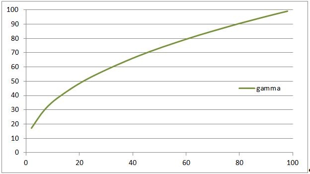
Gamma Correction is available in Poser Pro, and the in Vue Pro versions, and to a limited extend in the Vue Artist range. Its basic purpose is to adjust the image for better viewing on monitors and in print, to some extent to correct as well for the shortcomings of non-realistic lighting in 3D (more in Poser than Vue) and to make the image a bit more comfortable for the human eye.

Both corrections are somewhat similar, but are independent as well so they can be mixed, or not applied at all. They all are techniques, not religions. Use them knowledgably, with care, and with awareness of artifacts, limitations, pro’s and con’s. This articles aims to help you with that.

At first I’ll discuss the need for corrections at all, and how to make them in post. Then I’ll look in more detail to Exposure Correction as well as Gamma Correction, both to be applied after the rendering process.

At second, I’ll note that Gamma Correction comes with a companion: Anti Gamma Correction, applied before the rendering. This appears to be a tricky process with lots of side effects and artifacts. I’ll discuss these for Poser and for Vue.

Corrections (2 Do I Need …)

Do I need corrections?

Exposure and Gamma Correction, as well as any other correction, can be applied in post using Photoshop or GIMP or alike. You render, export the result and apply the adjustments to your liking. Applying Exposure or Gamma Correction within the Poser, Vue or other 3D application itself is different however, since you render, apply the adjustment and then export after that.
The difference is that the applications internally work in high resolution mode (HDRI, 16 or even 32 bits per color) while most exported results like JPG, PNG etc. use low (8 bits per color) resolution. Therefore, the correction is applied to the high resolution internal result – when the details are still there – instead of to the low resolution – when the details might have gone already, and have nothing left to correct.

So, next to make the image look good, there is a technical reason for applying the corrections within Poser or Vue: saving the details, especially in the dark areas of the image. And then, in post, you can take the corrections out again as the first step, process as if no corrections were applied at all but still with all details available. For this purpose, Gamma Correction is just more powerful then Exposure, and other corrections are just not available within the 3D program. Even Gamma Correction is not always available, like in Poser. Then Exposure Correction is your only option.

Why not?

The argument above also yields a reason NOT to do all this, or even to do the inverse: when saving the details in the darks, you will lose the details in the brights. This is relevant in images with massive cloud nuances in the sky, like in Vue. With respect to that, it has to be considered that our eyes are far more sensitive to details in the dark than to details in the brights. So lack of bright details is less relevant in our appreciation of the image than the presence of dark details.
This of course has a simple evolutionary background: all we can eat, or all which can eat us, was hidden in the woods and in the shades while far less opportunities and threats came from the sky. It’s ancient history especially since we all put a small light in our fridge J to avoid getting our food from the dark places, but it still plays important roles in our abilities to see and to appreciate details in our images. Details in the dark are preferred over details in the bright.

In Photoshop

Whatever your decisions are, it’s good to understand how to perform the corrections in post anyway.
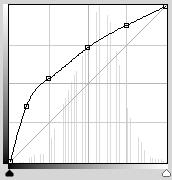
For applying a Gamma=2,2 correction in Photoshop, just perform a Curve adjustment passing through

  • (0,0)
  • (10%, 35%)    = (26,90)
  • (25%, 53%)    = (63,136)
  • (50%,73%)    = (127,187)
  • (75%, 88%)    = (191,224) and
  • (100%,100%)    = (255,255).

As you can see there is a major effect in the dark areas (left, increased brightness in the first 25%) which is compensated by a reduced contrast (about linear but less slope) in the remaining 75%.

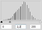
Or you perform a Levels adjustment, and move the middle sliderpointer (to the left) till the midvalue reads 2,20. Or just set the value. This is less accurate, it compares to a curve with only the 50% point set. As a result, it corrects only half as much in the dark areas. Or: it seems more an Exposure Correction to me.

Engineering stuff

For those people who like the juicy details, let’s look at some very dark (and so: very low) brightness levels.

Brightness (*) RGB 16bit RGB 8bit Gamma Corr RGB 8bit
0,00% 0,0,0 0,0,0 0,00% 0,0,0
0,22% 256,0,0 1,0,0 6,37% 28,0,0
0,32% 256,256,0 1,1,0 7,54% 23,23,0
0,39% 256,256,256 1,1,1 8,24% 21,21,21
0,45% 512,0,0 2,0,0 8,79% 39,0,0
(*) there are a lot of definitions for Brightness, based on human eye response, camera / film response, monitor behavior, paint / ink behavior, optical science, fast-to-calculate algorithms etc. In this article I use: B = square root ( (R2 + G2 + B2)/3 )

Next to 0% brightness, the 0,22% is the lowest level that can be produced in 8-bit per color RGB using RGB=1,0,0 (same for Green 0,1,0 or Blue 0,0,1), hence this pick.
Within Poser this brightness matches (256,0,0) in the internal 16-bit per color space. That gives plenty of nuances at a lower brightness level, but all those details disappear when this pixel is converted to 8-bit color and (1,0,0) becomes the only choice available.

Now, the pixel is Gamma Corrected first. This will shift its brightness from 0,22% to 6,37% so the export to 8-bit format will result in a pixel reading (28,0,0) which has a decent amount of lower brightness levels to represent the nuances. So, a 16-bit per color image with hundreds of brightness nuances between black and very dark either gets exported to an 8-bit image with only 2 brightness levels available (0 and 1), or – after internal Gamma Correction – to an 8-bit image with tens of nuances available. That’s a gain.

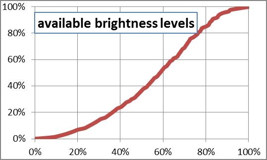
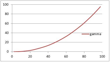
To show that this “quantization”, the effect of expressing color values in numbers only, especially harms the darks, I plotted the brightness itself against the percentage of brightness levels with a lower value:

  • At 20% brightness only 6% of the available levels have a lower value, which means that especially the darks have a serious shortage in expressing details.
  • At 80% brightness, about 85%% of the available levels have a lower value, hence 15% has a higher value. So for expressing details in the upper 20% of the brights there are 2,5 times as much nuances available as for expressing details in the lower 20% of the darks.
  • In the midtones, covering the60% range from 20% to 80% brightness, we’ve got 85% -/- 6% = about 80% of all brightness levels available for expressing nuances. Life isn’t fair.

This again demonstrates that details in the dark are somewhat of an issue in 8 bit per color imaging. One way out is going HDRI all the way. Another way out is applying in-program correction before export. In that case, when there is a choice, the method with the most attention to the darks is preferred. This method is Gamma Correction.

Does it work out?

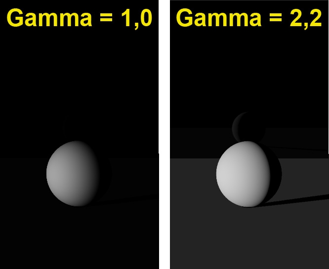
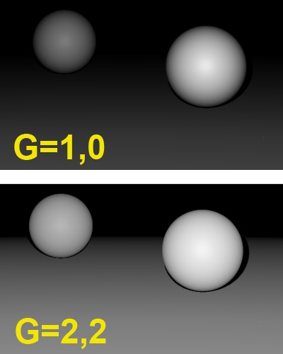
Watch this (scene concept by Bagginsbill):

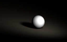
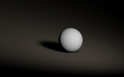
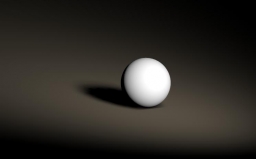
This scene shows a white ball on a white floor, lit from aside. At the back there is a black plane, which has a 2% reflectivity (is: water). As a result, full 100% white will produce a 2% brightness on reflection but as the backside of the ball is reflected, the mirror image will be an exercise in dark tones.

Without gamma (left) not only the image appears rather dark, but there are no brightness values left for the reflection. The brightness measures will be physically correct aka linear, though. With gamma (right) the image reveals what our eyes would see under those conditions. Although the image is far from linear, having the details at hand will be a great help in further processing.

Pumping up the brightness in especially the very dark levels, right from the original 16 bit-per-color result, is what will save the details. This makes in-program postworking before export superior over postworking after export of the image. This is why we need gamma or exposure correction in-program, whether it results in something pleasing for the eye, or not. We can take care of the latter in Photoshop, but at least we’ve saved the details to do so.

Corrections reconsidered

In my attempt to get an image on my display that resembles the original object and its textures for the best, and to create a believable (photoreal) 3D Poser or Vue render from it, I have to consider various issues.

  • Real lights have a volume, and produce light in a spatial distribution. 3D lights are like points and therefor produce harsh shadows. Some renderers can assign spatial light distribution to them, but Poser nor Vue can do so.
  • Real light progresses through the atmosphere, though the air we breathe, which is filled with damp and dust. This makes the light scatter all around. Some renderers can handle this, but especially Poser only can approximate those effects by using IDL (Indirect Lighting). In this, objects start acting like a (reflecting) like source, so the effects of walls and ceilings and bright colored objects can be considered. When it comes to the softening of shadows, Poser renderers fall short. Vue does its job somewhat better.
  • Real materials behavior is pretty complex. Specular and reflection are different faces of the same coin, diffusion and refraction meet in translucency and transparency, reflection and refraction are closely related phenomena and so on. But in the Poser and Vue materials those aspects are dealt with separately, while something relevant as surface smoothness is left out (at least as a direct controllable parameter).
  • And so on

In other words, the renderer is far from perfect, at the gain of speed and reasonable resource requirements. Exposure as well as Gamma Correction, softening the highlights, reducing overlight situations, and (for Gamma: especially) softening the shadows do help us to get a more realistic result.

Corrections (3 Exposure)

Exposure correction

Imagine, you take a picture of something and the “film” (an electronic one in the backplane of your camera nowadays) gets exposed for 1/100 of a second. Some parts of the film remain dark, others become bright already.
Now, let’s double the exposure time to 2/100.
During the first 1/100, in a very dark spot, the film was exposed for say 5%, and was still unexposed for the remaining 95%. That remaining 95% will again be exposed for another 5% in the second 1/100 and it’s quite safe to say that this will result in a 5% existing + 5% added = 10% exposed spot in the film. Hence, in the very dark areas the brightness of the image will be proportional to the exposure.
For a – say 90% exposed – bright spot after the first 1/100, things are different. In the second 1/100 only the remaining 10% will be exposed 90% again, but that will add only 10% x 90% = 9% to the already present 90%, to make 99% after doubling the exposure time.

So by increasing the exposure, the darks are – relatively – far more affected than the brights.

In Poser and Vue

Both programs have the ability to apply Exposure Correction in post. This is to be preferred over a similar action in Photoshop, because in the programs themselves the correction is applied against the internally stored 48-bit (16 red, 16 green, 16 blue) render result, when all details all still available, before exporting it. Especially exporting to a regular 8-bit color image format will lose detail in either the darks (shadows) or the brights (clouds). Exporting to HDR, EXR of 16-bit TIF might save the day. Note that Photoshop opens the Poser EXR images as 32-bit per color files.

In Poser, there is no alternative (except from buying Poser Pro). Check the Render Settings:

My advice is to take a medium value between 2 and 3, because

  • A value over 2 brings up enough details in the darks
  • A value below 3 prevents losing all details in the brights

Then, after export – in post, you can adjust the difference between your export and the final gamma/exposure correction.

In Vue, you can adjust the Advanced Camera Settings (double-click the camera object). Vue offers Gamma Correction as an alternative.

Exposure value

There are different ways to express Exposure, which leads to different interpretations of values like 2, 4, 0.5, -3 and so on.

One way expresses Exposure as the lengthening (or shortening) of exposure time. The value 2 means: twice as long, two times as much light into the camera. The opposite of 2 is: one half (0.5). The neutral – do-nothing – value is: 1. This is the way exposure is used in Poser.

Another way to express Exposure is in extra diaphragm stops. One extra stop (value: 1) doubles the lens opening, and so the light into the camera. The opposite is: one stop back (or value: -1). The neutral value is: 0, no extra stops. This is the way exposure is used in Vue.

Hence:

Poser: 1/16 1/8 1/4 1/2 1 2 4 8 16
Vue: -4 -3 -2 -1 0 1 2 3 4

Engineering stuff

Some people like the unambiguity of formulas and graphs over texts and words. So:

After correction = 1 – (1- Before) Exposure

in which the Poser (exposure time) use of Exposure is used, as I will do in this entire article.

Having exposure A followed by exposure B:

After correction = 1 – (1- Before) A*B

which says that exposing something twice as long, followed by exposing three times as long gives the effect of exposing six times as long. No real magic here.

And since exposure = 1 yields the neutral, do-nothing effect,

After correction = 1 – (1- Before) 1/Exposure

is the inverse. It says that exposing something twice as long is the opposite of exposing half as long.

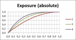
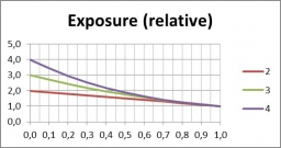
Plotting the exposure curve as such: But when plotting the ratio of after/before:

In which we see that tripling (green line) the exposure time will brighten up the dark areas threefold (0.1 => 0.3 in the left graph) while having hardly any effect on the already bright spots in the image.

Corrections (4 Gamma)

Gamma Correction

Imagine, you shoot a picture with your camera, load it into your PC and – perhaps even as part of your routine, you adjust the whitepoint, the blackpoint and the greypoint. In Photoshop Levels Adjustment or Curves Adjustment there are even straightforward colorpickers to do so. This image can be used for a texture in your 3D program, like Poser of Vue.
Alternatively, you paint a texture image and use the colorpicker values or colorwheel settings to get the right colors. RGB (63,0,0) or HSV (0,100%,25%) for instance might give you the proper dark red.

Now you just view it directly, or view the result your render created with this texture, or send any of it to print. Bets are that you will find the result rather overly dark, especially in the shadowy or low-brightness spots but in the midtones too. This is due to your monitor, which for various technical and historical reasons has an embedded brightness distortion known as the “gamma effect”. Nowadays, almost all displaying and printing equipment shows this distortion in a standardized way. This standard is known as sRGB.

The compensation for this effect is known as “Gamma Correction”. When applied to an image, it especially brightens the darks a lot and the midtones a bit too, and you get the image displayed or printed as it was intended. In order to get the correction out of the image, “Anti Gamma Correction” has to be applied. Actually, this is what your monitor does when displaying. The actual value (gamma) for modern equipment is: 2.2. The neutral – do-nothing – value is 1.

To Gamma or to Expose

When you are concerned about the brights in your image, you want to handle the risk of over-lighting, or you want to emulate natural film response, then Exposure Correction is the proper tool.
When you are concerned about the darks in your image, and want to handle the risk of losing detail and getting overly hard shadows, and/or you want to export the image with a minimum loss of detail, then Gamma Correction is the best pick. That is: when it’s available in the software. And of course you can do a bit of both.

In practice, Gamma Correction is not always available, and when it is, it comes with a stack of side effects. These will be discussed in later chapters in this article. But as discussed in an earlier chapter (Do I Need Corrections), not correcting has its drawbacks as well. Your image, your call.

Engineering stuff

For those who like formulas and curves, the formula for the gamma effect (the behavior of your monitor), and hence for the Anti Gamma Correction, simply reads

After correction = (Before correction) Gamma

And since the neutral – do-nothing – value equals 1, the inverse or Gamma Correction (right image) itself reads

After correction = (Before correction) 1 / Gamma

Formally the sRGB standard which your monitor is supposed to adhere to is slightly different, and especially a bit less aggressive in the very darks. But gamma = 2.2 is a good approximation, and a pure sRGB correction is not available within the software anyway.

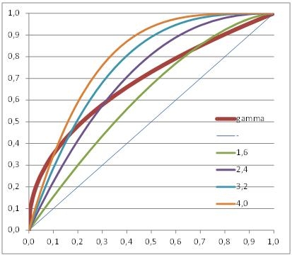
Graphs are a handy way to show the differences between Gamma Correction (set to 2.2) and Exposure Correction (various values).

Exposure Correction (compared to Gamma Correction)

As you can see, the Exposure Correction using 1.6 (Poser very bright part of the image. And Gamma Correction wins from every meaningful Exposure Correction when applied upon the darkest details of the image.

Gamma / Exposure Correction and the Human Eye

The ‘monitor’ which was not discussed yet, is the human eye. Our eye is a dynamic device, which adapts in various ways when looking to dark or bright areas. Varying pupil width is one way, but the light receptors and the signal processing in our brain have some more tools in reserve. Let’s concentrate on scene brightness.

From astronomy, star brightness is divided in classes or magnitudes. This was introduced by the ancient Greek (Hipparchus, 120BC), and refined when Norman Pogson stated that a “first magnitude” star is 100 times as bright as a “sixth magnitude” one. This implies that

Brightness = (2,512) Magnitude

give or take some constants, as 2.512 (6-1) = 100. Now, let’s compare the eye with Gamma or Exposure Correction.

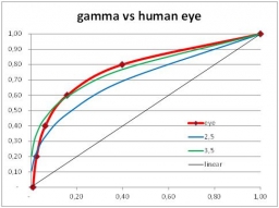
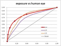
Just from the graphs (next page) we’ll find that Gamma curves (left) are far more comparable to the human eye behavior than exposure curves (right). Why does it matter? Well, when we look into a real scene our pupils adjust when we focus on specific areas. Usually the darker areas are farther away than the bright ones. But when we look at an image of that scene, on display or paper, the dark and bright areas are at the same distance. Focusing will be much harder, and our pupils will not, or far less, respond to brightness differences. Therefore, our eyes appreciate some help.

And as we can see from the graphs, and can experience by experimenting, Exposure Correction is a decent step forward compared to nothing (linear), but Gamma Correction is by far superior as it is more helpful in the darks.

From psychology, or better: from our evolution, humans are more curious about (or afraid for) the darks. This determines the workings of our brain. Each step in brightness magnitude should offer equal amounts of detail, for a comfortable feeling. In other words: overshooting the darks is less troublesome than undershooting, and vice versa for the brights.

This is why gamma correction is more pleasing than exposure correction. See the gamma=3,5 curve (left graph, green line) which offers a minor overshoot in the darks as well as a minor undershoot in the brights. This is what we appreciate. We feel more comfortable with it.
The exposure=3,5 curve (right graph, orange line) on the contrary shows a mild overshoot in the brights against a serious undershoot in the darks. This is what we like less. Exposure corrected imaged show more resemblance to a photograph, as it mimics film behavior. Gamma correction helps the eye and gives a more comfortable feeling. Your image, your call.

Corrections (5 Anti Gamma)

Anti Gamma Correction

Exposure Correction as well as Gamma Correction are straightforward, well defined adjustments of the render result. So far so good. Only … Exposure Correction just comes as such while Gamma Correction (GC) in Poser and Vue is the final part of a tandem. The first part of that tandem is the application of Anti Gamma Correction (AGC) on the definitions of lights, colors and materials before rendering. This part is far less understood, Poser and Vue perform it differently, and it comes with a shipload of artifacts.

The reason for applying AGC at all is the following. First the texture is anti-corrected, then the rendering adds highlights, shading and shadows. Then the result is corrected. In the end, the highlights, shading and shadows come out corrected (that is: softened), while the texture itself remains more or less intact.

But:

  • In Vue, external image-maps are anti-corrected but internal color swatches are not. So an object colored from an image-map and an object colored from an internal color that look similar without using GC, come out differently when GC is applied. Of course all internal colors can be adjusted and Vue provides proper tools for that, but then the reverse will happen: they will behave similar under GC but different when GC is not applied.
    The details are presented in the Vue chapters (part I, part II).
  • In Poser, external image-maps and all internal color swatches are anti-corrected, but color values are not. So an object with (50%,0,0) in the colorswatch and 100% in the value will come out different from an object with (100%,0,0) in the colorswatch and 50% in the value, when GC is applied (PoserPro) – and will come out similar when GC is not applied (Poser). And there is more to be concerned about.
    The details are presented in the Poser Pro chapters (part I, part II).

Corrections (6 Poser Pro pt I)

Gamma Correction in Poser Pro

Gamma Correction in Poser Pro is not implemented as just a post-effect only, applied onto the resulting render, as is the case with its Exposure Correction. The trick is that before rendering starts, all textures and color swatches as used in the materials (*) are anti-corrected first. So, colors are darkened, then everything is rendered, lights, shadows, reflections, refractions, indirect lighting and so on are applied, and then the resulting render is gamma corrected.
(*) Materials as in: manageable through the Materials Room. This affects object surfaces, background, lights and atmosphere.

This has the following net effect:

  • All brightness distributions of the textures applied to objects end up intact
  • While all brightness effects resulting from the play of light (shadows, reflections, …) end up gamma corrected.

Let’s see what this brings us.

No Corrections (gamma off):

This image is the result of 5 tiles, each having a grey texture at 100% / 75% / 50% / 25% brightness, provided as a diffuse map. Light comes from a single spotlight, full white, flaps open (no angular falloff) and a linear intensity falloff from 5 to 10 mtr. The first tile (Left) is at 5 mtr, then 6, 7, 8 and 9 mtr distance. So, without any corrections, we expect each 100% bright area on the tile (bottom right) to measure as 100 – 80 – 60 – 40 – 20% grey, and so they do. We also expect the brightness proportions per tile to stay intact, so the first reads 100/75/50/25 and the fourth read 40/30/20/10% grey. And so they do.

Now, consider the same with Exposure Correction switched on, at 2,4 which also gives a result somewhat comparable to a post-work gamma correction of 2.2.

Now the brightest bottom-right parts of each tile read: 91 / 85 / 76 / 61 / 36. So the dark ones at the back have gained at the cost of the bright ones upfront. But also the ratios per tile have changed, from 91 – 82 – 68 – 44 on the front tile till 61 / 51 / 38 / 21 on the fourth one. Or in percentages: 100 – 90 – 75 – 48 at the front, 100 – 84 – 62 – 34 at the back.

In other words, not only does the back tile gets less light, which is exaggerated by the correction. The correction also affects the brightness distribution within the textures themselves and makes them look different from their original.

Poser Pro Gamma Correction however behaves different from Exposure Correction or post-work Gamma Correction:

As can be expected, the brightest parts of each tile are distorted relative to the original uncorrected image: 99 / 90 / 79 / 65 / 46. This is what gamma Correction does to the play of light, where the falloff darkens the tiles further away.
But per tile, the distribution has stayed intact, as again we see on the fourth (and any other) tile: 65 / 49 / 33 / 16 (or: 64 / 48 / 32/ 16) is still in sync with the original 100/75/50/25 ratio in the texture.

Hence again:

  • While all brightness distributions resulting from the play of light (shadows, reflections, …) are gamma corrected – as other correction techniques do too
  • All brightness distributions on the materials applied to objects are kept intact – which is new. In other words: the final output will be only as distorted as the textures and colors used for input.

The interesting thing in here is that the pre-render anti-gamma correction is not only applied to textures, but to color swatches (and hence the generated, procedural maps) as well. When the reds of a texture and a color swatch are in sync (say: in Poser, or in PoserPro without GC), they stay that way (in Poser Pro, with GC). That’s good.

Corrections (7 Poser Pro pt II)

Poser Pro Gamma Correction reconsidered

So enabling Gamma Correction in Poser Pro is “the thing to do”? Yes, with some precautions.

Textures which should not be corrected

Simply stated, textures which contribute to the color of the result should be corrected back, and forth. But textures which contribute to the amount something happens, the values, should not be corrected.

So if this texture is used in:

  • Diffuse Color & Value
  • Specular Color & Value
  • Ambient Color & Value
  • Translucence Color & Value
  • Reflection / Refraction Color & Value
  • Alternate Diffuse / Specular – both Color & Value parts

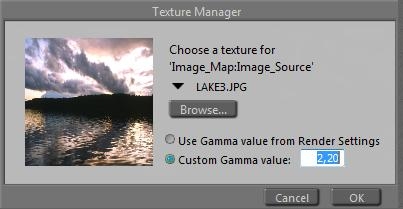
check “Use Gamma from Render Settings”, which is the default.

And if the texture is used in

  • Specular Highlight Size
  • Transparency, Edge and Falloff
  • Bump, Displacement, Gradient_Bump

set the Custom Gamma value to 1,00. In the Wacros, button UserDefined, or menu Scripts, MaterialMods, you’ve got a “changeGamma” routine. Enter 1,0 for Gamma, select All props and figures, and find out that this routine works on Bump, Displacement, Gradient_Bump and Transparancy. On the other material aspects mentioned this has to be set by hand, although using image-maps in these cases is pretty rare.

But things can get complicated. All color swatches are dealt with automatically (against the Render gamma value). But numerically derived colors, e.g. when using the “UserDefined’ node in Materials Room, are not. And (greyscale) color swatches which are used to communicate value are corrected when you don’t want them to. And mixtures of everything (e.g. resulting from Bagginsbill great VSS node system or his MatMatic materials generator, or Snarlygribbly’s EZSkin) do require close examination. Such an examination is discussed below.

Textures which should be corrected differently

The Custom Gamma Value in the Texture Manager usually is used to state that for this texture gamma should be one, or: not part of the correction process. Inputting the same value as used for Render Gamma makes it equivalent to Use Gamma from Render Settings, the default for textures and the standard for all color swatches. But how about using something different?

When a texture is too bright or too dark, you can correct for it in Photoshop, but you can also treat the image as the result of an image handling process under an incorrect gamma value. If it’s too bright, put in a higher gamma value to take the extra light out. And vice versa, when it’s too dark, put in a lower gamma value to prevent the light taken out too much.
1.8 comes to mind, compensating for the old Mac system / hardware monitor gamma.

Remember, the texture gets the gamma function applied in the first place: it will be darkened. Then it will be used in the rendering, then the total result including the effects of light and shadow will be brightened. This will sort of undo the darkening, and effectively limits the effect of gamma correction to the lighting and shadowing effects.

Materials which are handled incorrectly

This is the story of a well-known Poser material – the Vicky 4 out-of-the-box natural skin & body texture (sample, standard or high resolution, with or without genitals), which suffers under the effects of the Poser Pro Gamma Correction.

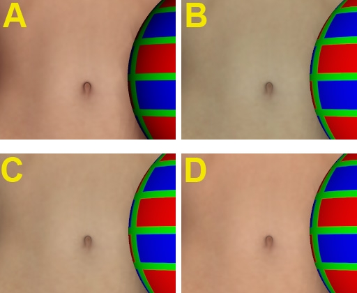
The figure shows Vicky (with a red green blue ball), in the out-of-the-box texture, rendered with Gamma Correction = 1 (A), the equivalent of a normal (non-Pro) Poser render. Looks good, just slightly reddish.

B is the Poser Pro render result of exactly the same Vicky, Gamma Correction set to 2,20. All natural looks have gone, Vicky is turned into some vampire / zombie crossover.

How come? Let’s have a look at the material definition:

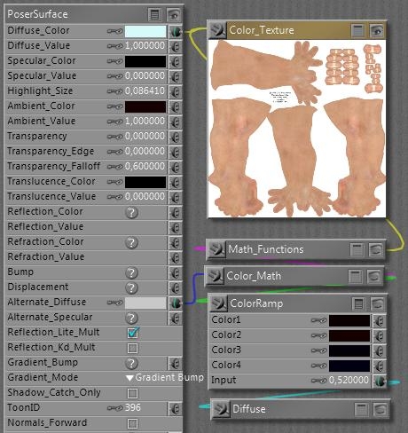
I’ll come to the cyanic Diffuse_Color later, and have a look at Ambient first. It’s fully switched ON with a value of 1, and when the color swatch is opened is reveals a 20/0/0 color, or: 8% red. So the Ambient will cause a mild red glow over the body, creating the translucent skin impression without the costs of Translucency itself.

Then, the Alternate Diffuse. It looks intimidating but actually the Diffuse node generates exactly the same light-fall-off as the normal Diffuse Color/Value channels in the material itself, and the Math_Function and Color_Math don’t do anything else but multiplying the texture map, turned to greyscale first. The ColorRamp creates an additional tinting, as the swatches go from deep red (10/0/0) via a slightly brighter red (20/0/0) via deep purple (4/0/8) to deep blue (20/0/0), in the end multiplied by about 80% grey in the Alt_Diffuse colorswatch itself.

In other words, the Ambient channel adds a 8% red glow while the Alt_diffuse adds another say 6% red/purple/blue shine. Therefore, we’ll have to take out about 14% of the reds in the Diffuse channel itself, for compensation. This is exactly what is accomplished by the cyanic 214/249/249 = 86% red / 3% grey color setting – the latter compensating for the glow itself as well.

When Gamma Correction is applied to this material, not only the texture but also the color swatches are darkened first (anti-corrected), before the final result is brightened up (gamma corrected) in post-render. Unfortunately, this initial darkening is not a linear process as we’ve seen from the curves. So, the dark swatches introducing the additional skin tones in Ambient and Alt_Diffuse are treated different from the bright cyan and bright grey in Diffuse and Alt_Diffuse respectively. The darks are darkened more than the lights, the cyan wins the battle, and as a result Vicky’s skin gets this zombie color tone (see A and B in the image above).

For a solution, you have to alter all materials in your scene that have this ‘semi translucent sub surface scattering’ setup for skin tones. Just halving the effect of the cyanic swatch (to 235/252/252) produces result C, which to me looks like a step in the right direction. The extreme, using white in the Diffuse Color instead, produces result D. To me it gives a bit too red impression. Perhaps setting the Diffuse Color to something in between or setting the Diffuse Color to C plus changing the Alt_Diffuse from 80% to 90% might give the best results. Things might be slightly different for Asian, African, etc skin tones. Your call, your image.

This example just shows how sophisticated material setups can get distorted by Gamma Correction, especially compensation mechanisms (aka Color Math) might go wrong.

Next to that, those “advanced” materials have problems when being translated to other programs. Like Daz Studio which has no Alt_Diffuse (and so: missing half of the red tone showing a C-like result in its renders) or LuxRender where Ambient has to be switched off too in order to avoid Vicky to behave like a lamp. But that’s something entirely different. Well, not completely, as the issue discussed here was the result of translating a Vicky scene from Poser to Poser Pro.

More examples

Gamma Correction can interfere with sophisticated material setups. Some people create such setups in Poser (without gamma) and then find out they don’t behave well in PoserPro, using GC. Then they blame GC for it, instead of slapping themselves for creating something without taking GC into account properly. Duh!

For you and me, using those setups and not really willing to make structural adjustments ourselves, the question is to find the proper dials to turn in order to straighten things up a bit. Essentially: dark color swatches will loose their effect when CG is switched on.

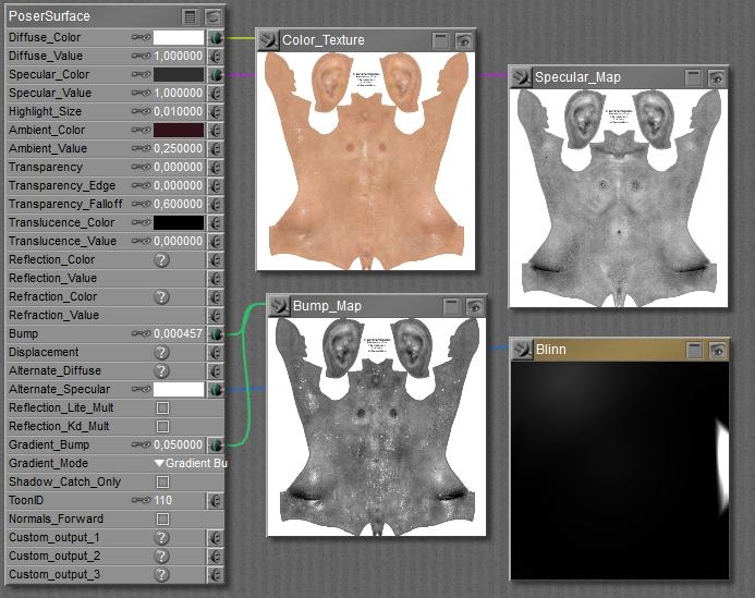
So let’s find out what we can expect from Vicky’s Wet Skin as it comes with the package.

Diffuse takes the texture with a white color swatch, as does the Alt_Specular takes the Blinn shader. White will stay white uder GC so both will pass unaffected.
But Specular takes the map with an 18% grey in the swatch, while the Ambient color contains a 13% red. Both will get reduced severely, and therefore the GC body of Vicky will show less shiny and less red than the non-corrected one.

Actually, I can restore the situation by boosting the 18% grey to 50% and the 13% red to 40%. I’m gamma correcting them by hand, I cannot do it otherwise.

The headache scenario

The Anti Gamma Correction in Poser does affect texture maps and color swatches, but not the values and the math. Let’s find out what that brings us. Roughly, it brings me a load of puzzles on how to build a proper node tree in the Materials Room.

Distorted additions

In Poser, the effects of lights are simply added up. Two lights at 60% each make a 120% light. This results in an overlighting situation, the render is clipped at 100% and all nuances get lost. But applying Gamma Correction makes a difference. The 60% is Anti Gamma Corrected into 32,5%, so two lights make 65% together, which then is Gamma Corrected to 83%. And now the entire clipping effect is gone! (Note: the ball has Diffuse only, no Specular)

Without Gamma Correction, 2 * 60% light 2 * 60% light with Gamma Correction

Personally, I like the second one far better as clipping is an artifact. But my bottom line here is that Gamma Correction is not just an adjustment of the render result, as can be derived in post as well. Thanks to Anti Gamma Correction, you really get a different image.

This not only holds for adding lights, it also holds for adding Specular to Diffuse, and to adding other channels as well (Ambient, Reflection, …). Gamma Correction is fine as it can be done in post as well. But it comes with Anti Gamma Correction sandwiching the rendering, and that really alters the result. Your image, your call.

Distorted multiplications

Poser Anti Gamma Correction does work on textures and color swatches, for surfaces, lights and more, but does not work on values. As a result, just in the simple case discussed above with two lights at 60%, I get different results depending on whether I put 60% in the intensity (value) or as a grey hue in the color swatch:

with CG, 100% white, 60% intensity with CG, 60% white, 100% intensity

So you still experience the overlighting and clipping in the left image, also it doesn’t show that much thanks to the brightening of the Gamma Correction in its near environment. By putting the light intensity in the color swatch instead of in the numericals, you do get the better image. This holds in all cases of the Material Room.

Distorted color for value

So it does matter whether I use a reduced value instead of a darkened colorswatch?
Yes, the first will result in a brighter result with the risk of clipping and stronger brightness contrasts, like brighter highlights and deeper shadows. Just because it is not reduced beforehand by the Anti Gamma Correction.

And if I use a texture or a color-constant instead of a value (like plugging a greyed colornode into a value of 1)?
Then that’s like an adjusted colorswatch, as all swatches and textures are affected by the Anti Gamma Correction.

What is best?
For those channels which ought to be affected by Anti Gamma Correction (that’s about everything except Bump, Displacement, Transparence and the like), you’d better leave the values at 1 and use a swatch or texture for the nuances.

Is there a difference between using two similar lights at the same place, or just doubling the intensity value?
No. This is exactly why the Anti Gamma Correction leaves the numericals alone. Otherwise the result of Poser Gamma Correction would become completely unpredictable.

How do I deal with the complex node-constructions that can be found in Alternate_Diffuse and Alternate_Specular?
You’ve got to analyze them in detail, or trust the constructor for having done so. The best construction takes sets all Image Gamma to 1 and puts in a Gamma node just before the Alternate input connector. But one should be aware that all color swatches always go against the Render Gamma setting.

Can the Anti Gamma handling of colorswatches be avoided?
All color swatches always go against the Render Gamma setting, but one can use the User_Defined node which uses numericals to generate a color, and is therefore immune to the Anti Gamma Correction.

What about Refraction?
Value and color determine the color of the refractive, or: transparent material. Like in all similar cases, you’d better make dark green glass by choosing a dark green color, instead of a green color and a low value.
The amount of refraction, the optical effect of bending light when it passes through an object, is determined by the Index of refraction (IOR) in the Refract node. This is not affected by Gamma Correction.

And Reflection?
Well, I can use either the Refract node or (in P9/PP2012) the Fresnel node. The latter is meant for transparent reflective materials, like glass, and the reflectivity is derived from the index of refraction. Note that using a color swatch or refraction value not only will alter the refraction, but the reflection too. Usually, reflections are uncolored.

Metals are the exception to this: they have no other properties than reflection, but when they are bad reflectors they look grey and vice versa (like puter), and when they are just relatively worse in reflecting bluish colors they appear yellow to reddish, like gold and copper.

Again, don’t put the reflectivity in the reflection value but combine it into the colorswatch: lower reflectivity implies a darker color. Then the anti-gamma / gamma sandwich around the rendering will result in a proper amount of reflection. When you reduce the value instead, you’ll end up with a far to reflective surface. Which might be great, but not for photorealism. As always, your image, your call.

Corrections (8 Vue pt I)

Gamma Correction in Vue

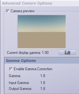
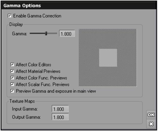
Vue offers Gamma Correction as well. In the Artists products (Esprit, Studio and Compete) it cannot be adjusted, the 1,80 value is the only option and you can either use it, or switch it off. Also, input gamma (anti-correcting the textures) and output gamma (correcting the rendered result) are the same – see image at the right.

Vue will also alter the preview, which turns that part of the display in an almost linear one. But that can be switched off, in Options \ tab Display options:More on the Vue Display Gamma at the end of this chapter.
Note that this affects the preview of Exposure Correction as well.

In the Pro products (xStream, Infinite) the display, input and output gamma’s can be set on an individual basis (see image from the manual):

And here too we find the option to switch off the Gamma Correction and Exposure in the main OpenGL preview pane itself.

Of course Vue is aware that Bump, Displacement and Transparency textures should not be anti-corrected. By selecting Override gamma, and unchecking Enable, this can be accomplished.

Corrections (9 Vue pt II)

Vue Gamma Correction reconsidered

The result of Gamma Correction in Vue is interesting:

The ball on the left is painted medium red (RGB=127/0/0) with a Vue internal color swatch. The ball on the right is painted medium red also, but by a texture. You can see that both respond different to the gamma settings. When Gamma Correction is switched on (I’m running Vue Complete so I don’t have the advanced control offered in the Pro software), the sky, the ground and the left ball go brighter. They all are driven by internal color swatches. Shadows and highlights brighten up as well. The ball on the right however hardly changes color. It might look as if it darkens since everything else brightens up, but Photoshop measurements reveal that a spot in the middle, somewhat away from the (brightened) highlight, remains as 50% brightness in both images. It also reveals a small drop in saturation which might be due to gamma correction applied to the atmospherics as well.

From this we can conclude that Vue – like Poser Pro – applies Gamma Correction like a sandwich. You’ll get the full brightening from Gamma Correction but you’ll get the Anti Gamma Correction for textures only. Textures and color swatches are not considered equal, the (anti) gamma correction brings external and internal (procedural) textures out of sync.

See Color Cop measuring the display while Vue sets the color:

To bring those back in sync, all color swatches have to be adjusted manually. When Gamma Correction is switched on, an internal 50% red (127/0/0) translates to 173/0/0 on screen (and in the rendered result). The other way around, an internal 73/0/0 translates to 127/0/0 on screen, and in the render, and in sync with a 50% red texture map.

But you can save yourself the math and trouble. When the Gamma option is switched on, any texture well be darkened by the Input gamma but you won’t see that because the display of it will get brightened by the Display gamma with the same value. Any color swatch however will get brightened only as the Input gamma (the Anti Gamma Correction) is not working on it. By choosing a color with matches the texture you’re essentially darkening, and gamma applying, the color swatch manually. The Display gamma is doing to the preview what the Output gamma will do to the rendered image.

Note: when in Vue xStream / Infinite the option Affect Color Editors is unchecked, you only will not see the brightened color in the swatch. But you still will have it in your render.

When switching and altering gamma values becomes an issue by itself, it might be a way out to create color functions which include a gamma correction node. The color swatches in the atmospherics editor however are not function driven, these are just simple colors to be set or picked.
On the other hand, when gamma brightens the shadows and highlights, it might be reasonable that it brightens the sky as well. So not altering the swatches makes some sense. Your image, your call.