CaseStudy: Hairy Stuff (1 Intro)

As long as your hair is styled properly …

Download this tutorial in PDF format (2.0 Mb).

Introduction

This Case Study is a beginners guide into Poser Hair Room, and will be about assigning fur or short hair to objects, clothes and animals and about assigning facial and body hair to humans.
To deploy the basic techniques I’ll put fur on a purse and on a jacket, and play a bit with hair coloring.

Then we’ll have a look at a pre-made, commercial product: Snow Bride. After that, I’ll consider more elaborate figures like a toon kitten or puppy and investigate under water scenes by considering a long-haired fish as well. Long hair on animals brings up horse manes and tail, so I’ll give that some attention too. The step to humans is a small one then, as long as I start with facial and body hair.

Long hair on human heads will be dealt with in #Photo Shoot#. Have a good hairday.

CaseStudy: Hairy Stuff (2 Purse)

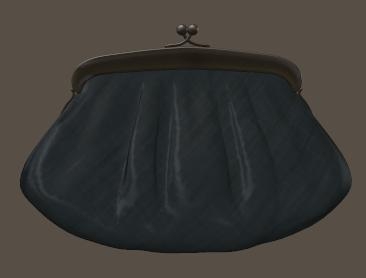
In this chapter I’ll put fur on a simple ladies purse (from the Noctia outfit).

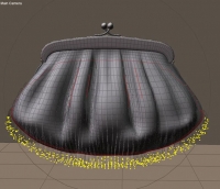
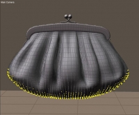
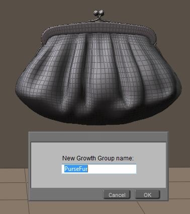
I switch the preview to Smooth Lined (or Flat Lined) to see the polygons, open the Hair Room, ensure I’ve got the Purse figure as well as the Purse bodypart of it selected, I click [New Growth Group] in panel 1 and assign “PurseFur” as the name for the new hairdo.

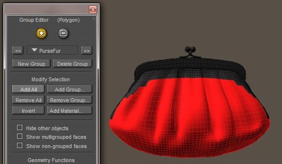
In order to select the entire surface into my hair group, I click [Edit Growth Group] which opens the Group Editor, and [Add All] adds all polys from the Purse\Purse (=figure\part) to the hair group.

The option Hide Other Objects helps me to concentrate on the Purse object, and when I check Show Multigrouped faces I get the entire purse, as all polygons are part of the group Purse as well as part of the group PurseFur.

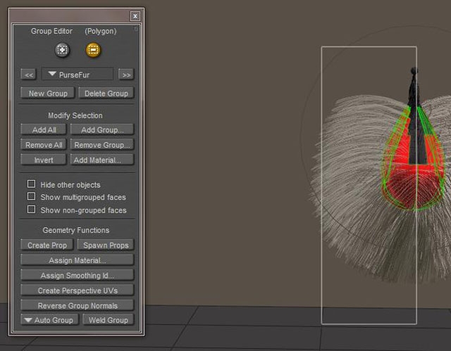
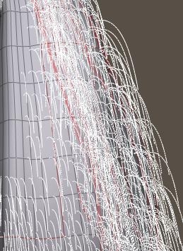
For more details on the Group Editor, just consult the Poser Reference Manual. I can close the editor now, and click [Grow Guide Hairs] in panel 2. Now I realize that I don’t need hairs on the back, I’m only going to render the front side. So I [Edit Growth Group] again, tick the [-] option to subtract faces from the group, position the camera so I can view the purse from aside. While selecting polygons or just clicking them, and by clicking [Grow Guide Hairs] regularly, I can check when I’ve got the proper surface. If I see any hair growing out of unwanted places, I still have to deselect a poly.

Growing Hair
Next, I estimate the purse at about 20cm wide and 10cm high, that makes 200cm2. When the fur comes from an animal with a dense coat I guess I’ll need 400 hairs per cm2 (human heads do about 200), so that will be 80.000 hairs. In this tut, I’ll far less. Given the size of the purse, the hairs can be 1-2cm long, and 1-2mm thick as animal hair. These short, thick hairs covering the purse are not going wild in wind, gravity or any styling so I do not need high mesh resolutions.

So on panel 2: Hair Length = 0,015 and Length Variance = 0,005 (my Poser is set to Meter units, for inch-units you can use about 0,6 and 0,2 respectively). On panel 3: Hair Density = 400,000, Tip Width=1, Root Width=2, Verts per Hair=4. For clarity, I zero out all other parameters in panels 2 and 3 (Kink Scale has a minimum of 1).

Important note: Hair Length and Variance are presented in user units, in my case: meters. My 0.015m = 1.5cm = 0.6″. Hair Density is presented in (hairs per) square user units, in my case: hairs per m2. My 400,000/m2 = 40 /cm2 = 258/inch2.

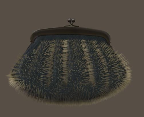
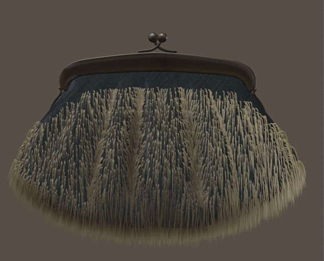
As all hairs are standing straight out, as I haven’t done anything dynamic and as there is a serious color contrast between the purse and the hairs, the rendered result looks like a porcupine. But I’m not done yet.

Since animal fur grows quite flat onto the skin, I can use the Pull Down dial to establish that effect. There is nothing to Pull back or Pull Side, so I leave these alone (at 0.0).

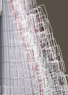
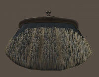
As the left image (shot from aside) reveals, I need a large value (0.005) and the hairs bend quite sharp. This is due to the lack of resolution, a hair can only bend at a vertex. So I turn the 4 Verts per hair up to 32. And now I get a much smoother result, at a much lower value (0,00004) – right image. And as I don’t need clumpiness or kinks in this straight animal fur, I decide that this should do.

From this I can identify some areas for improvement.

  • The hairs are the bottom should be shortened (shaved).
  • I need a coloring of the purse and the hair, and blend them together
  • If then still needed, I might need a higher hair density. This is simply a matter of raising the value and turning the appropriate dial. Twofold, Fourfold, I’ll see.

Shaving
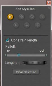
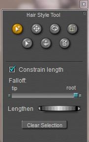
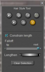
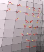
Of course I can remove the bottom area from the PurseFur hair group, and create a new one with shorter hairs. But now I’m going to alter individual hairs instead, and so I click [Style Hairs…] in panel 3. The Select+ option is on by default, and I start selecting all hair(tips) that I want to alter.

Then I use the Lengthen dial (rotate left) to shrink the selected hairs. When done I [Clear Selection], spot any hairs I missed and give them the same treatment.

Notes:

  • There is no way to save selections for later use. Once done, I’ve got to reselect them.
  • Any touching of button, dial of value field in panel 2 will completely undo all styling for all hairs in the hair group at hand. This means that I must be sure about Length and Pull settings before starting to style.

Dye Hair
In order to change to coloring of the purse and the fur, I step into Material Room, Advanced tab, and select the PurseFur prop from the objects list. This prop contains all hairs in that group, but not the purse surface itself.

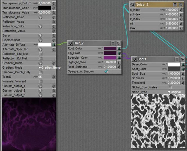
The fur material is set to its Blonde default, and the first thing to do is to increase the Root Softness. This blends the root of the hair into the surface by making the hair increasingly transparent from the outside in. But in this case, the contrast between haircolor and surface color is so strong that I really need recoloring. Since the purse is dark teal/blue-green I selected Root = RGB(31,33,32), Tip = RGB(71,85,99) and Specularity somewhat in between, and set Root Softness to 0.5.

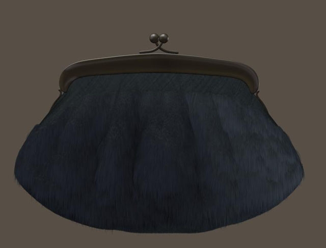
The result was not that satisfying, so I severely reduced the Specularity (and Alt_Specularity) of the purse itself, but reducing the brightness or their color swatches. And – as stated in the improvement notes above – I drastically increased haircount at the cost of longer render times and higher memory consumption. From 400,000 to 1,280,000.

To have more fun, I turned the purse into Marsupilami, the comic animal by Franquin (www.marsupilami.com).

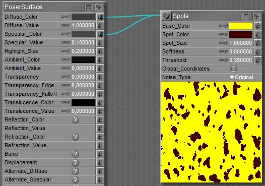
So I altered the material for the purse itself into a simple one.

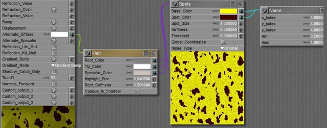
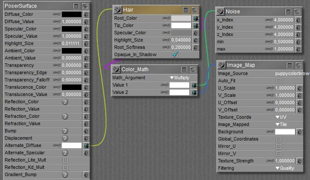
And I copied the Spots into the material of the PurseFur object, in between the original Noise and Hair nodes.

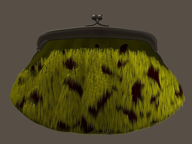
Since I’m using the same Spots in all places, any differences come from the filtering by the colorswatches. The Diffuse and Specular in the purse material itself both are the darkest, while Specular has a reduced value (0.1) as well. Only metals have a high specularity. My idea on finished animal furs is that the skin itself has the darkest tone. In the PurseFur hair material, the Root color is the next darkest, the Tip color is just white and the specular for the hair is somewhat in between with a slight brownish hue. The effect of the (already present) Noise node is very visible in the spots now.

And since the hair matches the cloth of the purse, I can do with a reduced hair density. So I lowered it from 1,280,000 to 320,000, and got after rendering:

CaseStudy: Hairy Stuff (3 Jacket)

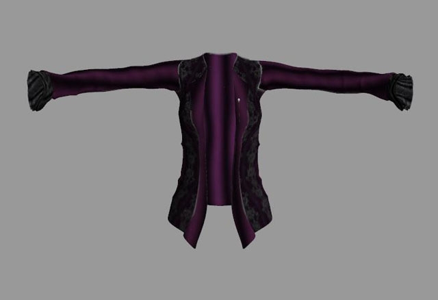
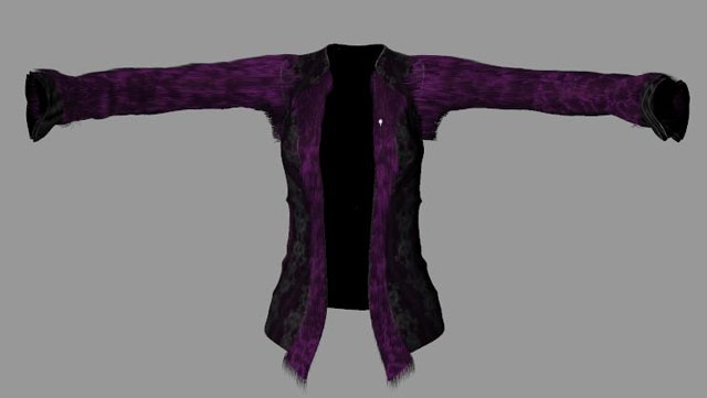
This is the jacket from the Witch Hunter for Vicky4.

It has some decorated parts on the sleeves and the front, and I’m going to “furrify” the smooth parts. This is not very different from handling the purse, but let’s look before we leap.

From a fur point of view, the jacket has a Left Sleeve with the hairs growing sideways (positive X, to our right), a Right Sleeve with the hair growing sideways (negative X, to our left) and a Body. Each of these is built from three mesh components:

  • Left Sleeve = Left Collar + Left Shoulder + Left Forearm
  • Right Sleeve = Right Collar + Right Shoulder + Right Forearm
  • Body = Hip + Abdomen + Chest

As I found out by clicking around on the jacket. In the Materials Room I found portions for

  • A Pen, that’s some jewelry sticking upon the left front of the jacket
  • Sleeves, that are the ultimate ends at the arms
  • Jacket, everything else

Each sleeve – from arm pit to wrist – measures about 50cm long x 40cm circumference = 200cm2, the body measures about 70cm high x 100cm circumference = 7,000cm2, minus 20% for the open front minus 20% for the decorated parts make say 4,000cm2. From the 7,000cm2, half of it sits at the back of the body, which leaves 4,000 – 3,500 = 500cm2 for the front side of the jacket. We’ll need this info to set the haircount to reasonable values.

Setup
I enter the Hair Room, select the Right Collar (mesh group / subobject / bodypart), start [New Growth Group], name it (“RightArm1” for instance), click [Edit Growth Group] to collect the polygons for the group, and just [Add All] to finish. Perhaps I’ll need to do some more detailing later on, but this gives me a start.

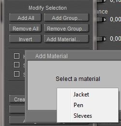
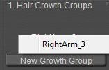
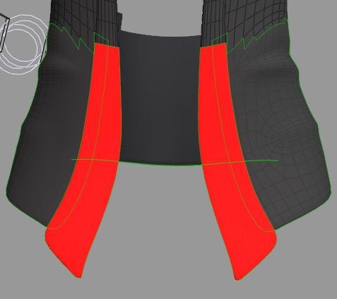
I select the Right Shoulder in preview, repeat the procedure (“RightArm2”, select Right ForeArm, repeat the procedure (“RightArm3”) but instead of using [Ad All] I click [Add Material], as I want to exclude the decorated ends. Those ends were assigned to a Sleeves material group, so I select this, and then click [Invert] because I just want the other part.

While the jacket has object-groups and material-groups which technically are independent, I must create hair-groups for each separate object-group, and I can use the material-groups for further selection within that object-group. Like above, Sleeves addressed both left and right end but while working on the right arm object, I could address the right part of the material group only. And I cannot make one single “Right Arm” hair group, I end up with three parts. When I select the Right ForeArm in preview, then hairgroup RightArm3 is accessable only.

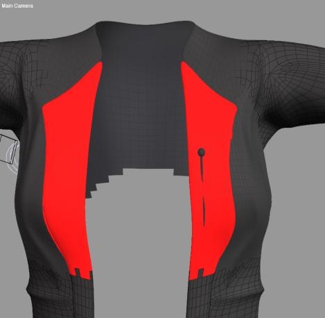
This way I also build my LeftArm1/2/3 hair groups, and also make my JackBody1/2/3 groups out of Hip, Abdomen and Chest. For defining JackBody1 from the Hip etcetera, I manually select the relevant portions as I’m avoiding the decorated parts and – for the moment – I don’t need hair on the back for my current renders.

Using the mouse for selections requires some practice. Adding, deleting and turning cameras is a must for the fine details. Sometimes it pays to make larger selections, and exclude (using the [-] option) some polys later. Some people might prefer a tablet for this kind of work.

Sometimes handling logic brings a way out. Excluding the Pin on the chest part could be done easily, by selecting the jacket part completely, then inverting (to everything but…), then adding all polys with the “Pen” material like I did with the Sleeves material before, and Inverting again.

Time to save now.

Growing fur
My next step is to grow fur on one area (say: Chest = JackBody3) , adjust it till I like it, and then (manually) copy my findings to the other areas. So I select that part of the jacket (preview), as well as the hairgroup (panel 1), and deploy panel 2 to [Grow Guide Hairs] with a length of 3.5cm, a Variance of 0.5cm (so: hairs will be 3-4 cm), no Pull back or Pull Side but a serious Pull Down supported by enough Verts per Hair. Kinks and Clumpiness could be zeroed out, and I vary the hairs between 2 (root) to 1 (tip) mm.

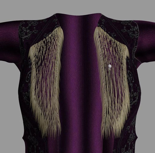
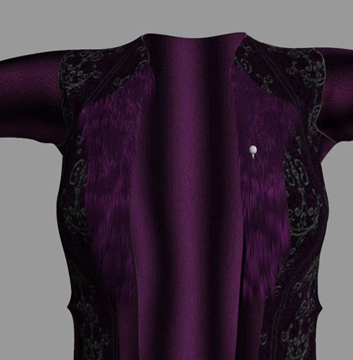
It renders like this:

From this I learn that it’s better to exclude the polys from the hair groups that do not face the front, but face up, down or sideways instead. The hairs from the side do not contribute to a nice result.

When re-selecting the bodypart for re-editing, be sure that you’ve got the object part (here: Chest) and not the hair-prop JackBody3. The first one contains the Hair Growth Group including all settings, the second contains the (guide) hairs that result from that. Check Hide Other Objects in the group editor to get rid of the hairs while (re)selecting.

Then I need to color the hair, and I need to set the hair density to a proper value. The full front of the jacket was estimated 500cm2, so this third part might be 180cm2 and with 200 hairs/cm2 that makes 36,000 hairs. To be halved or doubled depending on coloring.

Handling the material
I selected the Root color to match the purple surface RGB=(60,20,60) while making spots of darker tips RGB=(30,10,30) and added the same spots to a bright specularity RGB=(120,40,120), all in the same hue.

Once I like it, and once I’ve made another hair group, I can copy this material to the other hair groups:

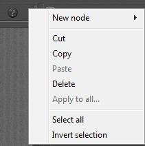
  • With the triangle at the upper right corner: Select All
  • Copy
  • Then select any other hair Prop (the prop, not the growth group body part),
  • And with the same triangle-menu: Paste
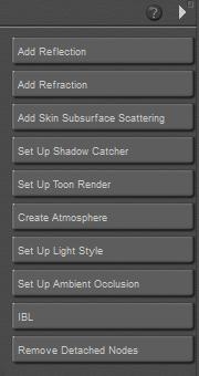
  • Then, from the list of buttons: [Remove Detached Nodes] to clear the original hair material
  • Select another hair prop, paste again, remove original nodes, and so on.

Details galore
Hair was quadrupled (144,000 for this area) and I’m still convinced that the top inner side, and the top outer side can use a shave. This is due to the high density of small polygons to make a smooth bend in the jackets form. With a guide hair per vertex, and populated hairs per guide hair, many small polygons mean: many hairs in that area.

Now I’ve got my settings I can do the other parts of the jacket.

  • Hair length 0,0350
  • Variance 0,0050
  • Pull 0,00012
  • Density (72.000 to 144.000)
  • Tip 1
  • Root 2
  • Verts 32

The arms have the hair pulled sideways instead of down, require far more pull and mind the +/- sign for the proper direction.

This still leaves room for perfection:

Around the Right and Left Collar or: RightArm1 / LeftArm1 elements, hair (polys) should be deleted and/or hairs should be shaved using the Hair Editor, and hair Pull and Density have to be looked into. Plus the details for shaving mentioned already for the upper/inner portions of the jacket. As usual, the devil is in the details, and so is our time.

CaseStudy: Hairy Stuff (4 Snow Bride)

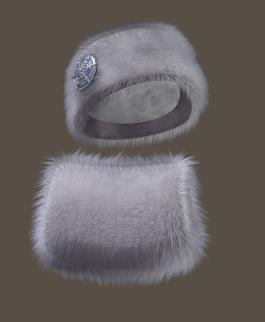
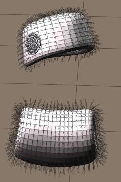
Snow Bride is a commercially available set of clothes for the well-known Vicky4 character. The clothes are fur, and look like this.

Let’s analyze the parameters, and learn from them.

Structure

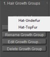
The hat as well as the muff have an Underfur as well as a Top-fur hair growth group, that’s four in total. and The other object parts have no hair groups. This is found out by selecting each part of each object looking in panel 1 which tells me about the available hair groups.

Clicking [Edit Growth Group] tells me that the inner bands, and the medallion on the hat are neatly excluded from the groups.

Guide hairs

Switching the preview to Flat Lined or Lit Wireframe (Ctrl+5) reveals the 3D mesh geometry, and clearly shows 1 guide hair per vertex. Or better: two guide hairs in this case as the Underfur and Top-fur groups overlap, so each vertex is in two groups.

For each hair growth group selected in panel 1, I looked at panels 2 and 3 and noted the numbers. The three Pull parameters were 0,0 in all cases, and indeed all hairs grow right up from the surface.

&ndsp; Hat-topfur Hat-underfur Muff-topfur Muff-underfur
Polygon size 2,5×1,6=4cm2   1,4×1,4=2cm2  
Nr of polygons Ca 250   Ca 500  
Hair length 0,030 cm 0,030 0,030 0,023
Length variance 0,000 0,000 0,015 0,011
Density (per cm2) 22000 (2.2) 88000 (8.8) 33000 (3.3) 88000 (8.8)
Tip width 0,4 mm      
Root width 2,0 mm      
Clumpiness 0,25 0,10 0,25 0,10
Kink Strength 3,0 7,0 3,0 7,0
Kink Scale 10,0 10,0 10,0 10,0
Kink Delay 0,1 (10%) 0,0 0,1 (10%) 0,0
Verts per hair 4 4 4 4

Analysis
Looking at the hat first, the hairs from both groups have equal length (3 cm) and no variance, are rather thick at the root and thin at the tips (typical for animal hair: thick roots for better protection, and thin tips due to natural wear and as they don’t do haircuts). The underfur is much denser (88 compared to 22 hairs per cm2. The hat measures 250 polys of 4cm2 each so the 88000 resp 22000 hair find their place at 1000cm2 hat). But even the total density of 88+22=110 is still half the coverage of the human head (about 200 hairs per cm2), which by itself is about half the coverage of real life animals.

So the objects have a furry impression, will need appropriate coloring of the cloth as well, but don’t resemble a full real animal coat. The underfur is denser, more even (the clumpiness of the topfur increases the furry impression) and more curly which makes is look denser. The topfur is not only less curly, the curls start somewhat (10%) away from the object surface.

The muff measures 500 polys x 2cm2 = 1000cm2 as well, so I see that the topfur is somewhat denser that the hat. I also see that the hairlengths are somewhat different from the hat as well, but especially they vary 50% (1,5 cm on 3,0 and 1,1 cm on 2,3) which will give it a more natural look. Again, the dense underfur is curlier to enhance a fuller look.

Since the hairs are short and we’re not expected to do dynamics onto them, only a few verts per hair are required and all dynamic parameters (panel 4) are kept at their default values.

Materials and more
The hair material is the same in all cases, white at the root, bluish grey at the tips to get the icy feeling and specular is a darker variety of that.

The cloth of the hat and muff are more complicated but essentially have the bluish grey tone as well, which is why the hair root material has quite a high Root Softness setting (0,5 instead of the default 0,1). The softness makes the hair roots transparent so they blend in well with the scull or surface, in this case with the cloth. If there is shadow on the cloth we might like the hair to stand out more, so the Opaque in Shadow is checked as well.

In Material Room is becomes clear that the 3D mesh (the cloth) of hat and muff are used to deliver the polys and vertices for the roots of the hairs, but the hairs themselves make a Prop to assign materials to.

Note that this prop cannot be saved, we are expected to save the hair growth surface with the (guide) hair definitions. This is what the hair collection in the Library expects.

CaseStudy: Hairy Stuff (5 Toon Animal)

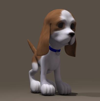
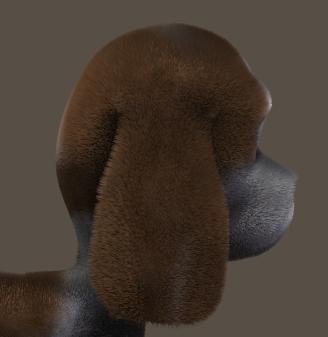
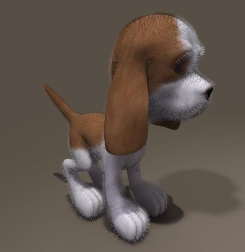
Next to clothing, animals are popular to assign fur too. To avoid debates on realism – which is mainly an issue of endless tuning of the grouping details, the hair parameters and the material properties – and since I’m a dog person, I’ll go for the Toon Puppy. For the cat persons amongst you, just take the Toon Kitten instead, or anything else.
The collar came as an additional prop, and I hide it for the moment.

There are two different ways to approach this:

  • Make a lot of small hair growth groups with different length and pull settings, and apply minor adjustments to them later
  • Make a few large growth groups without pull settings, and apply a lot of editing to the hairs themselves.

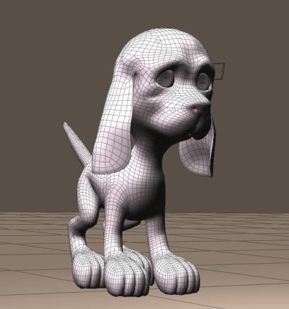
Making a choice upfront is relevant, because any attempt to alter a length or pull setting (Hair Room panel 2) erases all editing of hairs in that group. Since the Puppy is rather low poly and well curved, which implies: not that many guide hairs and a lot of detailed work required anyway, I take the second way. You might choose different for a highres Horse mesh.

Analysis

All areas that are worthwhile to be furrified are textured by mainly one (“Fur”) material, driven by a single image map. The Head consisted of a Fur, Muzzle and Nose material group, I picked the first two and left the latter out.

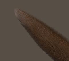
The puppy mesh offers the regular Head \ Neck \ Chest \ Abdomen \ Hip structure, and the four-part leg and arm structure. The fourth part is foot or hand, the puppy has no separate toes or fingers. The three-part ear-structure however is an addition to a normal (human) mesh, as is the ten-part tail. Especially this last element might do well with the straightforward Hair length and Pull settings, without additional editing.

Preparation
All this makes a 5+4*4+2*3+10=37 part animal, and each part gets its own hair growth group and hair material setting. Each hair growth group is a routine: select, [New Hair Group], [Edit Hair Group] using [Add All], [Grow Guide Hairs], set all values in panel 2 and 3, and [Grow Guide Hairs] again to make the preview properly show what I just did. Then next part.

The material is just a matter of setting up one correctly, and the copy / pasting as described in the Jacket chapter.


The skin image map is multiplied with the usual noise node, and fed into the Root color at a slightly darker tone than into the Tip color.

So after a tedious sequence of paste and [Remove Detached Nodes] in Material Room, I’ve got my Toon Puppy with guide hairs standing straight out on all places that should have hair. I excluded the bottom of feet and hand, excluded the nose on the head, and ensured that the inner parts of the ears were saved from hair by using the Fur material in my selections. And all hairs are colored properly. Time to save.

Styling
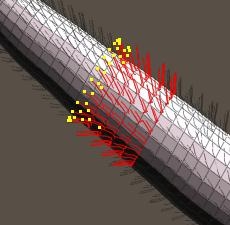
Now – except from hair density – our puppy or kitten only need his/her hair styled in the proper direction. As all surfaces are rather curved, the Pull values don’t serve that well and so I’ve to click [Style Guide Hairs] to use the Hair Editor. It’s just a matter of practice, and this animal offers almost 40 areas to practice with. The easiest parts are at the back (straight tail), the most varied and curved part is at the front (head). So, to gain experience along the way, I’ll work from the tail forward.

My main tools in the editor are the three ones up-left; select, deselect and move – which just pulls the hairs in a specific direction, plus the up-right one: scale – which tapers the hair ends. There is nothing to rotate, transfer or curl. I’ll keep all hairs at constant length while editing, all edits start at the hair roots (otherwise the hairs stand out for some part), and I won’t need to alter length, let alone exceptions at the ears or nose I guess. Each time I am dissatisfied (or just screw up), I can click [Grow Guide Hairs] in panel 2, and I can start all over again for that piece of hair.

Intermezzo
Since the puppy is composed from a lot of elements, it’s relevant that all have appropriate and matching parameters.

  • Length and variance are in user units. That is, if your general preferences (Interface tab) are set to inches, then 1.0 means; 1 inch. When you save your file, send it to me (I’ve my units set to meters), the same hair will show but the setting will read: 0,0254. Internally, Poser saves all lengths and distances in Poser Native Units (PNU). The translation is done in the user interface.
  • Pull is some angle between adjacent edges that make up a hair. The first edge always stand right up, then the bending starts. The more Verts per hair, the more edges, the more the hair will finally bend. And the smoother.
  • Hair density: the number next to the dial represents the amount of hairs per square user unit. If you (using inches) set it to 10 (hairs per square inch) and I open that file (using meters), I will see 16,000 in that field as 1 meter is about 40 inches (and 10x 40x 40 = 16,000). Note that human and animal hairs are about 100 hairs / cm2 = 645 hairs / inch2 = 1,000,000 hairs/m2. The number between brackets tells the amount of hairs to be generated in the population.
    The hair objects generated by Hair Room might become really huge for realistic settings at a high Verts per hair count. A Gorilla, having a body surface of say 2 m2, at 1 million hairs per m2, and 8 verts per hair will generate 16 million vertices which is 200 times as much as a highres Vicky character. You and your PC need the resources (memory, CPU power, render time) to handle that.
    Note that the default reads 32,000 hairs per square PNU = 4300 per m2 = 3 per square inch, that’s way below the natural values.
    Anyway, when all elements of the puppy needs matching settings, so needs Hair Density to be similar for all of them.
  • Width, at the tip and the root, can be considered in mm. For natural hair, 0.1 is a decent (root) value.
    (thought experiment: take 1 cm2 of surface, give it 100 hairs in a matrix at equal distance, and look straight at it (Front camera or alike). Then 10% of the area looks filled up, as 100 = 10×10, and 10 hairs of 0.1 mm make 1mm = 10% of 1 cm. So a setting of 1 (mm) is really thick.
    But when you choose – for performance reasons – for a lower Density setting you can take higher width values to compensate, until things start looking unnatural.
  • Kink makes curls in a hair, the Scale sets the number of them over a full length, so 4.0 makes 3 full waves as 1.0 makes no wave at all. A delay of 0.2 makes the first 20% from the root up without curl, only the 80% to the tip are effected. More curls per hair require a sufficient setting for the Verts per hair, 4 verts per kink is a minimum to experience effects of some quality (so scale =4 makes about 16 verts minimum), below that the hair gets fuzzy. Strength makes just stronger curls.
  • Verts per hair was discussed already, the more you use the more PC power you need to render the result, the smoother and more natural it looks (always that same trade-off J ), the more effect you’ll get from the same Pull values, and the better the quality from Kinks.

Getting Results
Back to Toon Puppy. When I set all hair groups to 1,000,000 hairs per m2, and counted all hairs generated from that, I found that my Toon Puppy was going to end up with about 1,370,000 hairs @16 verts/hair = 22,000,000 vertices. Pressing Render revealed that the memory requirements for even a shadow map went towards 20Gb RAM user memory, causing my PC to start disk-swapping. Not good. Reducing the density a tenfold to 100,000 / m2 reduced the RAM requirements to say 2Gb, easy on my machine but in my opinion a bit too low on quality at close-up camera distance.

So you can make a compromise depending on your machine specs. See the images, 500,000 hairs/m2, head unstyled, tail styled). Watch the (Windows) TaskManager to flag issues and chances.
By the way: after the tenfold reduction, Toon Puppy had as many hairs as a human blonde (150,000) so Poser is well equipped to handle nice portraits etc at a quality representing nature.

And of course, I can bring down the Verts/hair from 16 to 12 (or 8?). but that is something I can do best before creating styles with the Hair Editor. So, mind the numbers (or just watch TaskManagers when things tend to go wrong), and make some test renders to find the quality balance. High end (large size, high quality) results require appropriate machines, sorry for that.

Styling tip: in many cases, there is no One Style that fits all hairs in the group. Like this tail part, the hairs towards the tip end are a bit more styled than the hairs towards the body end, which are more upright. I handle this by first selecting all, do some styling, deselect hairs at the body side, style a bit, deselect more, style a bit, and so on. Especially the Hip (meeting tail and both legs) and the head (lots of curves) need threatments like that.

Toon Fish
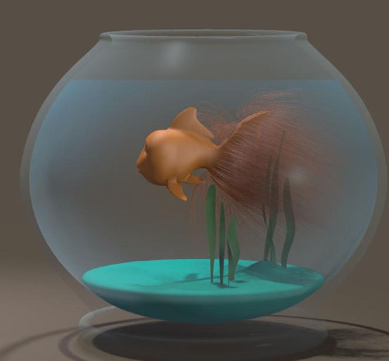
I know, most fish don’t have hair, but a hairy toon fish helps me to introduce some dynamics (panel 4).

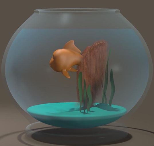
I simply select the tail, assign it a Hair Group, grow guide hairs and turn them orange for the fit. At 40cm length, some Pull back and down, with some density (20,000/m2), and no Kinks, this is it:

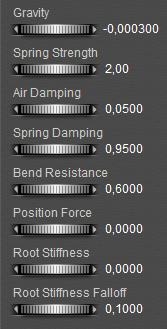
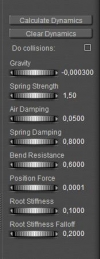
In panel 4, I reduce the Bend Resistance, zero the Root Stiffness and reduce the Falloff.
I click [Calculate Dynamics], gravity takes the hairs down, but the default 30 frames are not enough.

So I double them, to 60:

And I [Calculate Dynamics] again.

Nice, but a bit boring:

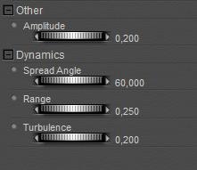
So I added a ForceField (menu Object . Add Wind Force). I put it about in front of the fish, and adjusted its parameters:
And I unchecked Visible in Camera, as the ForceField should look as being generated by the swimming.

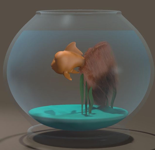
And I [Calculate Dynamics] again. Better, but let’s give it another try: Turbulence up to maximum (1.0), and after the calculation I use the time slider to seek an interesting frame. Halfway, I’ve got one for render. To spice it up even more, you can try the workings of the Wave generator (menu Objects . Add Wave). Next time you make dynamic hair for your swimming mermaid, think about the hairy goldfish. Golden hairfish. Whatever.

CaseStudy: Hairy Stuff (6 Horse)

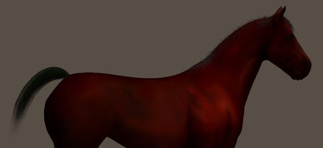
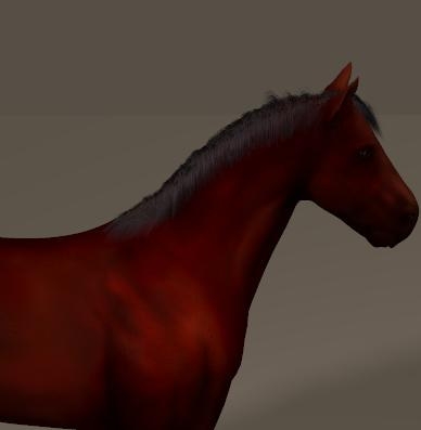
As with clothes, it’s good to learn from available implementations on animals too. So I pick the Horse, available from the Library (Figures > (poser standard runtime) > Animals > Pets). Not to be confused with the one in Poser Originals, which has the manes and tail modeled as part of the object. The new one, in Pets, is dark reddish brown and comes loaded with Dynamic Hair:

The HorseTail prop is a separate set of polys, parented to the horse, that hold the manes. Weird. I’ll do the tail later.
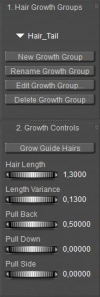
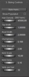
The hair actually refers to the prop Mane with a black material that needs some fixing: As the hair node feeds into Alt_Diffuse already there is no need for other links, into Diffuse, Specular and Highlight Size. Just break them, and nullify the values. After entering Hair Room and selecting the Mane prop, it becomes clear that the length and Pull values are set – and quite well, but all values in panel 3 (and 4) are left to default. In my opinion – see the render above as well – , the horse can do with far more, thicker, less curly hairs than default.

So with
I get
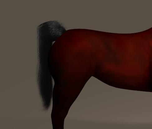
The Tail on the other hand appears to be a 10-element body part, I want to replace it by dynamic hair. So I make parts 2-10 invisible (to preview, camera and raytracing) and I use bodypart Tail1 to assign a Hair Group, for long hairs pulled back and slightly up, using the Styling / Hair Editor.Setting the frame count to say 90, and clicking [Calculate Dynamics] brings the tail down. But I’m not satisfied: it’s too full at the tail root.

To split the tail in three parts, I make tail-parts 2 and 3 visible again, and assign them a Hair Group. I decide to use more Pull back on all three, and to make the tails point in the same direction at the start give the 2nd some Pull Down (-0.05) and double (-0.10) for the 3rd tail element.
To improve the result even more, I just give the 1st element 5,000 hairs, same to the 2nd (so the tail starts thin at the horse) and say 25,000 hairs for the 3rd. I [calculate Dynamics] again to make the gravity bring the hairs down, for all three elements (or: I use menu Animation > recalculate Dynamics, which will do the manes as well).

Nice result, and it will dance on all moves and wind as well.

CaseStudy: Hairy Stuff (7 Facial and Body Hair)

I’m going to work Ryan (Poser 8 figure), but anyone else is fine too. The reason I’m picking Ryan instead of Android Andy is that Ryan comes with image maps for its textures, while Andy just has color settings only. I’m going to use these.

Preparation
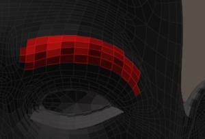
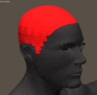
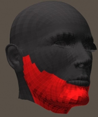
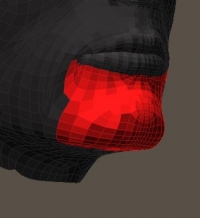
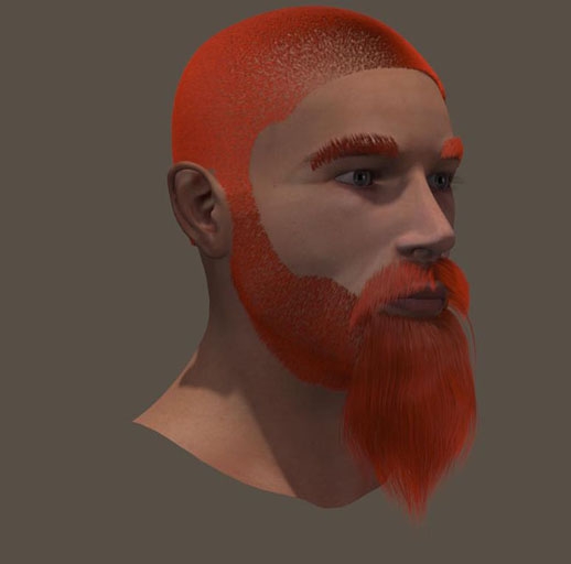
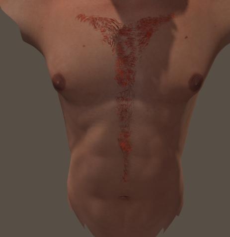
Although Ryan himself comes with Hair Props (Scull Cap, Beard, Brows etc) in the Library, I just make them myself for the sake of this tutorial. As I’m going to do Ryan’s head and front, I make the Growth Groups first by selecting the bodyparts in preview (switch to Flat Lined mode for easy poly selection), and by using [New Growth Group] and [Edit Growth Group]. The Front groups are simple selections from the Chest and Abdomen body parts. To the head, I assign multiple groups. Beard, Mustage (Left and Right, so I can use opposite Pull Side settings), Brow Left and Right (same reason), and Head which I do not subdivide as I’m going to do short outstanding hair only, without styling. Otherwise, a Left, Right, Back, Upper Right and Upper Left would have been handy. For the fun of it, I did make a second Beard area around the chin (in the Hair Editor: [Add Group], select Beard and delete the unneeded polys.

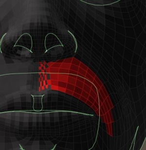
Note that on the mustache I deselected every other poly just below the nose, since these polys are very small. Populating hairs on all polys will make the mustache too dense in this area.

Headhairs are easy, trimmed, not shaven so 5mm (0.005 in meters, 0.2 inch) will do. No length variation, no pull as they all stand out, 1mm (thickness 1) at tip as well as root, nu clumb or kink, and 4 verts per hair will do fine as I’m not going to style anything. So the real issues are the color and the density.

From Materials Room I learn that RyanHead.png is the texturing file, I make a copy in my project folder and measure the head color in Photoshop (or GIMP or anything). It reads about RGB=(220, 150, 115) but I like a bit more red so I set the root_color as brown HSV (10,180,80), the tip as orange HSV (10,240,120) and the specular_color as HSV (10,40,60). Darker to make is less shiny than usual, but all colors are picked in the same Hue (10 in this case). I tend to work that way. Root_softness should go up, say 0,25.

Filling In
Now I need some test renders, to improve on the hair density and the various parameters.

  • Length= 0.005 (5mm), variance = 0
  • Pull = 0.00050 (back) 0.00010 (down) 0.00000 (side)
  • Density = 400,000 (test renders) or 1,600,000 (final render)
  • Width = 2 (tip as well as root)
  • Clumpiness = 0,0
  • Kink = 1.0 (strength) 4.0 (scale) 0.0 (delay)
  • Verts = 4 (test renders) or 16 (final render, takes time)

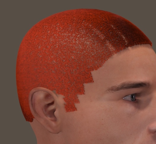
Not too bad, except for the jagged egdes at the sides but I’ll going to deal with that. The main trick then is to remove hairs by making them transparent, using an image (transparency map).

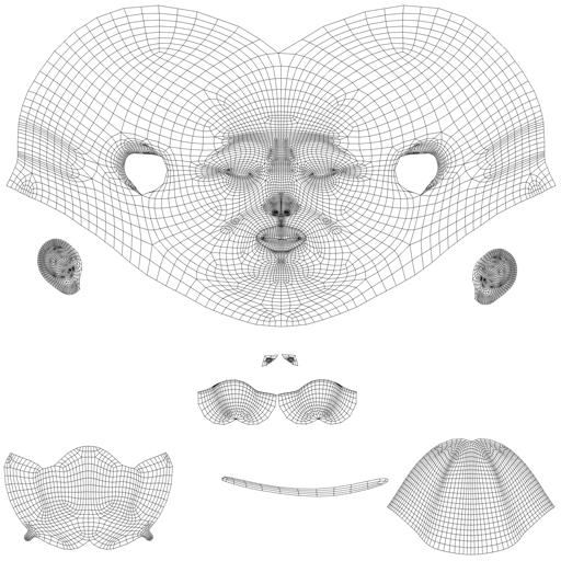
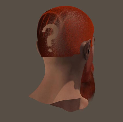
Note that this differs completely from the classical “hair transparency map” in which streaks of hair (props, clothlike flaps) were assigned a hair texture and transparency. In the approach presented here, hairs are made totally transparent as being shaved away. This way I can make fun shaving patterns too. For this, I need a (head) seam guide or template which tells me the way the head texture is mapped.

The Ryan template can be found in (main Poser Runtime) \ textures \ Poser 8 \ Ryan \ Templates, but a load of templates for other figures can be found at www.snowsultan.com.

I open the template in Photoshop (or whatever you like) and make a working copy to a second layer. The template offers a 2D representation of the 3D polygon mesh, although very fine meshes are usually represented by a courser structure to keep things workable.

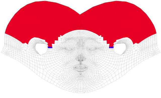
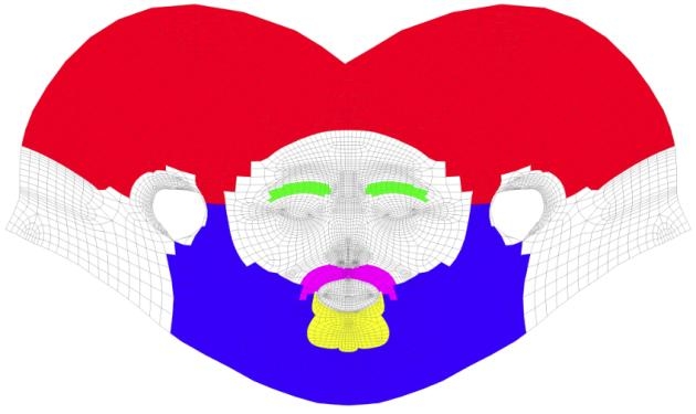
As a first step, I start to full all polys in the Photoshop image with a color, until I have a neat match to the Hair Growth Group on Ryans head. And I whiten out all the elements in the template that I won’t need anyway, but I do not alter the size of the image itself.

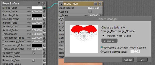
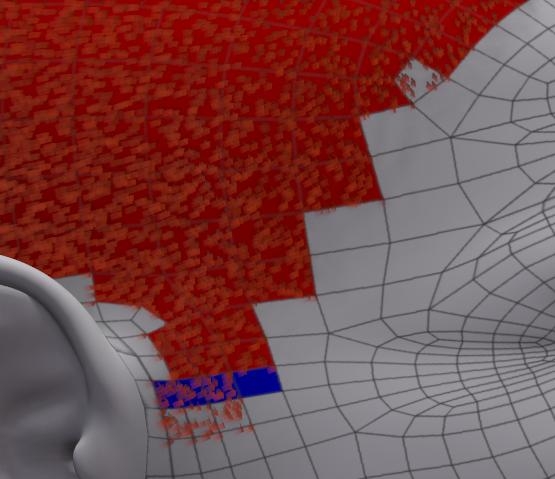
Next, I’ve got to answer the question; did I really pick the right portions in the image? The template can be done in a lower resolution than the 3D mesh, so one row of blocks in the 2D image might represent multiple rows of polys in 3D. And I’m a bit worried about the ear-region. So I save the template to a new name, and in the Poser Material Room I swap Ryans neat texture for the saved template. Don’t overwrite anything, and ensure that you know where to find the original texture, to get back where you came from originally. I made a copy of that in my project folder when I found out about the colors, describe above. From the result I find that I did quite well, except that at Ryans right (my left) the head-hair (red) meets the beard (blue marker) two rows lower than at Ryans left. To be corrected in the Growth Group. At both left and right, there is something at the ends of the front hairline, and you can see at the top-right in the image. A white square does contain hair. To be corrected in Photoshop. The area around the ear can be improved up, to be corrected in both.

Smoothing Up
When the 2D coloring is done, I select the (in my case: red) color, grow the selection with 1 or 2 pixels (to get rid of the non-selected grey template lines), make a new layer and paint it white within the selection, and black outside:

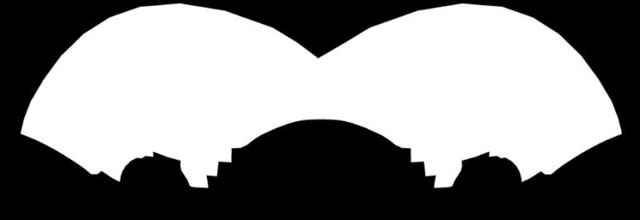
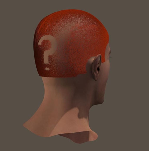
The white area will mark the places on the head where I do allow hair (to be visible), and the black areas will mark places that either will have no hair or will have transparent, invisible hair. Which means: now I can remove some hair by painting some black over white, and personally I prefer to do so on a separate layer – to keep the original info intact. This way I can remove the jags at the side.

But I also can use this technique to create some shaving patterns, as long as I take into account that a straight curve on the head, horizontal or vertical, is a round curve in the template, split in halves, and upside down (the higher up the image, the lower towards the neck).

There are special programs that can help me, which also help mapping tattoos, texts and logos (decals), or just paint in 3D straight on the head itself. There are various Photoshop tools and techniques to help me out (Liquify etc), and I can deploy some Photo Morphing program – which turn a lady into a man or a jaguar, but of course also can map a subdivided rectangle onto a curves template.

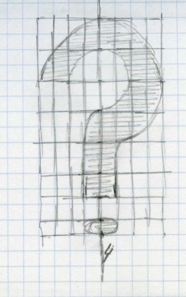
And of course, I can make a simple drawing on a pattern with some squares, and use the template to draw it in by hand.

So I did, note that I compensate for the polys on the head and the template not being equally in size: the ones in the neck are more square and the ones higher up are about twice as long.

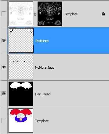
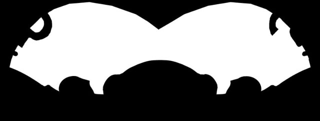
To help myself I created an extra layer for the pattern on top of the anti-jags layer (I love separate layers, this way I always keep previous steps intact), plus a top layer. This is a straight copy from the original template, but with all the white masked out so I only see the grey lines from it. Using those grey lines and my sketch, I could whiten out the pattern.

I saved the pattern in a separate Head_Hair_pat (PNG) file, without the grey template lines of course.
Now I have to bring this pattern into Poser.
So in Material Room I give Ryan his head texture back, and I select the head hair from the Props.
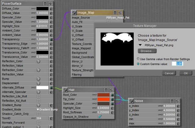
Right click in the area gives me New Node, I pick Image_Map from the 2D textures menu, I pick my saved image as the Image Source in the node – and for those working in PoserPro: I set Custom Gamma value to 1,0 (although it does not matter much, as the image contains black and white only). Now I connect the image map node to Transparency, and I set its value to 1.0. So everywhere the image shows black I get full transparency. That is, when I suppress all edge effects that Poser offers to make neat glasses and bottles. So, Transparance_Edge and Falloff are set to 1.0 as well, otherwise I get some left overs in the shaved are (try for yourself. It’s no too bad for the pattern put it’s awful for the removed jags). This is not enough, because absent hair should not reflect light as well. So I also connect the image map to the Specular Color entry in the Hair node. Now the hair has no specularity any more in those places where the image is black. Now we’ve done this, it’s only a small extra step to the other parts. Growing hair, making, checking and adjusting the template, satisfying those who want a shaving pattern in the beard, playing the colors, etcetera. Note that in the template I did not make a Left/Right difference for brows or mustache. When there is no hair, a white area in the image won’t create it. Only when there is hair, the black area in the image can hide it. The main differences between the various areas, on face as well as chest (same principle to get the jags out), are the settings for hair length, and styling.

Head Beard Chin Brow L Brow R Must L Must R Body
Length 0.0050 0.0050 0.1000 0.0060 0.0200 0.0400
Variance 0.0000 0.0010 0.0200 0.0010 0.0020 0.0040
Pull Back 0.00050 0.00015 0.0005 0.0003 0.0000 0.0000
Pull Down 0.0001 0.00005 0.0012 -0.0002 0.00005 0.00000
Pull Side 0.0000 0.00000 0.0000 -0.0005 +0.0005 -0.0001 +0.0001 0.0000
Styling No 1) 2) 3) 4) 5)
Density 1,000,000 1,000,000 500,000 600,000 800,000 300,000
Tip W 2.0 1.0 0.4 2.0 1.0 0.8
Root W 2.0 1.0 2.0 2.0 1.0 2.0
Clumpiness 0.0 0.0 0.2 0.010 0.010 0.0
K Strength 1.0 1.0 3.0 0.0 2.0 0.0
K Scale 4.0 10.0 100.0 1.0 10.0 1.0
K Delay 0.0 0.0 0.30 0.0 0.30 0.0
Verts 4 20 40 16 20 20

1) just a bit next to the ears, to correct some Pull effects on specific hairs
2) brought the hairs together, and shortened the hairs at the sides, to make it taper
3) not done but needs some for a detailed finish
4) ditto
5) see notes below

For the body hair, I assigned hair groups to Left and Right Collar, Chest, Abdomen and a piece of the Waist. The two latter parts got shorter hairs, 3 resp 2 cm instead of the 4 cm for the other parts. Then I used the Body template for Ryan to create a neat smooth mask, just to get rid of the jagged edges of the hair group polys. If one wants to shave figures in there: be my guest J. I used thick hair (2mm root, 0.8mm tip) and I found out that I got a neat coverage when I distributed about 300,000 hairs over the total body area (3 large areas of 85,000 plus the rest).

I want a full length twist. So I zeroed all Pull values, opened the [Style hairs…] editor, selected all hairs, set the Falloff to the right (root) so all styling occurs from the root up instead of giving away an unstyled portion, I selected the Twist option and sometimes the Rotate option and moved the cursor left/right or vice versa to give each bodypart about the same amount of twist. There is no indicator or so, there is no recipe, it’s trial, error and clicking [Grow Guide Hairs] in panel 2 to rest all styling on that group.

I switched off Cast Shadows in the hair object properties (real body hair is too thin for that). In general: more hair takes longer renders, and making hair a bit reflective under Indirect Lighting conditions can be a real time killer. More on that in the next hair tutorial.
Poser Render Passes (1 Intro)

Don’t do things in 3D when they can be done in 2D.
Render passes save a zillion trial and error test-renders, and make results interactively adjustable.

Download this tutorial in PDF format (1.4 Mb).

Introduction

While working in Poser, I can build a scene, and start tweaking the lights, shadows, atmospheres, specular and reflection strength, and more. And I might like to add special effects, like depth of field (focal blur), volumetric lights, etcetera.
Especially with multiple objects, multiple lights, the use of raytracing and IDL (Indirect Lighting) and alike I have to face renders, re-renders, re-re-renders and all of them having serious waiting times even on my – pretty fast – machine.

Professionals facing a deadline, with a limit on the hours they can spend on the job, or with a customer that shows a lot of variance in his requirements, this is not very desirable. But even hobbyists might face deadlines (the image must be done before Christmas or another event), might find themselves quite flexible in the result they want to achieve, and certainly don’t have the time to spend all forthcoming hours on perfecting that single image.

This is why Render Passes are invented. Each Pass (image) addresses a specific facet of the result, then all passes are combined as layers in a single Photoshop (or GIMP or else) image handling kit, and then the layer parameters are manipulated instead of re-rendering the scene over and over again. In practice, this is not only much faster, it’s also far more interactive.

In this article, making and re-combining render passes is presented, as far as Poser and Photoshop are concerned. Vue will be added in a later stage, or in a separate article. I presume almost all Photoshop steps can be performed in other, similar image handling kit as well. Just the screens might look different.
Step 1 will deal with separating the darks: handling shadows. Step 2 will deal with separating the lights. Both steps can be made in just Poser, and can be combined in: separating darks as well as lights.

Step 3 will deal with the tools available in Poser Pro, and step 4 deals with the Advanced Renderer toolkit.

Poser Render Passes (2 Shadows)

Separating the darks

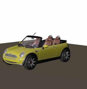
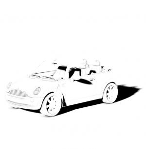
In this first elementary step I’ll present some basics: just dealing with the shadows in the image. To do so, I need one render result without shadows, and one with shadows only. This can be done in the Render Settings, the Manual department.

First: I uncheck the Cast Shadows option, render, and export the result.
Second: I check both the Cast Shadows as well as the Shadows Only options, render and export the result.

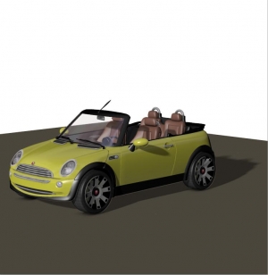
This gives me two images:

Without shadows Shadows only

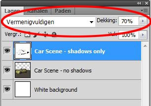
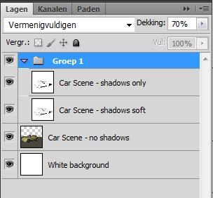
Now I’ve got to combine those two in Photoshop. Actually the color pass is the base layer, but since I exported it with a transparent background (PNG, or in Poser Pro: EXR) I’ll added an extra white layer underneath. On top of that I add the shadow layer, and I set the Blend mode to Multiply (“Vermenigvuldigen”, in my Dutch version). Right now, I can adjust the shadow strength by reducing the opacity of this layer to 70%.

=>

This gives me the same result as reducing the shadow-intensity of the light in Poser, but without the re-render.

In reality, all considerations that reduce the depth (darkness) of the shadows will also lead to blurred edges. Deep shadows have hard edges, while shallower shadowing comes with blurred edges. However, it’s a bad idea to use Photoshop blur un the Shadow-layer, because this 2D approach does not take the geometry of the scene into account.

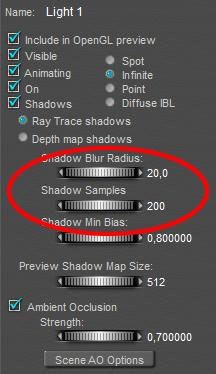
So I re-render the scene, for the shadow-pass only, with a very blurred shadow setting. Note that just tenfolding the blur radius (from default 2 to 20) might give very blodgy shadows, so I tenfold the Samples (from default 19 to 200) as well. Render and export as a new “soft shadows” image.
In the meantime, I’ve created a layer group for the shadow layers, put the already present Shadows only layer into it, and assigned the Multiply blending mode and the 70% opacity to the group while resetting the layer itself to Normal blending, and 100% opacity.

Now I can add the new Soft Shadows layer to the file (and to the shadows-group), Normal blending, 100% opacity too. Then I can start experimenting with the opacity of the top shadow layer. It’s a matter of taste whether to use the hard or the soft shadows layer on top. I prefer the hard ones, as using low opacity values for that layer gives me better control and nuances over the final result.

0% hard shadows 50% hard shadows 100% hard shadows

As a result, I’ve got one slider (group opacity) to set the shadow intensity and one (top shadow layer opacity) to set the shadow edge blur. Completely interactive, without the need for a re-render. I can stop right here, or I can use this method to establish the best settings for my final render. For instance, I might conclude that I’ll have to set shadow intensity to 70%, and shadow blur halfway (say radius 10, samples 100) for my final Poser render.

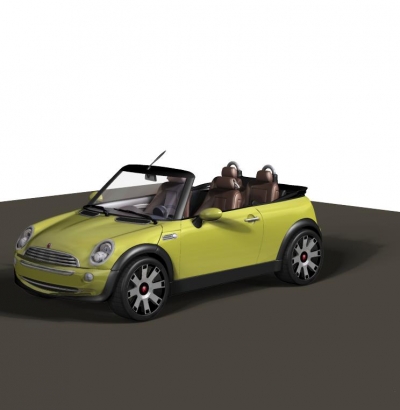
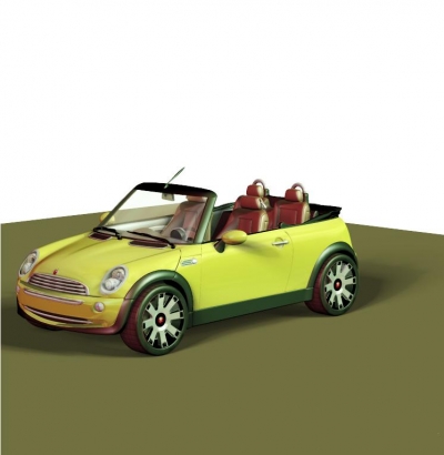
Note: if you look at the car closely, you’ll notice that there is some shadowing under the tires as well which is not dealt with. This is the result of the Ambient Occlusion setting of the light, I’ll discuss it in the next chapter.

Poser Render Passes (3 Lights)

Separating the lights

In a scene with multiple lights, I’ll have to balance those lights for color and intensity. This too can be done the Render-Pass way, to either achieve the desired result or to achieve the preferred settings for the final render.

The first thing I’ve got to do is to set my Render Settings. In the first run, I uncheck Cast Shadowsand Shadows only to get my shadow-less results. I don’t render, but just Save Settings instead.
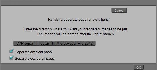
Then my help is in the menu: Scripts \ Rendercontrol \ Renderpasses:

And all I have to do is to click the presented folder path to set a better path for the results. It’s well advised to make an empty folder for each run in order to avoid overwriting files. Then I click [OK] which gives me – for a two light scene and both the extra ambient and occlusion passes checked – with four (PNG) files.

Now I alter the Render Settings, check Cast Shadows and Shadows only, Save Settings, go for the RenderPasses script, select a new “Shadows” folder (which I’ve created first), and click [OK]. Same files, but:

  • The files call Light 1 and Light 2 are the shadows of those lights, so I might rename them to Shadow 1 and Shadow 2 respectively and add them to the previous collection with the Light files.
  • The Ambient pass and Occlusion pass files can be discarded. Even better, the y can be checked OFF in the dialog box. With shadows only there will be no meaningful Ambient result while the Occlusion result will be the same as in the previous run. I will not use Ambient in this chapter, though.

Notes:

  • For all lights, switch OFF their Occlusion settings, and set all of them to 100% intensity, full white, 100% shadow.
    I prefer raytraced shadows for better quality and I have raytracing switched ON in the Render Settings. But that’s a personal preference only, shadow maps will work as well.
  • Following the routine from the chapter on shadows, I perform the shadow-run twice.
    First, all my lights have hard shadow setting (radius 2, samples 20).
    Second, all my lights have soft shadow setting (radius 20, samples 200).
    Next to the Shadow 1 and Shadow 2 files, this gives me Soft Shadows 1 and Soft Shadows 2 as well.
  • When you’re using Poser Pro, be sure to switch OFF Gamma Correction for the first, shadowless renderpass. Otherwise you’ll end up with a too much bleached result. For the shadow passes, it’s better to leave GC ON.

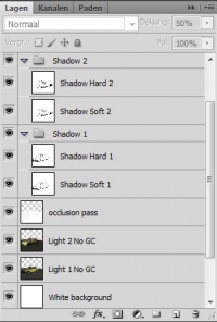
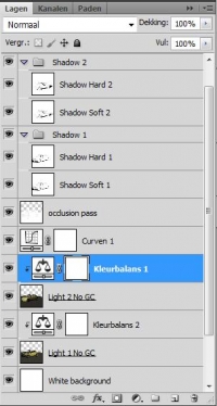
Okay, now I’ll have to combine the intermediate files to Photoshop layers. Like in the previous chapter, I make a white background layer to handle the transparencies from the PNG files, and I bring in both Light layers. The first one is set to normal blending (with the background) and the second is set to Screen blending. This blending mode acts if you’re projecting a slide on a wall, which is exactly what happens when we’re adding lights. To reduce the intensity of the second light relative to the first, I can reduce the opacity of that light-layer. If I want to intensities just the other way around, I have to swap the Light layers (and their blending modes).

Then I add the shadow layers. Occlusion – or: self shadowing – has its own blending mode and opacity, the other Hard- and Soft shadow layers per light can be grouped. Each group has Multiply blending and its own opacity, and within each group hard and soft shadows can be balanced separately.

Now it becomes so easy to play.

Softer shadows (group opacity to 50%, hard shadows opacity to 15%), a brightness boost using a curves adjustment on the light-layers, and a color balance adjustment to both lights: more green to Light 1 (right/back side), more red to Light 2 (left/front side).