Poser Pro Gamma Correction reconsidered
So enabling Gamma Correction in Poser Pro is “the thing to do”? Yes, with some precautions.
Textures which should not be corrected
Simply stated, textures which contribute to the color of the result should be corrected back, and forth. But textures which contribute to the amount something happens, the values, should not be corrected.
So if this texture is used in:
- Diffuse Color & Value
- Specular Color & Value
- Ambient Color & Value
- Translucence Color & Value
- Reflection / Refraction Color & Value
- Alternate Diffuse / Specular – both Color & Value parts
check “Use Gamma from Render Settings”, which is the default.
And if the texture is used in
- Specular Highlight Size
- Transparency, Edge and Falloff
- Bump, Displacement, Gradient_Bump
set the Custom Gamma value to 1,00. In the Wacros, button UserDefined, or menu Scripts, MaterialMods, you’ve got a “changeGamma” routine. Enter 1,0 for Gamma, select All props and figures, and find out that this routine works on Bump, Displacement, Gradient_Bump and Transparancy. On the other material aspects mentioned this has to be set by hand, although using image-maps in these cases is pretty rare.
But things can get complicated. All color swatches are dealt with automatically (against the Render gamma value). But numerically derived colors, e.g. when using the “UserDefined’ node in Materials Room, are not. And (greyscale) color swatches which are used to communicate value are corrected when you don’t want them to. And mixtures of everything (e.g. resulting from Bagginsbill great VSS node system or his MatMatic materials generator, or Snarlygribbly’s EZSkin) do require close examination. Such an examination is discussed below.
Textures which should be corrected differently
The Custom Gamma Value in the Texture Manager usually is used to state that for this texture gamma should be one, or: not part of the correction process. Inputting the same value as used for Render Gamma makes it equivalent to Use Gamma from Render Settings, the default for textures and the standard for all color swatches. But how about using something different?
When a texture is too bright or too dark, you can correct for it in Photoshop, but you can also treat the image as the result of an image handling process under an incorrect gamma value. If it’s too bright, put in a higher gamma value to take the extra light out. And vice versa, when it’s too dark, put in a lower gamma value to prevent the light taken out too much.
1.8 comes to mind, compensating for the old Mac system / hardware monitor gamma.
Remember, the texture gets the gamma function applied in the first place: it will be darkened. Then it will be used in the rendering, then the total result including the effects of light and shadow will be brightened. This will sort of undo the darkening, and effectively limits the effect of gamma correction to the lighting and shadowing effects.
Materials which are handled incorrectly
This is the story of a well-known Poser material – the Vicky 4 out-of-the-box natural skin & body texture (sample, standard or high resolution, with or without genitals), which suffers under the effects of the Poser Pro Gamma Correction.
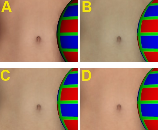
The figure shows Vicky (with a red green blue ball), in the out-of-the-box texture, rendered with Gamma Correction = 1 (A), the equivalent of a normal (non-Pro) Poser render. Looks good, just slightly reddish.
B is the Poser Pro render result of exactly the same Vicky, Gamma Correction set to 2,20. All natural looks have gone, Vicky is turned into some vampire / zombie crossover.
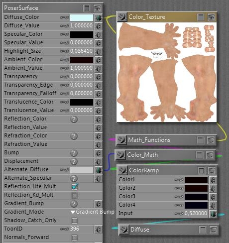
How come? Let’s have a look at the material definition: I’ll come to the cyanic Diffuse_Color later, and have a look at Ambient first. It’s fully switched ON with a value of 1, and when the color swatch is opened is reveals a 20/0/0 color, or: 8% red. So the Ambient will cause a mild red glow over the body, creating the translucent skin impression without the costs of Translucency itself.
Then, the Alternate Diffuse. It looks intimidating but actually the Diffuse node generates exactly the same light-fall-off as the normal Diffuse Color/Value channels in the material itself, and the Math_Function and Color_Math don’t do anything else but multiplying the texture map, turned to greyscale first. The ColorRamp creates an additional tinting, as the swatches go from deep red (10/0/0) via a slightly brighter red (20/0/0) via deep purple (4/0/8) to deep blue (20/0/0), in the end multiplied by about 80% grey in the Alt_Diffuse colorswatch itself.
In other words, the Ambient channel adds a 8% red glow while the Alt_diffuse adds another say 6% red/purple/blue shine. Therefore, we’ll have to take out about 14% of the reds in the Diffuse channel itself, for compensation. This is exactly what is accomplished by the cyanic 214/249/249 = 86% red / 3% grey color setting – the latter compensating for the glow itself as well.
When Gamma Correction is applied to this material, not only the texture but also the color swatches are darkened first (anti-corrected), before the final result is brightened up (gamma corrected) in post-render. Unfortunately, this initial darkening is not a linear process as we’ve seen from the curves. So, the dark swatches introducing the additional skin tones in Ambient and Alt_Diffuse are treated different from the bright cyan and bright grey in Diffuse and Alt_Diffuse respectively. The darks are darkened more than the lights, the cyan wins the battle, and as a result Vicky’s skin gets this zombie color tone (see A and B in the image above).
For a solution, you have to alter all materials in your scene that have this ‘semi translucent sub surface scattering’ setup for skin tones. Just halving the effect of the cyanic swatch (to 235/252/252) produces result C, which to me looks like a step in the right direction. The extreme, using white in the Diffuse Color instead, produces result D. To me it gives a bit too red impression. Perhaps setting the Diffuse Color to something in between or setting the Diffuse Color to C plus changing the Alt_Diffuse from 80% to 90% might give the best results. Things might be slightly different for Asian, African, etc skin tones. Your call, your image.
This example just shows how sophisticated material setups can get distorted by Gamma Correction, especially compensation mechanisms (aka Color Math) might go wrong.
Next to that, those “advanced” materials have problems when being translated to other programs. Like Daz Studio which has no Alt_Diffuse (and so: missing half of the red tone showing a C-like result in its renders) or LuxRender where Ambient has to be switched off too in order to avoid Vicky to behave like a lamp. But that’s something entirely different. Well, not completely, as the issue discussed here was the result of translating a Vicky scene from Poser to Poser Pro.
More examples
Gamma Correction can interfere with sophisticated material setups. Some people create such setups in Poser (without gamma) and then find out they don’t behave well in PoserPro, using GC. Then they blame GC for it, instead of slapping themselves for creating something without taking GC into account properly. Duh!
For you and me, using those setups and not really willing to make structural adjustments ourselves, the question is to find the proper dials to turn in order to straighten things up a bit. Essentially: dark color swatches will loose their effect when CG is switched on.
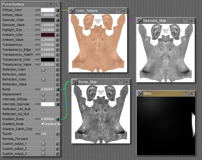
So let’s find out what we can expect from Vicky’s Wet Skin as it comes with the package.
Diffuse takes the texture with a white color swatch, as does the Alt_Specular takes the Blinn shader. White will stay white uder GC so both will pass unaffected.
But Specular takes the map with an 18% grey in the swatch, while the Ambient color contains a 13% red. Both will get reduced severely, and therefore the GC body of Vicky will show less shiny and less red than the non-corrected one.
Actually, I can restore the situation by boosting the 18% grey to 50% and the 13% red to 40%. I’m gamma correcting them by hand, I cannot do it otherwise.
The headache scenario
The Anti Gamma Correction in Poser does affect texture maps and color swatches, but not the values and the math. Let’s find out what that brings us. Roughly, it brings me a load of puzzles on how to build a proper node tree in the Materials Room.
Distorted additions
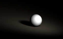
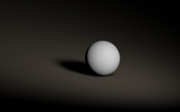
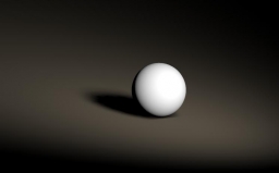
In Poser, the effects of lights are simply added up. Two lights at 60% each make a 120% light. This results in an overlighting situation, the render is clipped at 100% and all nuances get lost. But applying Gamma Correction makes a difference. The 60% is Anti Gamma Corrected into 32,5%, so two lights make 65% together, which then is Gamma Corrected to 83%. And now the entire clipping effect is gone! (Note: the ball has Diffuse only, no Specular)
| Without Gamma Correction, 2 * 60% light | 2 * 60% light with Gamma Correction |
Personally, I like the second one far better as clipping is an artifact. But my bottom line here is that Gamma Correction is not just an adjustment of the render result, as can be derived in post as well. Thanks to Anti Gamma Correction, you really get a different image.
This not only holds for adding lights, it also holds for adding Specular to Diffuse, and to adding other channels as well (Ambient, Reflection, …). Gamma Correction is fine as it can be done in post as well. But it comes with Anti Gamma Correction sandwiching the rendering, and that really alters the result. Your image, your call.
Distorted multiplications
Poser Anti Gamma Correction does work on textures and color swatches, for surfaces, lights and more, but does not work on values. As a result, just in the simple case discussed above with two lights at 60%, I get different results depending on whether I put 60% in the intensity (value) or as a grey hue in the color swatch:
| with CG, 100% white, 60% intensity | with CG, 60% white, 100% intensity |
So you still experience the overlighting and clipping in the left image, also it doesn’t show that much thanks to the brightening of the Gamma Correction in its near environment. By putting the light intensity in the color swatch instead of in the numericals, you do get the better image. This holds in all cases of the Material Room.
Distorted color for value
So it does matter whether I use a reduced value instead of a darkened colorswatch?
Yes, the first will result in a brighter result with the risk of clipping and stronger brightness contrasts, like brighter highlights and deeper shadows. Just because it is not reduced beforehand by the Anti Gamma Correction.
And if I use a texture or a color-constant instead of a value (like plugging a greyed colornode into a value of 1)?
Then that’s like an adjusted colorswatch, as all swatches and textures are affected by the Anti Gamma Correction.
What is best?
For those channels which ought to be affected by Anti Gamma Correction (that’s about everything except Bump, Displacement, Transparence and the like), you’d better leave the values at 1 and use a swatch or texture for the nuances.
Is there a difference between using two similar lights at the same place, or just doubling the intensity value?
No. This is exactly why the Anti Gamma Correction leaves the numericals alone. Otherwise the result of Poser Gamma Correction would become completely unpredictable.
How do I deal with the complex node-constructions that can be found in Alternate_Diffuse and Alternate_Specular?
You’ve got to analyze them in detail, or trust the constructor for having done so. The best construction takes sets all Image Gamma to 1 and puts in a Gamma node just before the Alternate input connector. But one should be aware that all color swatches always go against the Render Gamma setting.
Can the Anti Gamma handling of colorswatches be avoided?
All color swatches always go against the Render Gamma setting, but one can use the User_Defined node which uses numericals to generate a color, and is therefore immune to the Anti Gamma Correction.
What about Refraction?
Value and color determine the color of the refractive, or: transparent material. Like in all similar cases, you’d better make dark green glass by choosing a dark green color, instead of a green color and a low value.
The amount of refraction, the optical effect of bending light when it passes through an object, is determined by the Index of refraction (IOR) in the Refract node. This is not affected by Gamma Correction.
And Reflection?
Well, I can use either the Refract node or (in P9/PP2012) the Fresnel node. The latter is meant for transparent reflective materials, like glass, and the reflectivity is derived from the index of refraction. Note that using a color swatch or refraction value not only will alter the refraction, but the reflection too. Usually, reflections are uncolored.
Metals are the exception to this: they have no other properties than reflection, but when they are bad reflectors they look grey and vice versa (like puter), and when they are just relatively worse in reflecting bluish colors they appear yellow to reddish, like gold and copper.
Again, don’t put the reflectivity in the reflection value but combine it into the colorswatch: lower reflectivity implies a darker color. Then the anti-gamma / gamma sandwich around the rendering will result in a proper amount of reflection. When you reduce the value instead, you’ll end up with a far to reflective surface. Which might be great, but not for photorealism. As always, your image, your call.
