Managing Poser Scenes (12. Lights Advanced)

Poser lights have their shortcomings, when I want to use them as lamps in real life. Poser lights are extremely small, therefore they produce very hard shadows, and they lack the atmospheric scattering which is always present in real-life environments. And… real-life behavior takes lots of resources when rendering. All this can be compensated for.

Shadow Bias

Then we’ve got the magical Shadow Minimum Bias property, what does it do and why?

Well, technically it takes a shadow casting surface, shifts it a bit towards the light, calculates the shadows onto that uplifted surface, and then assigns those shadows onto the actual shadow casting surface in its original position.

The advantage comes when handling displacement maps and small scale surface detail. Without the bias, every detail has to be taken into account as it warps a tiny shadow onto the surface. Those shadows are quite unnatural, such minor irregularities don’t warp shadows at all. The light bends around them, and the scattering in the atmosphere will make the thin shadow fade away. Besides that, it’s an enormous job for the shadow calculations. With the bias, only details that rise (or sink) more than this value will be taken into account. This enhances the natural feel of the shadows and it saves processing effort as well.

The downside is: it creates an artifact as the shadows themselves are somewhat displaced relative to the objects. To a minor extend, this is acceptable but larger values produce notoriously incorrect results.

Actually, the default 0.8 is quite a lot already so in my opinion one should never exceed 1. On the other hand, 0 cracks the renderer so 0.000001 is the real minimum here and will make shadows from every surface detail. Perhaps 0.1 would be a nice setting.

Ambient Occlusion

Direct lights warp direct shadows, either mapped or raytraced. Indirect and Image based Skydome lights generate an omnipresent ambient lighting which hardly warps shadows at all. But that is incorrect, as in my room the lighting level under my chair is much higher than that under my PC cabinet. Objects and surfaces close to each other hamper the spread of ambient lighting, they occlude each other from the ambient light.

In the early days of Poser, this Ambient Occlusion (or: AO) was dealt with as a material property, hence the Ambient_Occlusion node in the materials definition. Actually this is weird, as AO is not the result of a material but the result of the proximity of objects or of object elements (hence: the shape of an object). Above that, AO is mainly relevant to Diffuse IBL lights which generate the shadow-less omnipresent ambience.

More on that later.

Light arithmetic

In real life, when light shines on my retina or on the backplane of my camera, one light shining at a surface fires some percentage of the light-sensitive elements. A second light then fires the same percentage, of the remaining elements. As a result the non-fired elements reduces to zero when adding lights, and the captured lighting level increases to 100%. Photoshop (or any other image handling program) does a similar thing when adding layers using the Screen blending mode.

Poser however just multiplies and adds up. A 50% white light on a 50% white object results in a 50% x 50% = 25% lighting level. A 100% white light plainly lighting a 100% white object results in 100% lighting level. Two of those 25% lights make a 50% lighting level, or in the second case: a 2x 100% = 200% lighting level in the render. And this latter will get clipped (back to 100%) when establishing the final output, resulting in overlit areas. As in the first case, five lights on a grey object will cause overlighting too.

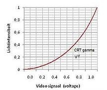
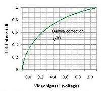
Things will be slightly different when Gamma Correction is applied. Then, first, all lights and objects will get anti-gamma-corrected (darkened), let’s say the 50% reads as 20% then, but 100% stays at 100%. In the latter case, nothing changes: one light on a white surface makes 100%, two lights make an overlit area in the render. The first case however produces a 20% x 20% = 4% lit area, two lights make 8% (Poser still just adds up), and now that intermediate result is Gamma Corrected to say 35% instead of the 50% without GC.

But even 24 lights add up to 24 x 4% = 96% which gets Gamma Corrected to 98% in the final result, in other words: Gamma Correction prevents – to some extent – severe overlighting. Actually it dampens all effects of lighting and shadowing.

Light materials

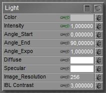
Poser direct lights appear in the Material Room as well, having Color, Intensity, Diffuse and Specular as the main parameters. Other parameters mainly serve legacy situations and can be discarded.

Color and Intensity team up (multiply) to fill the Preview, and give me light on my work. While rendering, the Diffuse and Specular channels kick in as well, and multiply with the Color x Intensity just mentioned.

This implies that blacking out the Diffuse make it turned off for diffuse lighting in the render, while still lighting the preview, and making specular in the render as well. This is great when working with IDL lighting which caters for all diffuse lighting itself, but fails to light the preview and does not produce specularity either. Similarly I can produce lights that make diffuse light only, with the Specular channel blacked out. Or lights which contribute only to the preview, having both Diffuse and Specular blacked out.

I also can have strong lights in the preview but have them dimmed in the render, by having reduced intensities (grays) in the diffuse and specular channels. And I can confuse myself a lot, by using some white hue in the preview but using some color while rendering. I never do that, though.
Next >>

Managing Poser Scenes (13. Direct Lighting)

Poser offers several types of direct lights: Point Lights, Spot Lights, Infinite Lights and ImageBased Lights. Poser does not offer Area Lights, nor shaped lights like neon texts, as a direct lighting source. These can be emulated by Indirect Lighting techniques, which are discuscced in a later chapter.

Point Lights

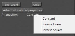
A Point light differs from an Infinite light in just a few ways. First, is has a location X,Y,Z and so it has a distance to figures and props in the scene. As a consequence, attenuation and distance related intensity falloff can be supported. In the light properties, for a start. Constant means: no drop, like the infinite light. Inverse Square means an 1/x2 or: following physical reality for a singular light bulb. Inverse linear means 1/x which is just somewhat in between, a bit like the falloff from a lit shopping window or a long array of street lanterns.

The Constant attenuation works with the parameters Dist_Start and Dist_End.

These imply that the intensity drops from full to zero – linearly – in the given distance range. In this example, a 100% light remains so until 5mtr, and then drops with 20% a meter till after another 5 mtr there is no intensity left.

Note that this distance-drop works for Pointlights as well as Spotlights (even if the title says: Spotlight), and works for Constant attenuation only. Inverse Linear or Inverse Square attenuations remain as they are, they do not respond to this extra distance drop. When Start as well as End are set to 0, there is no drop, which is the default.

Spot Lights

In addition to Point lights, Spot lights have an additional “light beam width”. The light is equally intense in all directions, then drops off (linearly) from the Angle_Start to the Angle_End.

Personally I don’t understand the default, who wants a gradual falloff from the heart of the beam to 70°? When the flaps could open up to 180° then the spot would turn into a point light, but they can’t: 160° is the max. In reality, 80° to 90° might be a decent maximum. I guess real light dims within 20°, so flaps at 80° would suggest an angular dropoff from 70° to 90°.

Spotlights are the ultimate candidates for making beams in fog and other atmospheric effects. This is dealt with in the chapter in Poser Atmospherics, later in this tutorial.

Bulbs and Window Panes

In the real world, lamps are not infinitely small. Lamps may come as bulbs (say half to one inch radius), but also might be as large as a shop window, or even a street full of shop windows.

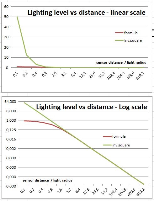
Very close to the light, there won’t be any falloff when we move gradually away. Very far from the light, every lamp becomes a point light and will have inverse-square falloff. This is illustrated in the graphs, the green one presenting inverse square, the red one a lamp with some real size.

For a disk-shaped light source (as a point light with some size at a distance) with radius R lighting and a sensor at distance d, the light captured by the sensor is directly proportional to

{ 1 – 1 / sqrt[1+ (R/d)2] }

From the graphs it becomes apparent that when the distance becomes more than twice the radius of the lamp (value 2.0 on the horizontal axis), this falloff behavior becomes about the same as ideal inverse square falloff (red and green curves match), and hence the lamp can safely be considered a point light.

Window panes – although not circular – will not be that different. I can use half the average of width and height for “radius”, and I can use a distance : size ratio of at least 3 or even 4 to be on the safe side when I want to. But at least I do know that for distances larger than say 3 times the window size, the inverse square law holds pretty well, while for distances smaller than say half the window size, any falloff better can be ignored.

Light Strips and Softboxes

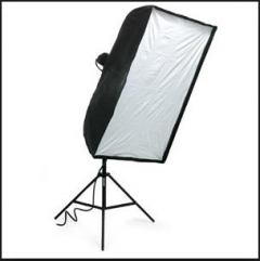
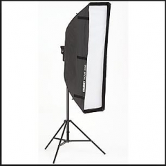
Photographers use softboxes (square-ish) or lightstrips (quite elongated softboxes) instead of flashes, for the simple reason that the larger the light, the softer its shadows will be. So softboxes are a nice way to simulate environmental, ambient lighting while flashing under studio conditions.

Something similar holds for Poser lighting as well, and one might like some softbox equivalent in the 3D scene. Unfortunately, Poser does not support Area Lights, which would be ideal for this.

This leaves two alternatives: I can make one from a glowing rectangle under IDL conditions, or I can stack a series of direct (spot)lights together in a row or matrix. Indirect or direct lighting, that’s the question. The first option will be investigated later in this tutorial. The second option takes one spotlight, flaps wide open, in the middle and four around it at the corners. Of course one can make up larger constructions, but it’s doubtful whether that pays off. Parenting the corner-ones to the middle one enables me to use the shadow-cam related to the middle one for aiming the entire construction.

Middle spot only at 100%

5-spot rig, 2×2 mtr wide

The result, 10% + 4x 22,5%

Then I’ve got to adjust the lighting levels, and make sure the sum of the intensities matches the original intensity (or just a bit more, to compensate for the corners-lights at some distance of the main one). Like 10% (middle) + 4x 22,5% to make 100%, or 15% + 4x 30% = 135%. Next to that, I adjust the shadowing (raytracing, blur radius 20, samples 200) to soften the lighting even further, as I can reduce the shadow parameter itself to say 80%.

What is a good size for softboxes? Well, photographers are quite clear about that. A good box is at least as large as the object to be pictured, and placed at a distance at least once, at most twice the size of the box itself. So, for the mildly zoomed out result above, the 2×2 mtr software actually is too small, and probably a bit too far away as well.

Should I set attenuation for the lights? Well, an object so close to the softbox should be considered as a person standing in front of a shopping window. And in the paragraph above on window panes I argued that the range between one and two window-sizes meets the transition area between no attenuation (till say half the window size) and neat point-light-like inverse square attenuation (from say three window sizes). So I can pick inverse-linear as a go-between or use the Dist_Start and Dist_End parameters for each lamp to ensure the softbox is working on the object only, and is not lighting the background, as is done in real life too.

Diffuse IBL

This technique is a first attempt in the graphics industry to make a) better environmental lighting and b) create lighting in a 3D scene which matches the colors and intensities of the light in a real scene. The latter is required to make a smooth integration of 3D elements into real-life footage.

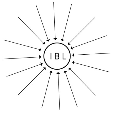
First, this technique uses an “inverse point light”, that is the light rays in the 3D scene will be treated as generated from an all-surrounding sky dome – which is not really present in the scene – towards the IBL Light. Or: the IBL-light is the “source’ of light rays which are treated as travelling inward. Whatever view fits you best.

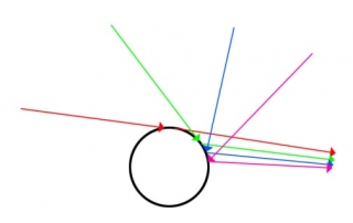
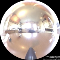
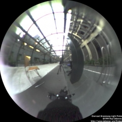
Second, all those light rays get their color and intensity from an image map. When this image map is folded around a tiny sphere at the place of the light, then each point on the sphere presents the environment, sky as well as ground, when looking around from the center of the sphere. The image map can be obtained by taking a picture of such a (very reflective) spherical object in the real life scene.

Indoor sample Outdoor sample

So one also can say: the IBL light projects the image map onto the (imaginary) sky dome in the 3D scene which then re-emits that light back to the IBL.

In the meantime, the industry has developed the concept further, and especially tried to replace the reflective ball by panorama photography and multi-image stitching, or by other types of mapping the obtained images onto the IBL, aka the virtual sky dome.

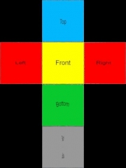
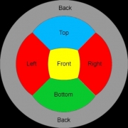
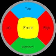
Cube mapping Panorama Angular map Mirrored ball

Poser Diffuse IBL (Image Based Lighting), works in the Diffuse (Reflection, etc) channels but not in Specular (nor Alternate_Specular): Poser IBL lights cannot produce highlights, I need one of the other direct lights for doing that.

Poser IBL is quite good in creating an ambient, environmental lighting in a fast way. As a result, it’s not so good in creating a similarly improved, matching shadowing. This introduced the need for AO, Ambient Occlusion, the shadowing of ambient, environmental lighting which makes it darker under tables and cupboards, and generates self-shadowing in objects with a complex geometry.

In Poser, and in lots of other programs, the developments continued. And so did the processing power in our PC’s. This introduced IDL, Indirect Lighting, with sky domes or other scene-enclosures which radiate light by themselves into the scene, and which can be textured in the regular way. Fading out IBL as a lighting solution.

Next >>

Managing Poser Scenes (14. Indirect Lighting [IDL] )

Indirect Lighting, aka IDL, is a computational intensive lighting strategy which can be considered the successor of IBL, Image Based Lighting. The use of it can be switched on/off in Render Settings. The basic principle of IDL is that loads of light rays travel around through the scene, hitting objects, and be re-radiated by those objects again usually with an adjusted color and intensity. This supports ambient lighting, indoor lighting from outdoor sources, radiating objects, radiosity (colors spilling over to neighbor objects) and proper mild shadow levels.

For a start, just a collection of notes and remarks:

  • * IDL is a successor of IBL, easier to use but far more computational and memory intensive. So, when IDL is not really working for you in a specific scene or on specific objects, consider re-introducing IBL as an alternative.
  • * Like IBL, IDL is working on Diffuse channels only, including Reflection, Refraction, Alternate_Diffuse. It is explicitely not working on Specular (and Alternate_Specular, and any specular material node wherever in the shader tree).
  • * IDL lights do not show in preview. As a result of this, and of the previous point, consider to use direct light in the scene with the Diffuse disabled (blackened out). And eventually, with Specularity blackened out too.
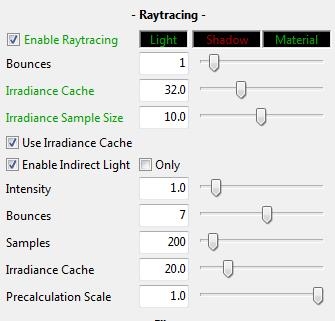
  • * IDL renders best (for final results) with Irradiance Caching ON, value at least 80 at most 90, and with IDL ON, Quality at least 80 at most 90. Lower values introduce noticeable splotches all-over the image, and overly dark shadows in self-shadowing areas. Higher values take a lot of time and resources while not adding noticeably to the result.
  • * It should be clear then that IDL does require raytracing to be active. This also introduces another mechanism to let the light rays die: when the limit for bounces is met, as set in Render settings, Poser cuts off any further handling of them. This will darken the ambient lighting, might introduce artifacts, and is explicitly meant for speeding up draft renders. Please set Bounces to the max when making your final render.

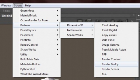
An interesting point is: I can launch the rendering from the Dimension3D menu too, and get access to additional settings. Indirect Light does have its own Bounces and Irradiance Cache, next to the generic ones for AO and reflection / refraction.

  • * IDL renders best when the scene is enclosed by a sky dome, walls of a room, or anything alike that traps the light rays and keeps them bouncing around.
  • * IBL comes with AO (Ambient Occlusion) to improve on shadowing from ambient, environmental lighting. Any other direct light should have AO switched off. Also, AO should be off under IDL conditions as IDL generates its own shadowing. Again: AO is for IBL only.
  • * IDL lighting can be switched off per object, by switching (off) the Light Emitter property of that object. This is worth considering: * for Skin, as Ambient is used sometimes to mimic translucency and subsurface scattering in a fast way, for the older Poser versions. Don’t let your characters be a light source, switch Light Emitter off. * for Hair, as light rays will bounce around forever requiring about infinite render times without adding much to the result. You will then lose the ambient lighting and additional shadowing for that object; it might look a bit flat. Think IBL + AO as an alternative.
  • * As the environment is supplying a lot of light, either by bouncing direct light around or by adding light from glowing objects (and especially: all-surrounding sky domes), I need far less lights and far lower intensities compared to non-IDL scenes. As a consequence, all the advanced lighting rigs constructed for non-IDL scenes – emulating environmental lighting with lots of direct lights all around, won’t serve very well any more. All I need is a glowing dome for sky, an infinite light for sun, and perhaps one or two spots for support and flash.
Radiosity

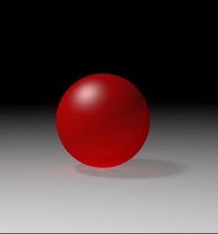
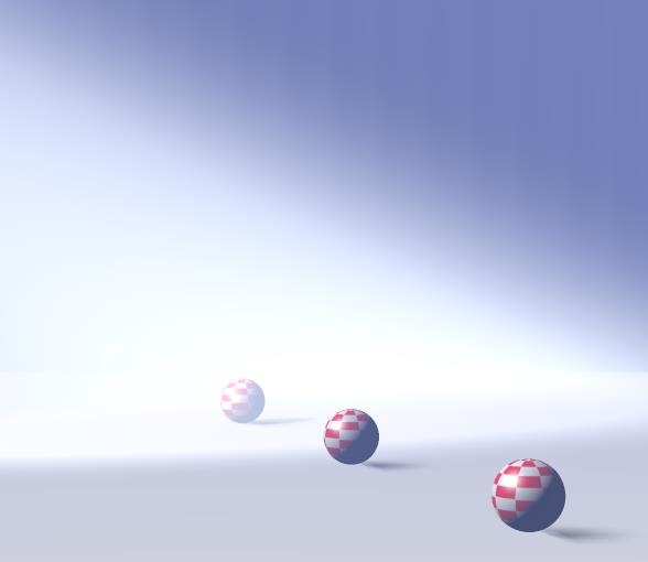
Objects which catch light, re-emit light after merging in their own colors, and reducing intensities. This makes a bright red ball warp a reddish light around, noticeable on white floors etcetera.  This is the basic principle of Indirect Lighting and served automatically when this lighting mechanism is enabled. The re-emitted light then is used in all further IDL lighting as well, the light rays either die from energy loss or from being captured by the camera (or by being killed by Poser when Bounces is set low).
Light Emitting Objects

In order to use IDL, I need at least one light emitter which sends out rays. This can be a regular direct light, like point, spot or infinite. Such a light is required anyway for creating specular effects and additional shadowing, but for (diffuse) lighting itself I don’t need direct lights at all.

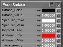
I can make an object glow, by assigning it a high level of Ambient as a material, and it will serve as some lamp immediately. The larger the Ambient_Value, the higher the intensity of the light, the stronger the lamp.

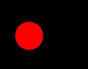
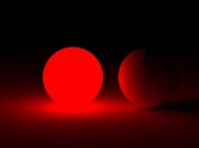
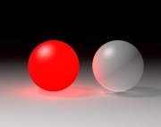
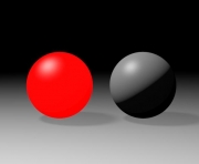
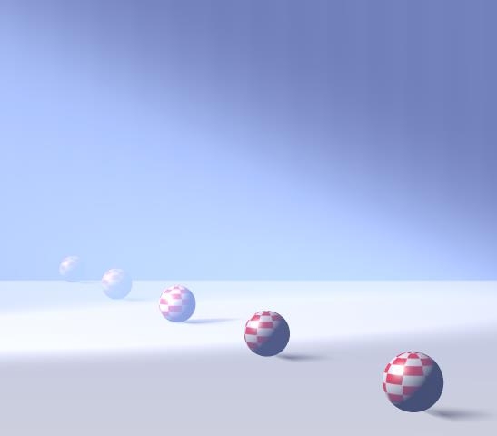
Two balls, one glowing, IDL off, no direct light Same scene, IDL on Same scene, IDL, extra direct light on Same scene, IDL off

Note the strong shadows in the rightmost image, which lack in the third where the white floor is bouncing the direct light, reducing the shadows at the lower back/right side of the white ball. The second image shows shadows from the right ball onto the floor caused by the glow/lighting from the red ball at the left, and also demonstrates the lack of specularity (highlights) in IDL lighting.

Sky Domes

IDL works best when the entire scene is embedded in some kind of enclosure, like a box (walls, floor, ceiling for indoor shots. For outdoor shots, the answer is: a sky dome. I could use a normal (hires, half a) ball at a large scale, but dedicated sky domes have even a larger resolution (more polys to reduce smoothing artifacts) and have their normal pointing inward which generally is not the case with regular objects. And I can apply a texture to the dome to obtain the lighting conditions as were, or could be, present in a real life scene. Large shots from landscape generating software, like Vue, serve pretty well here too.

Note that the Diffuse material channel will “reflect” the regular lighting in the scene, and the Ambient channel will make the dome glow by itself. The latter is the usual response to sunlight, scattering through the atmosphere. The sun itself is best represented by an infinite light, within the dome. Then I raise Ambient_Value to get the proper intensity for this generic atmospheric lighting.

When the sky dome is used for color and intensity of the indirect light, scattering all around, the resolution of its texture map is not an issue. But that leaves the question: is the texture on the sky dome fit for purpose as a background image? Usually, it’s not.

Consider a camera at normal lens settings, that’s 35mm focal length and 40° Field of View (see table below), taking a shot (render) of 2000 pixels wide. The full sky dome, being 360° all around, then would require 360/40 = 9 times my view. And good texturing practices require at least double the resolution of my render. So the sky dome should be assigned a 2x 9x 2000 = 36.000 pixels wide texture, at least. Note that Poser takes 8.192 for max texture size, and you know you’re stuck.

Note that the size of the skydome – or any other 360° environment – does not matter. The Field of View matters, as a shorter focal length (typical for landscapes, say 20mm) increases FoV to 60°, and reduces the required texture to a 2x 360/60 x2000 = 24.000 pixels width.

Focal length (mm)

10

20

30

35

40

60

90

120

180

Field of View (°)

90

60

45

40

30

22,5

16

12

8

So the bets are that you’ll end up with say 8000 pixel wide panoramic image for the skydome, which is too low a resolution for proper background imaging, plus some background image prop holding another 2x 2000 = 4000 pixel wide portion of the high-res version of the panorama just covering the left-to-right edges of the rendered view.

Since this billboard prop might block the skydome lighting considerably (ensure it does not cast shadows, highlights etc) when placed nearby the dome it might need to serve as an active light emitter, the same way the skydome does. When the prop resides at some distance from the dome however this might not be necessary, so you’ll have to test for this a bit.

Next >>

Managing Poser Scenes (15. Atmosphere)

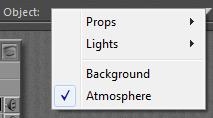
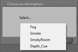
The Poser atmosphere has three aspects: Depth Cue, Volume (both through the Material Room, Atmosphere Node) and Lighting (through the Properties of a Direct Light (Spotlight, eventually Point light). Depth Cue and Volume can be set independently, the Lighting works with the Volume settings. Material Room also has a big button (Wacro): Create Atmosphere. There are various standard options to choose from:

So, let’s take each element apart, and combine them later. Before I dive in: these effects are visible only against objects, reflecting light towards the camera which then is filtered through the atmosphere. Just having a set up a background image and the Poser ground won’t help. You do need a real ground object, and a real backdrop object even when it’s painted black.

Depth Cue

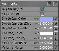
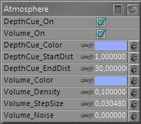
The Atmosphere Node, accessible in the Materials Room, presents for DepthCue: On, Color, StartDist and EndDist.

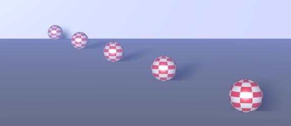
Depth Cue adjusts the color of objects towards the DepthCue_Color, such that all objects less that StartDist from the camera are not affected, all objects more than EndDist are fully effected and take that specific color only regardless of its materials, and everything in between is effected linearly (so an object at 30% between Start and End gets 30% of the DepthCue Color and 70% of its own.

This reflects the presence of damp or fog, which colors objects slightly towards bluish grey (large outdoor scenes) or to white (real fog, smaller outdoor scenes). It is also a great way to mimic environmental (indirect, IBL) lighting without the rendering costs, for instance sliding colors towards green in a deep forest, and it’s also great for creating under water scenes, coloring towards dark bluish / greenish cyan.

A common trick is the use of “black fog” making objects fade into the dark. Great for evening shots. Or use dark blue, for graveyard and gothic effects. The main thing is: Depth Cue relates to the camera looking into the scene, independent of the lighting.

Thanks to the on/off switch it can be activated independent of other effects to ease setting and evaluating the proper values, and to make atmospheres with volume without depth cue, or the other way around.

Volume

As Depth Cue relates to the camera, so does Volume relate to the lights. Volume effects can be switched on/off themselves too, so they can be set independent of the Depth Cue effects.

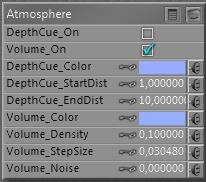
The main parameters are Volume Color, and Density. When a direct light illuminates a volume in the scene, that volume acts like a transparent fuzzy object with that specific internal color. The lower the Density the more transparent it seems. On the other hand, each light can have its own Atmospheric Strength parameter:

So some lights can interact more than others. For example:

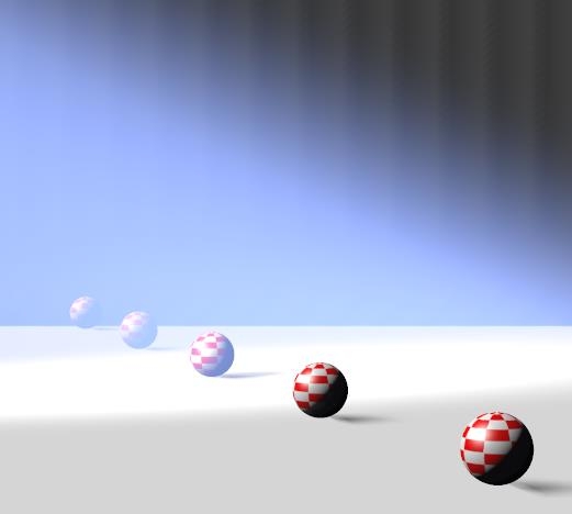
One infinite white light, Atmospheric Strength as low as 0.000010 plus one white spotlight, angular falloff from 10 to 20, Atmospheric Strengths as high as 0.100. From the different settings of the lights one can discriminate the spotlight from the overall scene lighting. The bluish color is from the Volume settings.

I noted that especially Volume effects take some time to render. A larger stepsize speeds up the calculations at the cost of quality and detail. Increasing the Noise parameter helps to improve on the quality especially at larger stepsizes.

Volume and Depth Cue together

As said: like Depth Cue relates to the camera, so does Volume relate to the lights. But atmospheres of course do both: light rays travel through the atmosphere before they hit an object, and then travel through the atmosphere again to hit the camera. So, let’s add up Depth Cue and Volume:

Which gives me:

The art of making atmospheres now focusses on mixing the proper colors and balancing the other parameters, Volume Density versus Depth Cue Start/End. This happens when I just brighten the Volume Color:

The beam stands out more, but I’ve lost the two balls in the back.

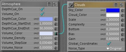
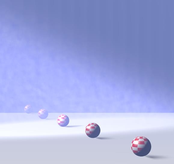
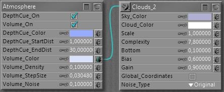
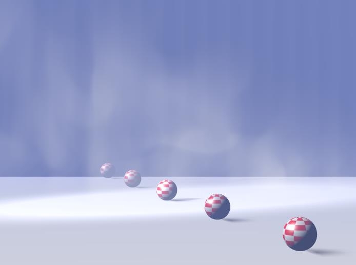
Introducing some structure however (assigning a clouds effects to the Volume):

Given render times, it might be an idea to construct the atmosphere in a simplified version of the scene. Then build the scene with the atmospherics switched off. Ultimately, switch on the atmospherics in the final, detailed scene. From the examples above we learn that we should not spend too much time in tweaking the details of the far away objects.

Standard Atmospheres

The Create Atmosphere Wacro button in Material Room presents four standard settings, as a start for my own:

Fog

Just assigning its own specific Cloud node to an existing Atmosphere node, which does not have any parameters changed.

Smoke

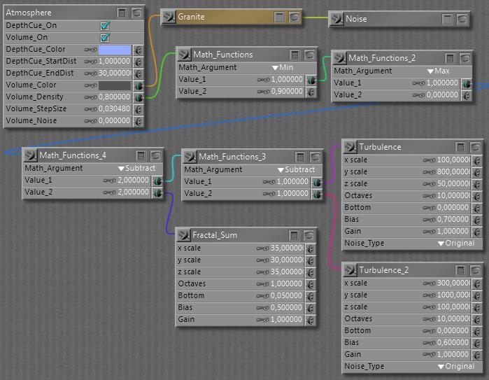
This Wacro changes the atmospheres Volume Color and Desity, and adds a serious set of nodes to both of them. Which does have an interesting effect:

It’s really different, isn’t it? Looks great as a morning fog above the water too, it looks as moving upward.

SmokeyRoom

Does a similar job, except it replaces the Fractal_Sum function by an extended set of nodes, resulting in:

Different structure in the beam of light, this kind of smoke seems to build up, thanks to the ceiling in the room.

Depth Cue

This option leaves all Volume settings as they are, but alters the Depth Cue Color, Start and End parameters. The latter two are determined by the positions of elements in the scene itself. A larger scene gets larger values, quite convenient.

The three Volume choices replace each other when selected, all are independent of Depth Cue. The Depth Cue option adds to either Volume setting.

Next >>

Managing Poser Scenes (16. Background)

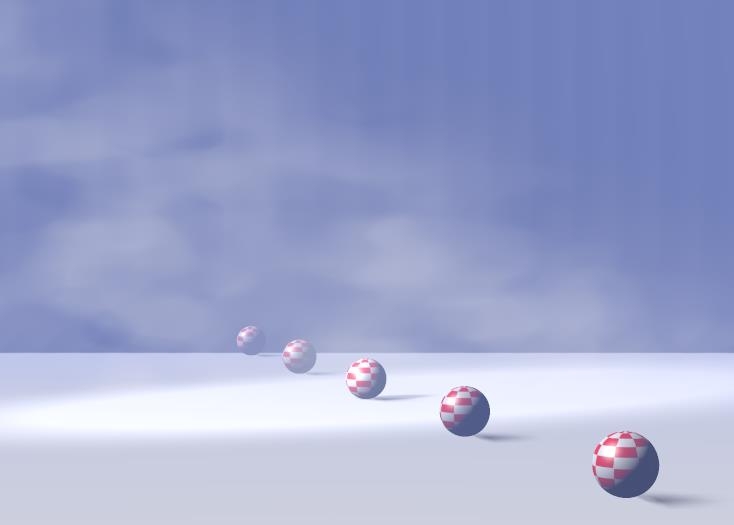
Since the Poser virtual world can’t be filled with objects to infinity, I’ve got two ways to define the far away portions

  • A background shader – this chapter
  • A defined object with a color or texture (usually a photograph) attached – next chapter

The background shader

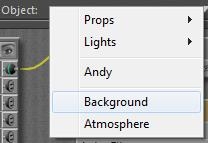
As light rays travel from all lights via all objects onto the view plane of the camera, some pixels will hardly, or never, get lit. This is where the “background shader” kicks in, and fills the emptiness. The Poser background shader can be set for the Background notion in the Materials Room. Background is not an object, like the atmospheric Volume is not an object either.


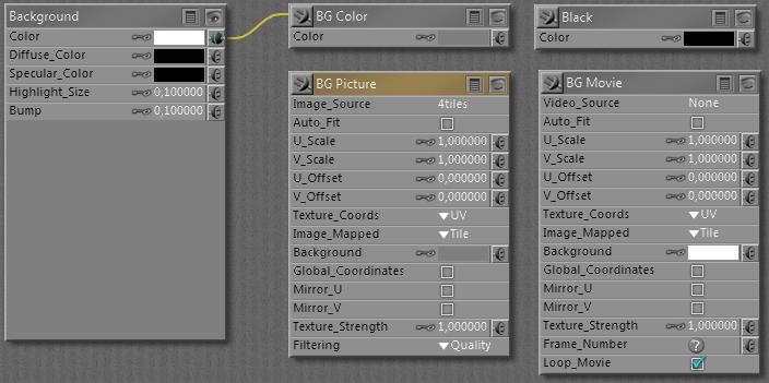
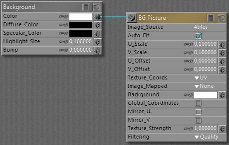
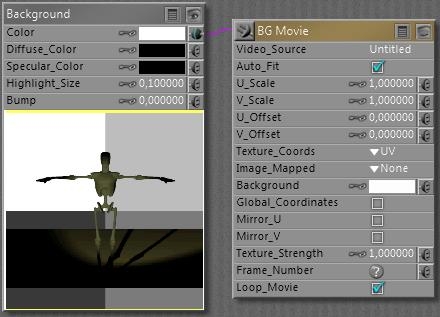
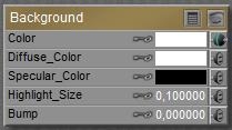
The actual working of the elements is a bit confusing, as you can see there are

  • The “Current BG Shader” of Background root node (root nodes don’t have an output connector at their upper left)
  • The BG Color node
  • The BG Picture and BG Movie node
  • The Black node

Now I’ve got the Preview and the Render, and the question: which one is showing what?

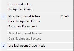
The Preview is arranged for in the Display menu:

When an image is loaded into the BG Picture node, either by assigning one as the Image_Source parameter or by loading one via the Import \ Background Picture menu option,

the Show Background option in the Display menu becomes available. That is: the BG Picture node should be connected to the Color parameter of the Background node. Then, when the menu option gets checked, the picture is shown in the preview. The image, and hence the content of the Image_Source parameter in the BG Picture node can be deleted by using the Clear background Picture menu option.

A similar scenario holds for displaying a movie in the preview: load one in the Video_Source parameter of the BG Movie node, or import one via the Import \ AVI Footage menu. The Show Background Footage option becomes available and can be checked. Again: the BG Movie node should be connected to the Color parameter of the Background node.

When nothing is checked, or the checked Picture / Movie option is not connected to the Background node, you’ll get the BG Color node contents in the preview, whether it’s connected to the Background node or not.

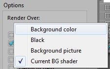
The Rendering is arranged for in the Render Settings:

The first three options pick the contents of the BG Color, the Black and the BG Picture node, the latter has to be connected to the background node’s Color parameter. The last option: Current BG Shader, picks up whatever is connected to the Color parameter, and multiplies with that color swatch too!

Again:
In Material Room I’ve got the background root node, and four basic nodes: Black, BG Color, BG Picture and BG Movie. I can connect any of these to the Color channel of the Background node.

In the Display menu, I’ve got options like Show Background Picture, Show Background Footage and Use Background Shader Node. Only when the BG Picture node is connected with Background, the Show Background Picture option becomes available to turn showing the background picture in the preview on/off. Only when the BG Movie node is connected with Background, the Show Background Footage option becomes available to turn showing the background movie in the preview on/off. The Use Background Shader Node menu option has not shown any effect on anything up till now. Sorry for that.

From the File menu, I can Import either a background picture or background footage. When importing Background Picture, Poser loads the BG Picture node, connects this node with Background (hence dims the Show Background Footage option) and switches Show Background Picture to ON. When importing Background Footage, Poser loads the BG Movie node, connects this node with Background (hence dims the Show Background Picture option) and switches Show Background Footage to ON.

Do note that I can set the BG Color from the Document panel directly, using the (second) color-swatch option at the bottom-right. So, for handling backgrounds, I don’t have to enter Material Room at all.

In Render Settings, I can select the render background almost independent of my choices for Display, or the node-connections in Material Room. That is: I can render against Black or Color even when the preview is showing Picture or Footage, with Picture / Movie node connected and the Display menu option switched ON. I also can render against Picture or Footage while the preview is not showing it, having the Display menu option switched OFF. But in order to use Picture or Footage in either preview or render or both, the corresponding node must be connected to Background in Material Room. To the Color swatch.

The other way around: how to rotoscope against a movie.

First, I go File > Import > Background Footage. This will load the BG Movie node, connect it to Background en switch ON the Show Background Footage option in the Display menu, so the footage will be visible in preview.

Then, in Render Settings, I have to select Render against: Background Picture (or Current BG Shader), and the footage will appear in the render results as well. That is: provided I use a save / export format without transparency: a series of PNG’s will not show any background anyway!!

Next >>

Managing Poser Scenes (17. Backdrops)

Instead of filling the empty space and non-rendered pixels in the result by a background image, I can put objects in the scene. From simple planar billboards or screens like the backdrops in a real-life photographers studio, walls of a room, to varied setups representing outdoor scenes with more depth. Cycloramas, dioramas, environment balls and more – supported with additional partial billboards and images with alpha channels – all serve the purpose of building a partial environment in the scene.

The one question that comes up every time is: what’s a proper size for images used on those backdrops? Simply stated, the amount of pixels that can be seen on the result should be at least twice (and at most four times) the amount of pixels in the result itself. This has to do with texture sampling and pixel processing statistics, a simple one-to-one ratio might result in loss of quality. As Poser puts a 8192 limit on texture sizes, this implies a 4096 limit on good quality render results – as far as backdrop images are concerned.

And what about full 360° environments like a sky dome?

Consider a camera at normal lens settings, that’s 35mm focal length and 40° Field of View (see table below), taking a shot (render) of say 2000 pixels wide. The full sky dome, 360° all around, then would require 360/40 = 9 times my view. And as good texturing practices require at least double the resolution of my render, the sky dome should be assigned a 2x 9x 2000 = 36.000 pixels wide texture, at least. Note that Poser takes 8.192 for max texture size, and you know you’re stuck. Note that the size of the sky dome – or any other 360° environment – does not matter. The Field of View matters, as a shorter focal length (typical for landscapes, say 20mm) increases FoV to 60°, and reduces the required texture to a 2x 360/60 x2000 = 24.000 pixels width.

Focal length (mm)

10

20

30

35

40

60

90

120

180

Field of View (°)

90

60

45

40

30

22,5

16

12

8

So the bets are that you’ll end up with say 8000 pixel wide panoramic image for the sky dome, which is too low a resolution for proper background imaging, plus some background image prop holding another 2x 2000 = 4000 pixel wide portion of the high-res version of the panorama just covering the left-to-right edges of the rendered view.

Object versus Shader

Using a background object instead of a background shader (picture, footage) does make a difference.

  • * In order to make proper use of atmospherics, Volume as well as Depth Cue, I do need a background object. Atmospherics don’t show against voids, even not when they are textured using a BG Picture.
  • * In order to make proper use of Depth of Fields or: focal blur, I do need a background object. The background shader will always be presented sharp, as it replaces empty space. This might give gradually blurring objects against a sharp background, so weird. But of course I can use a blurred background picture for shader, which then remains blurred in renders without Depth of Field set.
  • * Wherever you turn the camera to, the background shader image will always be the same. Great for stills but not for camera-moving animation.

Not every picture can or should be used for background under all circumstances: it should match the scene, or the other way around. The first issue usually is: brightness, contrast, saturation or: light and color intensities should match. The second issue then is: shadowing. Both issues are best addressed by a complex balance of lighting (position and intensity), materials, sometimes even atmospherics and pre-processing the background image or footage. And please do note that shadows in a background image do suggest the positions of the main lights, so you might have to flip the image to establish a match with the lighting in the scene. And please turn off shadow casting for the background object itself.

Other material aspects “just depend”, usually they are absent. No specular / highlights, no bump let alone displacements, no reflection nor transparency or translucency. But when the background represents a real wall, it just might benefit from specular, highlights and some bump.

Perhaps the backdrop object shouldn’t even respond to Indirect Lighting (switch off its Light Emitter property then), or the other way around: it should emit light from its Ambient channel to compensate for blocking the environmental lighting from a sky dome.

There is no single best way, but perhaps these notes might serve as a checklist. Happy Rendering

Managing Poser Scenes (01. Intro)

Badly lit or rendered images are like vampires: they’d better stay out of the daylight.

Download this tutorial in PDF format (3.5 Mb).

Introduction

Working with Poser is like working in a virtual photographer’s studio. And in order to master the tools of the trade, I enter my empty virtual studio early in the morning, with no models or products to be shot around yet. This leaves me

In this series of tutorials, I’ll discuss them one by one.

Next >>