Workflow considerations
Everyone involved in 3D is aware of the simple relationship between image size and quality on one hand, and system resource (Ram, Cpu) usage and rendering time on the other hand: they all go up, or down, simultaneously. This calls for a stepwise refining workflow: gradually go up, while getting the maximum benefits from the fast modes.
Of course everyone has his or her own way of work, but it never hurts to give this look-before-you-leap approach a second thought.
Step 1 Rough Design
A picture tells a thousand words, so it won’t harm me to write down the goal I want to accomplish in less than hundred.
Then I set the image size or at least its proportions (aspect ratio), create the (Dolly) camera which is going to take the shots, build the scenery including props and put the figures where I want them. I do so in low resolution, like using blocks and other primitives instead of the real details, using copies of Andy instead of the full dressed Vickys and so on. Now I should be able to get the camera settings right, and to establish the lighting setup. Almost all details of cameras and light could be established in this phase already.
Figures, props and scene elements can be assigned the right basic surface properties, especially color, as well as location and body pose. No details, which is why Andy has no expressions and no fingers, but does have the full rigging (bone structure) of a hires character like Vicky. Note: Andy2 (Poser 9 / Poser Pro 2012) does have fingers too.
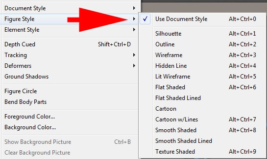
To find out the basic impression of the image (does it communicate the message?), I set and switch the display style of the whole Document, of each figure individually or even of specific figure elements. Each of those can be set in the Display menu:
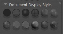
All those can be switched from the Document Display Style panel:
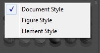
And I can choose what is going to be affected as well:
The ones I use most are:
- Outline (Ctrl+2), literally to draw the line of the objects whereabouts, works as a Document style
- Silhouette (Ctrl+1), to check whether poses do communicate, works on Figures but hardly on the whole scene
- Cartoon with Line (Ctrl+7), is just a more advanced and somewhat shadowed silhouette
- Smooth Shaded (Ctrl+8), shows the base surface color without textures and so gives a quick color impression
The default Texture Shaded (Ctrl+9) actually becomes relevant after texturing, and usually after bringing in the real (and textured) scene elements, figures and clothes.
This “phase one” approach becomes especially relevant when building animations. Camera paths, focal changes, following spots and alternating lighting strengths, the effects of major color shifts, finding out whether objects stand in the way but also most pose changes, body moves and collision risks too can be addressed.
Next to that, this “phase one” scene or animation is a very good starting point to test the overall workflow. Post-processing and Photoshop interfacing, movie frame production and video editing, syncing animation with sound and music, deploying Pose2Lux and LuxRender for high end results, eventual Background, Queue and Network rendering, establishing the proper project folder setup. Whatever I’m going to accomplish: I get an end-to-end test early on the easiest ‘this took me a day’ scene around, instead of on a fully loaded and fine detailed ‘took me four months’ result. Because fixing thinks also requires far less time.
During this phase, the default render setting is fine: just casting shadows, no raytracing, no options checked. And if I want to test my IDL / IBL / Global Illumination / SkyDome setting: I use a very low value for Irradiance caching.
Step 2 Fine design
Well, I gradually improve the quality and detail in the scene. I replace the primitive shapes by the final scene elements, replace the Andys by Vickys or alike, give them clothes, replace base colors by textures, bump / displacement maps and whatever, start deploying dynamic hair and cloth and tweak animations, camera settings and light sets accordingly. Just step by step.
While doing so, I keep on testing the major pieces of the remaining workflow, especially those that are apt to break due to newly added elements. When I know up to which version of the project everything was functioning, fault finding becomes much easier than on the final result without intermediate steps. I also check the settings for new materials and texture maps after replacing objects and assigning material sets. Especially when using Poser Pro 2010 and up, the Gamma settings and color swatches need attention. This is dealt with in detail in my separate Understanding Corrections tutorial.
While improving on the project details, also the render quality can be improved upon. The Auto-settings go from 1 to 9 – numbers are not visible though. Draft equals 2, Default equals 4 and Final equals 8 which is fine for all electronic publishing (eBooks, DVD, web gallery, …). The extreme setting (9) might have some use for fine print only (real world exposition gallery print result, art magazine) as it sort of doubles the resolution (level of detail), which cause a four times or more longer render time.
At the same time, I start on checking the render options. Smooth polygons (increases render time somewhat), use displacement maps – in my materials as well (this really might be a RAM killer!!), apply depth of field (focal blur) and 3D motion blur when appropriate (these might about double render time), and eventually apply a post filter sharpening the bump and texture details.
The manual render settings let me also:
- Increase raytrace bounces, to handle extra reflection-in-reflection (having the Silver Surfer as a figure) or refraction-on-refraction (looking through a series of glass objects) in the scene.
- Switching on Indirect Light, and set the quality
- Reduce Irradiance caching, Pixel samples or increase Shading rate to reduce render times while remain quality by the other settings
- Increase bucket size (say doubling) which will give a slight reduction in render time (say 5%) while requiring somewhat more ram (5% as well), but it mainly works out for a large image and a limited number of threads as the render is only finished till the last thread is done. Honestly, I never do it.
- Adjust Displacement bounds, when the use of displacement maps is checked. Note that I have to fill the Displacement slots in the materials as well !
One way to achieve high quality test results fast is to deploy area rendering: just rendering a small portion of the scene. This works for investigating texturing or lighting details, which are not easily seen in the preview. Think for example of reflection and refraction, and displacements and shadowing of it.
Another practical way is to test any post processing on low resolution results. Layering, color correction, masking and the like can be set for lowres renders first, and just need refinement later. But this saves me the burden of handling tens of layers and settings with 7000×5000 images.
