Generally, lighting 3D scenes can be done in two ways: direct / lamp based or indirect / image based.
Direct lighting requires “lamps”, light emitters without size or shape. Direct light produces strong shadows and highlights, which give depth to an image. Poser supports: Infinite lights, Point lights and Spotlights. Although their lighting is very controllable and can be good, their infinitely small size results in unnatural, hard and sharp shadows which do not take environmental (walls, ceilings, …) and atmospheric effects into account. Even in real life photographers prefer softboxes over halogen spots.
Indirect lighting in Poser supports: SkyDomes, light emitting objects (scifi clothes, neon signs, …) and radiosity (the red ball producing a red shine onto its neighborhood, a white wall brightening a dark alley). This kind of lighting is much harder to control, is hardly visible in the Poser preview, but the lighting itself is much softer, shadows are softer, blurred, brighter and sometimes about absent which gives a more natural impression especially in outdoor situations. But indirect light does have issues producing defining shadows and highlights, and might flatten the image.
As a result, we see mixtures of both in real life, and should do so in Poser as well. Indoors, without natural lighting, softboxes and light reflecting planes (umbrellas, dishes) help us to get a more natural look. Outdoors, additional flashing helps us to adjust the lighting levels and to get some highlights in place.
Infinite Lights, Lighting sets and General Light handling
The Infinite light is the oldest lighting concept in Computer Graphics. It imitates the sun, so far away that all rays run in parallel so the only thing that matters are color, intensity in the scene, and the angle to the scene. Effectively, Infinite lights always are directed towards to 0,0,0 center of the scene. There is no intensity falloff over the distance through the scene either, and it can produce dark, hard edges shadows like sun does at noon in the tropics.
All Poser direct lights have an indicator (quasi-object in the scene, presented in outline style), and a Scale parameter which does nothing to the light itself but alters the size of the indicator for easier interactive handling in the preview window.
Those light also have a similar set of properties:
- * Include in OpenGL preview OpenGL unfortunately can handle a limited amount of lights only. For most current systems, this limit is 8, at least from a Poser point of view. The preview takes the first 8 lights (in order of creation) but I can prioritize them by ticking this property. So, the preview takes the first 8 in order of creation which have this box ticked. On the other hand: why do I have so many lights in your scene? Am I just softening shadows or trying for omnipresent lighting? Then Indirect lighting might be a better choice. Am I lighting up dark areas? Then using Gamma Correction (Poser Pro, or Poser 10 up) and/or Exposure Correction might help me more. Or perhaps using another renderer (e.g. LuxRender, Octane) instead might be the thing I’m looking for. Your image, your call.
- * Visible switches the light indicator on/off in the preview. By default, the light indicators are visible when selected for parameter change. When setting up my lighting rig it might be handy to see the non-selected lights too.
- * Animating when ticked Poser will create animation keys when I change color, intensity or more. But when I am just re-establishing a lighting setup for the whole period, this key-creation is quite annoying as other moments in time just keep their light setting. Then I un-tick the box to switch this key-creation off.
- * On the ability to switch a light ON/OFF just prevents me from dimming intensities to get rid of the light for a while. Especially when I’m using Indirect Lighting in my render (which will not show up in the preview) I need some extra light just for the preview. Or perhaps I want to make separate renders for each (group of) light(s), to add them up in post. Here I can switch them off before rendering.
- * Type indicator well, Poser starts each new scene with a colored infinite light, two spot lights and one IBL, and the light control panel defines each new light as a spotlight. From Poser 9 and up that is, earlier versions are different. So here I can change the light type. When creating a light from the menu (Object \ Create Light) I’m offered the choice immediately.
Shadowing
The interesting part of direct lighting is: shadowing. The main shadowing routines are: Raytraced shadowing and Mapped shadowing. In both cases, the shadow intensity is set (or more precise: multiplied) by the Shadow parameter, ranging from 100% (full shadow) to 0% (no shadow).
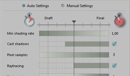
Raytraced shadowing is straightforward: it’s determined at rendering time, and it requires Raytracing to be selected in the Render Settings. This can either be done in the Manual Settings or in the Auto Settings from the second half of the options on.
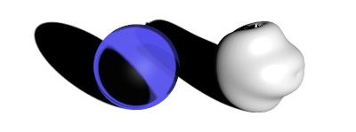
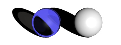
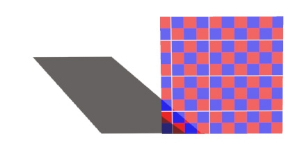
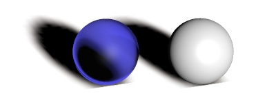
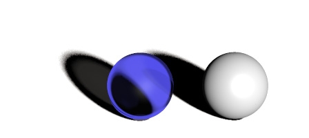
The use of Raytraced shadows becomes clear when I’m dealing with transparent objects. Shadow maps are generated from the objects mesh, independent of the material, while raytraced shadows take transparency into account. Well, to some extent that is. Mapped shadows do cater for displacement maps, while raytraced shadows do not handle the refraction color. As a result, light through a stained glass church window will produce a black and white shadow on the floor.
Shadow map:
Shadow map doing displacements:
Raytraced shadows:
Raytraced shadows, stained glass:
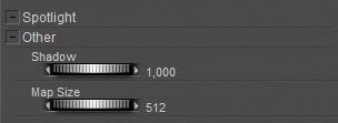
Mapped shadows were (and still are) used to save render time, at the cost of some loss of quality. The controlling parameter is map size, ranging from 64 to 1024, the default 256 sitting in the middle (of the 64 – 128 – 256 – 512 – 1024 series). Since Poser 10 (Pro 2014) there is a separate parameter for shadow maps in preview.
Map size 64:
Map size 1024:
Poser recalculates the shadow maps before each render, and for another speed-up this can be switched off: check Reuse Shadow Maps in the Render menu.
This makes sense as long as position and orientation of objects and lights don’t change, for instance when I’m sorting out materials or camera position. I can do animations though, as shadow maps are calculated on a per-frame basis. When I have made changes that affect shadowing I can just Clear the current set of shadow maps, but leave the Reuse check on for further work. As long as I don’t forget to switch things off before the final render.
Wrapping up: when in draft mode, building up the scene, low to medium resolution shadow maps are fine. Reusing them makes no sense as figures, props and lights all move around in this stage of development. Gradually, increasing map size makes sense, eventually with the Reuse option. Raytracing might be on already to care for refraction and reflection, but one can add raytraced shadows only in a semi-final stage as well.
The next step in shadow quality control addresses the properties Shadow Blur Radius and Shadow Samples (Light properties panel). Both work for Mapped as well as Raytraced shadows:
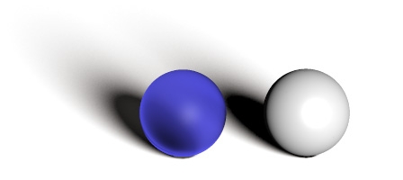
The first is just feathering the edges of the shadow. Hard edges are the result of tiny light sources, or tropical outdoor sunshine. When light sources grow in size, or when outdoor lighting becomes more arctic, shadows become soft edged and eventually less dark as well (so, reduce the Shadow parameter). The effect of enlarging the Blur radius depends on the map size (when shadow mapping of course). A radius of 2 blurs a 64-pixel map far more than a 1024-pixel map: the blur is apparently absolute, measured in pixels or so. Enlarging the blur also introduces graininess in the shadows; this can be dealt with by enlarging the number of samples as well.
Blur Radius 2, Sample 19 (default) – small, noisy edges on the shadows:
Blur Radius 16, Sample 19 – broad, noisy edges on the shadows:
Blur Radius 16, Sample 190 – broad, smooth edges on the shadows:

