A PoserSurface material offers Diffuse, Specular, etc. How do these work together?

Simply stated, all elements of a surface/light interaction are added up mathematically, on a per light, per channel (like Diffuse, Specular, Ambient, …), color-by-color (Red to Red, Green to Green, Blue to Blue) basis. This may cause overlighting, as components might add up to values over 100%. This can be prevented by reducing the intensities of lights and/or by reducing the brightnesses of the various surface components.

A more detailed answer following below requires determining all the steps from scene to render, which is something for the experienced and curious users, who want to have a better understanding of the way things work.

Intermediate

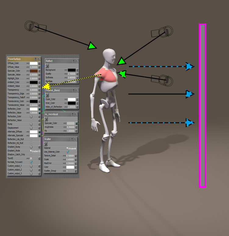
Say, a portion of the render result is determined by a portion of an object surface (material zones) which is covered by a single material. That material offers various “channels” (like Diffuse, Specular, Ambient, …) and the surface is lit by various light sources in the scene.


Object mesh (white) consists of various material-zones (red), each catching light rays (green) and using its own surface definition (yellow) to calculate the re-emitted light (blue) towards the camera / render plane (pink).

First, when my Poser version supports gamma correction (GC) and I have enabled it, each channel and light will be adjusted in a way that brightnesses are (or may be) reduced (more precise: pushed away from 100%). When my Poser version does not support GC or I’ve disabled it, this step will be skipped.

Second, for each channel / light combination a render subresult is derived. This will introduce reflections, shadows, highlights, glow and so on, on a per-light basis. By the way: Poser, and especially Poser Pro, offers various scripts and features to export those subresults individually for manual re-combination in postproduction.

Third, all those render sub results are added up, per light, per channel, on a color-by-color basis. So a diffuse result RGB (60%,50%,10%) and a specular result RGB (80%, 60%,15%) on the same spot make RGB (140%, 110%, 25%). Plain simple arithmetic.

Forth, when my Poser version supports gamma correction and I have enabled it, the final result will be adjusted in a way opposite to the first step: brightnesses are increased (more precise: pulled towards 100%). When my Poser version does not support GC or I’ve disabled it, this step will be skipped, as was the first step in the process.

Fifth, but only for showing the resulting image on screen and for exporting it to a standard 8-bit-per-color format (JPG, PNG, …): all colors are clipped to 100% max, which for instance might turn the result (140%, 110%, 25%) into (100%,100%,25%). Internally, and in some export formats as well (HDR, EXR for Poser Pro) the software works in a 16-bit per color format.

A brief elaboration on Poser Gamma Correction(GC)

As a result of the third step, two identical lights will give the same result as a single light with double intensity, that is: when GC is not enabled. The arithmetic then is simple and linear. This is different from adding light effects in nature, like projecting an image on a wall via multiple projectors. In that case, my eyes will adjust to the increased lighting level. But images can’t. Photoshop offers the Screen layers mode for handling this, which is considered the industry standard for handling the addition of light/surface subresults as it’s very close to the behavior of good old film, and its modern electronic equivalent.

Side note:

Screening is defined as “re-inverse the multiplications of the inverses” which for images a and b comes down to : result = 1- (1-a)*(1-b).   Applying this to the colors mentioned above, this will result in 1- (1- (60%,50%,10%))*(1- (80%, 60%,15%)) = (92%, 80%, 23.5%)

When applying Poser GC to the colors mentioned above, the result will be RGB (97%, 76%, 11%). This does not need clipping and hence will not present any overlighting artefacts. This is one of the big reasons to enable GC when available. Next to that, the Poser result under GC is somewhat similar to the industry standard. And on top of that, GC will soften shadows and shading as if the scene is filled with air and as if other objects are bouncing light around, as in real life.

When applying GC it’s much recommended to keep all Values at 1.0 (or 0.0) and to define all brightnesses through the Color (swatch). This is because Poser’s GC mechanism treats colors and values differently, so a light with a 50% white (mid gray) and 100% intensity works as required but a light with 100% white and 50% intensity will produce a different (far brighter) result. Bump, Displacement and Transparency should be excluded from the Gamma mechanism. You might like to read more about CG in these articles on GC fundamentals and GC advanced use.

Next >

Poser Materials III Intermediate Surface Definitions

The articles in this section discuss some material definitions for object surfaces (the PoserSurface), which are handled through the Advanced Interface: the nodes from the Lighting group, and the nodes on image-maps and movies. It also discusses some principles on dealing with the PoserSurface root node.

Next subsections present similar articles on an(IV) Advanced level, as well as on defining the properties of (V) Non-objects (atmosphere, background, lights) as far as these are handled through the Material Room interface. The Appendix lists all Material Room nodes and relevant Render Settings, and their availability in the various Poser versions.

What are the Bump/Displacement components intended for?

Each object surface – except for the hard and smooth ones – has some irregularities, like pores in the skin. On a large distance, these details don’t show in the render at all, or can be embedded as shady areas in the color texture at most. At a somewhat shorter distance, but still away from the camera, those regularities can be faked, saving a lot of render time and memory resources. That is what Bump is for. The magic is done by the texture (Bump-map) alone; no surface elements are actually moved.

When the object surface comes closer to the camera, surface elements actually do have to move a bit in order to make believable results. Those displacements still can be image driven, which is where the Displacement-map kicks in. This way of work actually saves a lot of detailed modeling. For instance, terrains are generated this way. But again, its effects are limited, so when the object surface comes really close to the camera, it pays off to actually adjust the object mesh actually, and to model in the details themselves.

So, the other way around: I can either put the details into the object mesh which takes a lot of my modeling time, or I can apply a displacement map which requires memory and render time, or I can apply a bump map faking the displacements, or I can leave it the way it is. The best choice depends on the distance of the object to the camera. Additional considerations on this are required in animations, where this distance can vary over time. In general, a serious difference between Bump and Displacement is that Bump does not distort the object itself, and hence leaves the edges intact. So a bumped ball still will be a perfectly round object in the render. A displaced ball will not.

makes

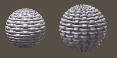
And notice the difference between Bump (left) and Displacement (right). Not only the bumped one still is a perfectly round object while the displaced one has got a roughed up edge, the bumped one also is smaller, for the same amount used. This is why:

  • In Bump, white gives maximum effect outward, while black gives maximum effect inward, so 50% grey is the neutral / no effect value. The Amount indicates the total difference between black and white, so the effect is half of the amount outward, and half the amount inward. Using a negative amount will reverse the effect: black will simulate an outward effect, while white will dent inward. And… bump is not modifying the object mesh, and hence cannot alter its size.
  • In Displacement, white gives full outward growth of the object while black gives no growth at all. So, for displacement, black is the neutral / no effect value, and any displacement will grow the ball. When displacements should be made inward, then negative amounts must be used. Hence, displacement will actually grow the ball, and its visual effect is twice as strong as for bump.

Notes:

  • Via the Simple interface, using the Displacement option one can choose between Bump and Displacement, it’s either the one or the other. Via the Advanced interface, one can have both. For instance to drive large adjustment by a displacement, and small details by a bump.
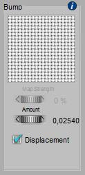
  • The Amount is measured in the unit I’ve set in my Global Preferences. The screen grab above was made on a system using Meters, so 0.0254 indicates 2.54 cm. Which by the way is about 10% of the balls diameter; quite a lot. When the units are changed to inches, that value will change to 1.0. I have to take this into account when using data from examples. (And… python scripts have to use inches by all means). This 1” value is the default, which actually is quite a lot for say skin details, but quite small for outdoor terrain surfaces.

Intermediate

The PoserSurface material definition offers a few additional options for compatibility:

  • Gradient_Mode = Gradient Bump offers compatibility with old Poser versions, I can plug the existing *.bum file into the Gradient_Bump slot, as an image
  • Gradient_Mode = Normal Map offers compatibility with Game Characters. If my figure comes with normal maps instead of bump/displacement maps, I can select the correct type, and plug the map into the Gradient_Bump slot as an image.

Important note: in Poser Pro and Poser 10 and up, when using image maps for Bump and/or Displacement, these should have the Gamma set to 1.0 explicitly. Otherwise, the images will get dimmed considerably before application, especially in the mid-grey areas. This will result in dimming the Bumps / Displacements themselves as well, which is wrong.

Next >

What’s the Reflection component intended for?

Well, I know about reflections in nature, from mirrors, metal balls, glass, and water surfaces. So the answer can’t be that difficult.

Unfortunately, it can be quite complicated in a 3D program, because the proper handling of reflections requires a full fletched use of raytracing, with an infinite number of bounces. In the old days this required so much computing power that rendering took about till infinity. From this recent past, which is just one to two decades away, three approaches remain which are discussed below:

  • Reflection maps
  • Specularity
  • Raytracing

Although most characteristics of these are available through the Simple interface into Material Room, the implementations in Poser are not always the easiest to comprehend. That turns the presentation of this topic into a mixture of Simple and Intermediate elements. Sorry for that.

Reflection Maps

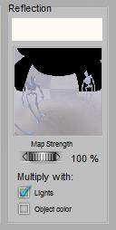
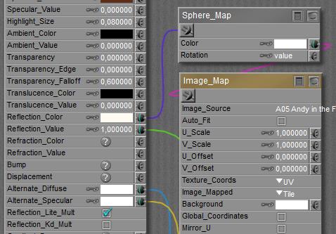
First, the reflections can be faked by assigning just an image to it. For quite blurred reflections and an image which matches the surrounding scene quite well, this might work and will speed up rendering tremendously, which is a serious advantage in lengthy animations. It’s used often on chrome car accessories.

or

Note however that the brightness of such reflections is autonomous, independent of the surrounding lighting levels. So when the lights dim, or the object resides in a shadowy area, the intensity of this material property should be adjusted accordingly. Poser supports this, by multiplying the reflections by the brightness (and color) of the (diffuse) light on the surface of the object. The Reflection Lite Mult option (or Multiply with Lights in the Simple interface) caters for this, and is ON by default.

So, when I animate a car driving through a sunny lane with shadowy trees, and the shiny chrome wheels are made pseudo-reflective by using just images, then the reflectivity is dimmed when a wheel passes through a shadow.

The option should be OFF however when actual raytracing (see ‘third’ below) is used to handle the reflections because then the amount of reflected light is properly derived from the surroundings themselves.

Specularity

Second, specularity was introduced to create highlights, representing blurred reflections from direct light sources only. In Poser, an active specular channel of a direct spot-, point- or infinite light in combination with an active specular part in the objects material, are both required for getting such highlights. Note that indirect (IDL) lighting schemes as well as image based (IBL) lights deal with diffuse light only, and will not produce any highlights. See this lighting article on details.

Raytracing

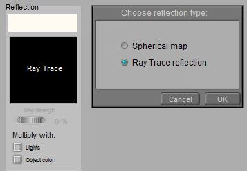
Third, real raytracing can be implemented by plugging the raytrace node into the PoserSurface definition. This is directly available in the Advanced interface only. In the Simple interface, just choose the Raytrace option:

Note that in his case, those ‘real reflections’ will only consider the objects in the scene, and not the direct light sources around. To get the shine of lamps in the render, I either have to include some additional glowing objects in the scene, or I have to use specularity for this purpose. Also note, as said above, that the Reflection Lite Mult option (or: Multiply with Lights in the Simple interface) should be OFF for raytraced reflections as it serves the brightness adjustments of image based reflections (reflection maps). Raytracing makes the adjustments itself automatically, and having the option ON will then enforce the adjustments twice.

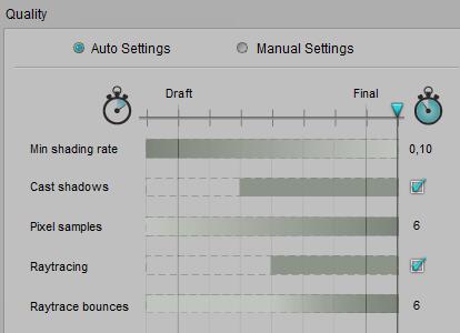
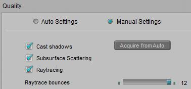
Plus… raytracing has to be enabled in the Render Settings, and the (maximum) amount of raytrace bounces has to be set high enough. That is: the highest value is the best as nature does not have any maximum at all, but some people report that lower values speed up their renders without a recognizable loss of quality. See the notes on Transparency below.

or

Poser offers Reflection Color, and in the Advanced interface Reflection Value as well. See

Also see this article on plugging Material Room nodes into the Reflection (and Refraction) slots of a PoserSurface material definition.

Advanced

For short: when I use Gamma Correction for my renders, I leave the Reflection_Value at 1.0 and adjust the color swatch instead.  And as discussed below, when I use transparency next to reflection, I use Alternate_Diffuse instead of the Reflection component. This happens to be a color swatch as well and so caters for the GC adjustment too. And when I’m not using GC or transparency, there are no losses in using Alternate_Diffuse anyway. So that is the preferred way of work.

Combining (raytraced) Reflections with Transparency

Most objects which are (semi)transparent, are reflective as well, at least to some extent. When I combine (raytraced) reflections with transparency in one PoserSurface, I have to take notice of various things.

  • The combination of raytraced reflections and transparency will generate internal reflections within the object. Poser does a reasonable (*) job handling these, but as the amount of ray bounces is about infinite, render times will go up immensely, and any reduction of Raytrace Bounces in the Render Settings might reduce the quality of the result.
  • Light which gets reflected cannot pass the surface, so for reflectivity R (say 80%) the transparency should not exceed 1-R (in this case: 20%) or vice versa. Otherwise, I’ll introduce some magical source of extra light, and things will start looking overly bright. In any case, I should not combine any reflectivity with 100% transparency, or 100% reflectivity with any transparency. Such a surface cannot exist.
  • In the Simple interface, and in the Advanced interface with an image_map or Reflect node plugged into the Reflection component, I have to balance transparency and reflectivity manually. Transparency does not reduce the Reflection component as it does with Diffuse. However, Transparency does work on the (Alternate_)Diffuse  component so when the Reflect node is plugged into Alternate_Diffuse, the reflection is reduced automatically in a correct proportion. That is: with a 90% surface transparency set, and reflectivity set to 80%, the final reflection will be reduced to 1-90% = 10% of that, making 8% net surface reflectivity. This then is boosted up due to internal reflections.
  • (*) due to internal reflections, the final reflectivity goes up to R*[1+T2/(1-R2)] for a surface reflectivity set to R and a surface transparency set to T. This is what Poser does, as it treats transparency as a surface property. With R=80%, T=20% we’ll get 89% final reflectivity. For a semi-transparent solid object however, the final reflectivity should go up to R*[ 1+T2/(1-(RT)2) ] which results in 83% with the same numbers filled in. This refers to only one-third of the earlier derived additional brightening from internal reflections. In the first (surface) model, the light bouncing around within the object is only absorbed when it passes the surface, leaving the object. In the latter (solid object) model, the light becomes absorbed while bouncing around in the object. Therefore, in the latter case internal reflections contribute less to the final result. Poser however does not support the volumetric approach, and so, when its surface transparency actually represents a volumetric effect, the internal reflections are (far) too strong. I can reduce the surface transparency a bit, for compensation.

Next >

What’s the Transparency component intended for?

Although I’ll grasp transparency from my own experience, and although most characteristics of it are available through the Simple interface into Material Room, its implementation in Poser is not the easiest to comprehend. That turns the presentation of this topic into a mixture of Simple, and Intermediate elements, plus some Advanced issues too. Sorry for that.

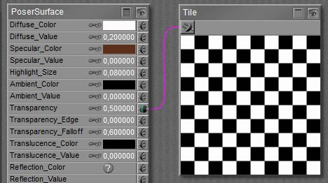
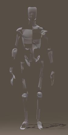
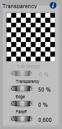
Formally stated, transparency is the ability of a surface to let light to pass through. Transparency is a number, 0-100%. When that number has different values at various spots on the subject, a (greyscale) image can be used. Note that – in Poser – the image is used in an inverted way: 100% or black means: fully transparent, while 0% or white means: fully opaque.
or  =>

See this article on how both Simple and Advanced interfaces relate.

The behavior of Transparency can also be stated in another way:

  • When it’s just a value, then that value represents transparency (100% is fully transparent)
  • When an image is attached to it (or any nodes are attached to it in Advanced interface), its meaning flips and the value is a multiplier for the resulting image_map which represents opaqueness instead: 1 (white) is fully opaque and 0 (black) is fully transparent.

More in detail

There are three different reasons surfaces can let light pass through:

  • Because of lacking material. This is a lace-like transparency, usually supported by an image (the transparency map) representing the pattern of this materials presence or absence. This is the way to drill holes in a wall or in a jacket, and let the background (or an underlying shirt) shine through. White means presence of material and black means absence. For very fine – and hence almost invisible – patterns (e.g. nylon stockings), a uniform grayscale or just a transparency value can be used instead.
  • Because a perfectly clear object is covered with a thin layer which filters all the light upon it. This is what’s meant by setting an intermediate value for transparency, or using an image (greyscale) map instead. Like the lace-like variant just mentioned, this thin-layer transparency is a pure surface effect. And in Poser, all object materials are surface properties.
  • Because the material filters and colors the light passing through, as is the case in liquids and glass; it’s a glass-like transparency. In this case, using a transparency value is the common way to represent the amount of light which can pass through. Any colors from an image map will be ignored, and the (volumetric) effect has to be translated to a surface effect. For instance, a surface transparency set to 90% will represent an object transparency of 90% x 90% = 81% regardless of local thickness and shape, as the light passes through the front and back surfaces. Poser can’t handle thickness and shape but presents some tricks for escape, see Edges & Bends below. When I want to color (filter) the light passing through I’ve got to use the Refraction_Color or the Alternate_Diffuse component, which is available through the Advanced interface only (see the Refraction article for details). Then things get complicated.

Note:

When the material has a diffuse (surface coloring) component too, then this will show as far as the material is non-transparent. The diffuse material will not show in the holes in the surface, as driven by the transparency-map. Do note that the more transparent a surface becomes, the less it gets colored as the color is a property of the non-transparent portion of the surface. The specular component however is not affected at all by the transparency settings, so transparent areas on the surface can be as shiny as less (or non-)transparent ones. This is good for thin-layer and glass-like transparency. But for lace-like transparent surfaces, the holes should not be shiny at all, as there is no material in place to reflect the lights. Hence, for such material the transparency patterns should be copied to the specular settings.
glass-like (highlights overall) <=>  lace-like (highlights on substance only)

The same holds for Ambient, Bump, Displacement, and Reflection: when there is no material then there can’t be a surface response to light. But I have to tell Poser myself, as Poser does not distinguish the various interpretations of transparency (lace-like vs layer/glass-like). When using the Advanced interface: Transparency also does affect Alternate_Diffuse but does not affect Translucence, Refraction or Alternate_Specular.

Edges and Bends

When I look at, or through, a (semi) transparent object with various curves and bends, I will note that the frontal view differs from the sides. For hollow objects, light rays passing the front and back might meet less material underway compared with rays traveling through the sides. For solid objects this might be the opposite. On top of that, various causes for light-bends (called Refraction), absorption and scattering will reduce the transparency of objects at the edges. Next to all this, in real life transparency depends on the angle towards the camera: perpendicular angles have a much higher transparency than skew ones; for the latter, light rays just bounce off, and transparency decreases while reflectivity goes up. This advanced effect (known as Fresnel) is supported by recent versions of Poser, at the cost of serious prolongation of render times and increased memory requirements.

So when one wants an improvement over just transparency, without requiring the high level of photorealism that comes with Refraction, Poser offers a way to cheat to compensate for its inability to handle any kind of volumetric effects:

  • Transparency_Edge defines the transparency at the edge, while
  • Transparancy_Falloff defines the thickness of the edge.

As Transparency 1.0 means fully transparent, the Edge should have a (much) lower value to mimic the mentioned effects in a believable way. The default is 0.0, completely opaque at the edges. When I do it the other way around however, and set the edges to a high value like 1.0 (combined with a low value for transparency), the edge will fade away like I’m presenting a gaseous, cloudlike object.

Small values for Falloff make a fast transition from edge to regular surface, and hence make a thin “surface” layer for the object. This surface thickness seems proportional to the size of the object, the Falloff is a percentage of something, it’s not an absolute value. And although results can become quite unnatural, high values like 10 and up are possible and allowed.

Note:

Although Edge and Falloff make some sort of skin or surface layer for a transparent object, there is no sharp boundary at the inside. As a result, these parameters cannot make a hollow object.
Raising Awareness

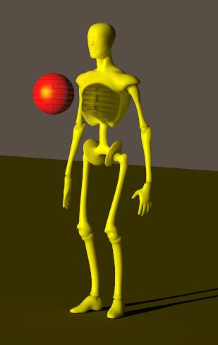
One image says it all: in Poser, yellow light passing through a red patterned-transparent ball will cast a patterned black shadow onto the object behind it, mixed with the yellow of the light. In nature, such a shadow would be red (as the passing light gets filtered).

Transparency won’t handle color at all, but it does make the pattern in the shadow. Diffuse will filter the light shining onto the ball and bouncing towards the camera. Refraction will sort filter the light passing through the ball from behind towards the camera. It’s objects only, and does not handle direct light at all but produces dark shadows instead.

Neither transparency, nor a diffuse or a refractive color will color-filter the light rays passing through the ball as such, and no reddening of the shadowed area will occur in any way.

Poser Firefly does have its limitations, and this is one of them.

Advanced

Transparency and the effect of Viewing and Lighting angles

Poser does not do anything with material properties or object thickness; it does not deal with object (volumetric) transparency but uses a surface transparency value instead. Poser behaves like a semi-transparent foil is wrapped around the object, and while the light passes through the object, the foil is passed twice. So, when the PoserSurface transparency is set to 70%, the object transparency equals about 50%, and the render will match nature’s behavior.

When the light passes under an angle, nature will reduce the transparency of the object because the path within the object (or through the foil, which does seem have some thickness anyway) becomes longer, and more light gets absorbed along the way.

The math: When – in real life – light passes a block or foil of semi-transparent material, with a thickness w (in meters or alike) and under an angle a, then a portion of that light will be taken out, and the remaining portion – known as object transparency – is exp{ -k*w/cos(a) }  with k being a constant describing the material itself. Low k values, close to zero, make high transparency and large values make low transparency. The same way thick objects (large w value) are less transparent than thin ones. But as Poser does not support material properties or thicknesses, all I can do is set a surface transparency T in PoserSurface. Then the final object transparency will be T2/cos(a) .

Poser does support this angular behavior, but not exactly. I guess because that would require too many calculations during the render. But as the following graph shows, it does a nice job:
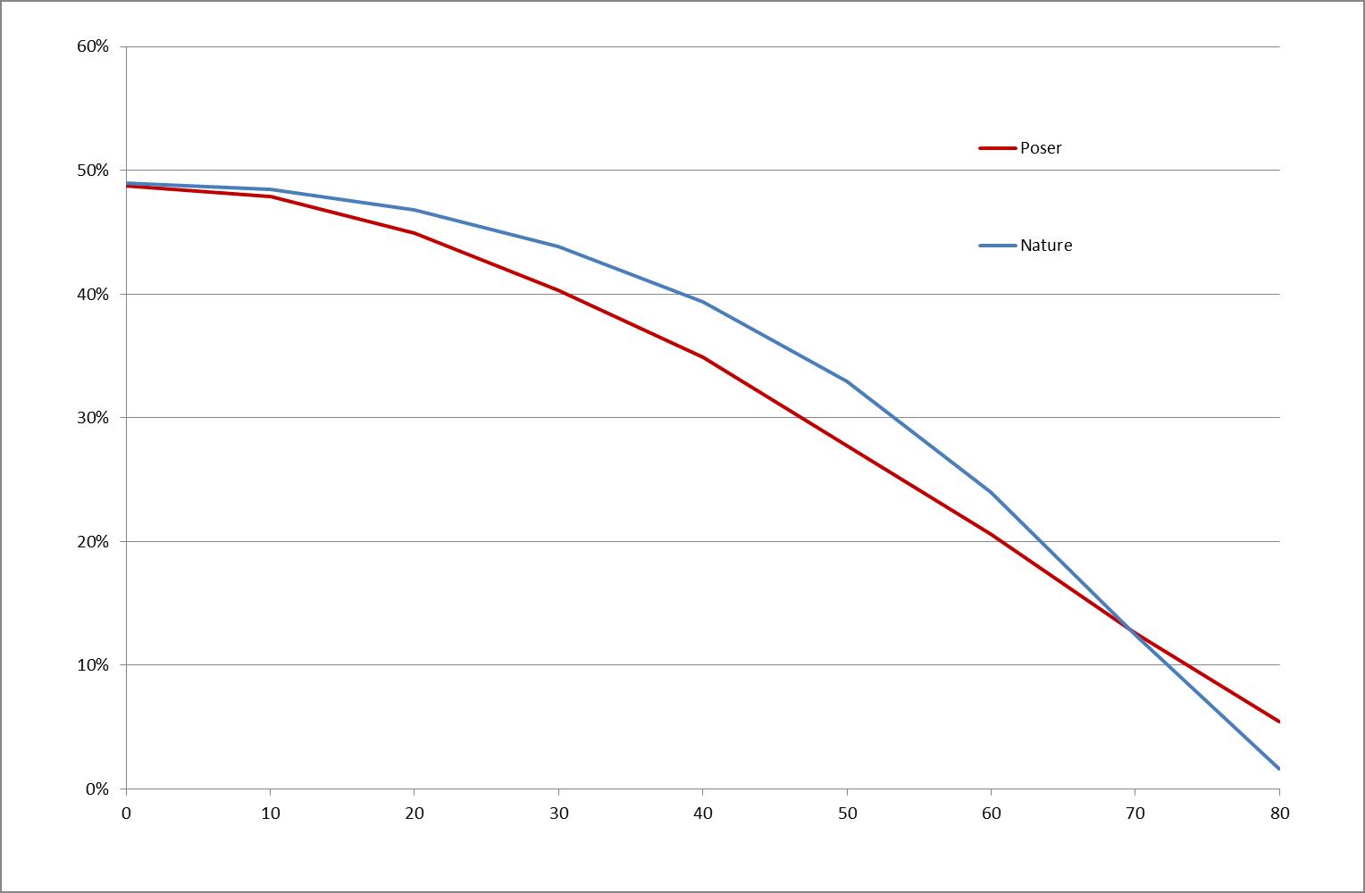
This is for a block with 70% surface transparency. Light which comes straight through will be dimmed to 70% x 70% = 49% object transparency. When it passes at a 30° angle Poser (red line) will dim it to 40% while in nature (blue line) it will be 44%, and at 60° Poser will dim to 20% while nature will reveal 23%.

Conclusion: For an application which is not doing any volumetrics, and is not raytracing except when assigned to do so for specific surfaces (reflection, refraction), Poser does quite a nice attempt to stay close to “the real thing” in an efficient and effective way. Transparency is a surface property, as if a foil surrounds the object at hand, but that foil is supposed to have some finite thickness and Poser supports the angular dependency which comes from that. At the detailed level, it does show differences which cannot be eliminated any further. Poser does have its limitations, and this is one of them.

Transparency and the effect of Gamma Correction

Consider an object A blocked by another object B, that is: B will cast some shadows onto A. For various reasons those shadows tend to look overly dark. For instance, because in real life light scatters around in the air thanks to tiny dust particles floating around, and because ceilings, walls and objects in the scene scatter light around as well. Poser offers a correction mechanism for that: Gamma Correction (aka GC), present in Poser 10 and Pro 2010, and up. GC will brighten up shadows and will dim highlights to give the render a more pleasant and more realistic look. So far so good.

Now, consider object B to be partially transparent, say 90% per surface. Light passing from its front to back will be reduced to 90% x 90% = 81% and object A will just receive less light instead of no light at all in the deep shadow. That will be catered properly by GC again. Actually, GC will brighten up the dimmed area back to about 90%, and keep it in sync with all other shadows and shades in the scene. But any light from A, through B towards the camera will be dimmed to 81% as well as being filtered by B’s transparency too. And as Poser cannot tell the difference from all those dimming effects, shadowing or transparency or anything, this transparency effect is brightened up to about 90% as well. As a result, the object B looks far more transparent than it’s designed to be, thanks to GC.

Now what should I do? Should I let Transparency bypass the Gamma mechanism resulting in proper shadows and a slightly too bright object, or should I let Transparency participate in the Gamma mechanism, with probably a more accurate object but too dark shadows, which can be brightened up in other ways? This is discussed in detail, but for short: I should do the first. Transparency should bypass Gamma like Bump and Displacement do. The object will be a bit off then, but when I act the other way, it will be off as least twice as much.

Next >
What’s the Ambient component intended for?

For short: ambient make objects glow, and emit light independent of any lighting sources in the scene. This is to represent led-lights, or some phosphorescence of fluorescence effects.

=>

Note that light, and hence ambient glow as well, serves the visibility and presence of objects in the scene while shadows serve shape and surface structure details of an object. So, when using ambient glow, I will gain object visibility but I will lose some of the shape and surface details, and hence I’ll “flatten” the image. In other words, I should not overdo.

Intermediate

In Poser, Ambient (both Simple and Advanced interface) as well as its equivalent Translucence (Advanced interface only) will make an object glow. There are various reasons to have an Ambient component in the materials definition.

First, the truly legitimate reason, is to implement the objects glow as it appears in real life. Led-lights, or some phosphorescence of fluorescence effects, were already mentioned above.

Second, considered a half-legitimate reason, is to represent translucency as can be found in skin, wax candles and alike, in a render setup which is poor on raytracing and hardly supports sub-surface scattering. Early Poser versions, PC’s with less computing power, or the requirement for a massive output stream as in animations might be the reason for this. A resource intensive process is then replaced by a much faster process with – sometimes slightly – less realistic results.

Third, nowadays considered almost an illegitimate reason, is to compensate the object for poor lighting conditions at the spot. Adding some local point- or spotlights, and especially switching to indirect lighting (IDL) conditions supported by modern Poser versions, resolve the lighting issue the way it should be.

Some additional notes:

  • In contrast to Diffuse and Specular, there is no angular distribution of the light send towards the camera. Edges are as intense as areas in the middle part of the object, which makes it harder to distinguish shape details. This is the way nature works too, by approximation.
  • See this article on plugging Material Room nodes into the Ambient (and/or Translucency) slots of a PoserSurface material definition.
  • Ambient (and/or Translucency) generate some local lighting levels which are independent of the intensities of external sources of light. Hence, when I decide to dim the lighting levels in my scene to avoid overlighting, I’ve got to dim those Ambient aspects of the materials as well to keep the balance.
  • Ambient (and/or Translucency) are proper candidates for turning an object into a light source under indirect lighting (IDL) conditions. This is the way to make an all surrounding dome object lighting the entre scene. I may have to pump up the intensities though.

Recommendations:

  • To prevent artefacts in rendering when applying the Gamma mechanism (recommended, available in PoserPro and Poser 10 and up) the Value setting should be kept to 1.0 only (or 0.0 but no intermediate values).
  • To prevent overlighting when combined with other aspects of lighting and material definitions, it’s recommended not to exceed a (100% – (Diffuse+Specular)) brightness in the Color-swatch and maps (or in the Value setting when not applying Gamma). So with Diffuse set to 70% and Specularity set to 20%, Ambient should be limited to 10% at most. See this article on details.

Next >

What’s the Specular / Highlight component intended for?

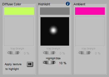
For short: specularity makes highlights on an object surface, representing the (blurred) reflections of the direct lights (infinite, spot, point) in the scene. Although color and an eventual image map both work as an extra filter, such a coloring filter should be applied to make believable metallic surfaces only (metallic car paint included). In the vast majority of cases, the color swatch should be a shade of grey. Small highlight sizes represent hard, smooth surfaces.
Note that in Poser IBL (image based lights) and IDL (indirect lighting) cannot make highlights themselves, I do need regular direct lights in my scene to do so.

More in detail

When light hits an object surface, some portion of it might get reflected. In the good old days, when computers were short of raw CPU power, this handling of reflecting light rays was something to be avoided in order to get industrial render projects done in due time.

Faking reflections by using images of the surrounding scene (‘reflection maps’) was one way to get out, and another one was to concentrate on the – usually blurred – highlight producing reflections of the direct lights in the scene only. The latter is referred to as specularity.

In nature, as well in modern ray-tracing based renderers like LuxRender or Octane, there is reflection only, handling all sorts of light. But Poser supports the easy to calculate Specularity for direct lights, and the more computational intense Reflection for the indirect light bouncing (or emitted otherwise) from objects in the scene. Two sides of the same coin, served separately for convenience especially aimed at reducing time and resource requirements at rendering. The downside is that I have to cater for both aspects separately in my material definition.

Intermediate

The Advanced interface into Poser Material Room offers a Specular_Color which makes it the equivalent of Simple interface, and offers a Specular_Value next to it which acts as an extra filter. Intensities are reduced with that factor, and it can be driven by a (greyscale) image map as well. This way one can easily make non-reflective stains on a surface. See the various articles on how both Simple and Advanced interfaces relate, and on the way Colors and Values work together.

Recommendations:

  • To prevent artefacts in rendering when applying the Gamma mechanism (recommended, available in PoserPro and Poser 10 and up) the Value setting should be kept to 1.0 only (or 0.0 but no intermediate values).
  • To prevent overlighting when combined with other aspects of lighting and material definitions, it’s recommended not to exceed a (100% – Diffuse) brightness in the Color-swatch and maps (or in the Value setting when not applying Gamma). So with Diffuse set to 80%, Specularity should not exceed 20%. Click here for details.

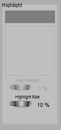
Highlight_Size, available in Simple as well as in Advanced interface, is a straightforward parameter: small values make small, intense highlights representing hard, smooth, shiny surfaces while larger values make larger, blurred highlights instead. Like for Diffuse, Poser offers a Specular node (Advanced interface only) which offers features similar to the Specular component in the PoserSurface. See the respective acrticles on assigning either an image or a movie respectively to the Specular slots.
Making Highlights

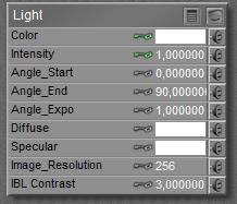
As said, Poser discriminates between Reflecting (diffuse) light from objects, and Specular light from direct light sources in the scene. To do so, direct lights in Poser offer a diffuse as well as an independent specular component. The first component will trigger responses from the Diffuse part in the material definition (and similar parts as well) while the second component of the direct light will trigger responses from the Specular part in the definition.

<=>

The Diffuse and Specular components in the Light relate to the Diffuse and Specular components in the Material definition of an object.

So, in order to get highlights, I need this Specular component in the direct lights in the scene to be available. But I can black out the diffuse component, turning the light into a Specular-only one.

The shape of Highlights

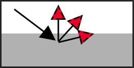
Although Poser is not raytracing to derive the specular highlights, the blurred highlights are still decently described by the “angle in equals angle out” concept as is the case with mirrors. This implies that the outgoing light intensity is highest in a direction determined by the angle of the surface with the incoming light. Around that “angle out” range the intensity drops – depending on the highlight size. Unfortunately, and though it calculates and renders pretty fast, the standard highlighting method produces quite unrealistic results and makes everything look like a bad representation of hard plastic.

This is why Poser offers additional features via the Advanced interface, especially alternatives for the Specular node, like Blinn, or Anisotropic for microscopically grooved surfaces.

Next >

What’s the Diffuse component intended for?

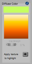
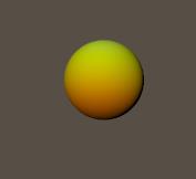
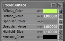
For short: Diffusion is equivalent to Object Color. This is the place to turn an object simply green, and/or to assign an image to it for a detailed coloring of the surface. The color swatch then works as a filter: when I assign an image as well as turn the swatch to green, it’s like I’m looking at the image through green glasses or through a sheet of green transparent plastic. A white swatch means: no filtering, and is generally recommended when images are used.

makes

Clicking the larger area opens the Texture Manager, which offers the option to import an image.

More in detail

In nature, objects get their color by scattering back some of the light that falls upon them, and do so in a color-filtered way. So white light shining on a plants leaf will make it look green because the leaf scatters back the green portion out of the white light, at the place and time the light hits the leaf. When the light is pure red without any green in it, then the leaf cannot scatter anything back and hence will look black instead. This “scattering back” is called Diffusion, not to be confused with Reflection.

The amount of light which is received by a “unit of surface” (say 1 cm2 or in2) depends on the angle the light makes with the surface. Perpendicular lighting makes high intensities, skew angles make low intensities as the same amount of light has to shine on a larger area.

Also, the diffuse response to light usually will not be equal in all directions: the response perpendicular to the surface might be stronger than that parallel to it, making objects look darker at skew angles towards the camera. That is: at their edges.

Both effects are referred to as: shading, in contrast to shadowing which includes blocking the light by other objects, or other parts of the same object. In Poser all this is understood in the Diffuse part of the material definition.

Intermediate

The Advanced interface into Poser Material Room offers a Diffuse_Color which makes it the equivalent of Simple interface, and offers a Diffuse_Value next to it which acts as an extra filter. Intensities are reduced by that factor, and it can be driven by a (greyscale) image map as well. This way one can easily make dark stains on a surface. See the various articles on how both Simple and Advanced interfaces relate, and on the way Colors and Values work together.
Recommendations:

  • To prevent artefacts in rendering when applying the Gamma mechanism (recommended, available in PoserPro and Poser 10 and up) the Value setting should be kept to 1.0 only (or 0.0 but no intermediate values).
  • To prevent overlighting when combined with other aspects of lighting and material definitions, it’s recommended not to exceed 80% brightness in the Color-swatch and maps (or in the Value setting when not applying Gamma).

As said, in nature the diffuse response to light usually will not be equal in all directions. This was already investigated upon by the mathematician J.H. Lambert (about 1750). In Poser, this “Lambert diffusion” is embedded in the Diffuse part of the material definition (Simple and Advanced interface), as well as implemented in the diffuse node (Advanced interface only). See the various articles on more background on Lambert, on details about the Diffuse node, and on assigning either an image or a movie respectively to the Diffuse slot(s).

Anyway, the diffuse light is scattered outward, that is: with following the surface normal, which is a vector perpendicular to the surface which generally should be pointing outward. For various reasons the latter is not always the case, depending on the way the object is made and imported into Poser. If not, it can make the scattering go in the wrong direction, causing black spots in the render. The solution is to force Poser to reconsider the surface normals, and I can make it doing so by ticking the Normals Forward checkbox. It’s in the node, as well as at the bottom end of the PoserSurface definition itself. It’s not available in the Simple interface.

That aside, the results from the “Lambert approximation” do not look utterly realistic for organic, porous surfaces. Therefore, Poser offers alternatives to the Diffuse component, like the Alternate_Diffuse part of the material definition, plus a Clay node  with enhanced properties.

On top of all this: in nature, non-metallic objects get their color from diffusion, while metals get theirs from reflection. Especially when I’m into photorealism, it will be good to understand – and to implement – this difference. Metals don’t diffuse, they reflect.

Next >

Poser Materials II Simple Surface Definitions

The articles in this section discuss material definitions for object surfaces, which can be handled through the Simple Interface, and do not require a deep understanding of Material Room principles. Each article however also presents an Intermediate approach as well, using the Advanced interface for the same purpose. This is to avoid multiple articles answering the same question.

Next subsections present similar articles on an (III) Intermediate and (IV) Advanced level, as well as on defining the properties of (V) Non-objects (atmosphere, background, lights) as far as these are handled through the Material Room interface. The Appendix lists all Material Room nodes and relevant Render Settings, and their availability in the various Poser versions.

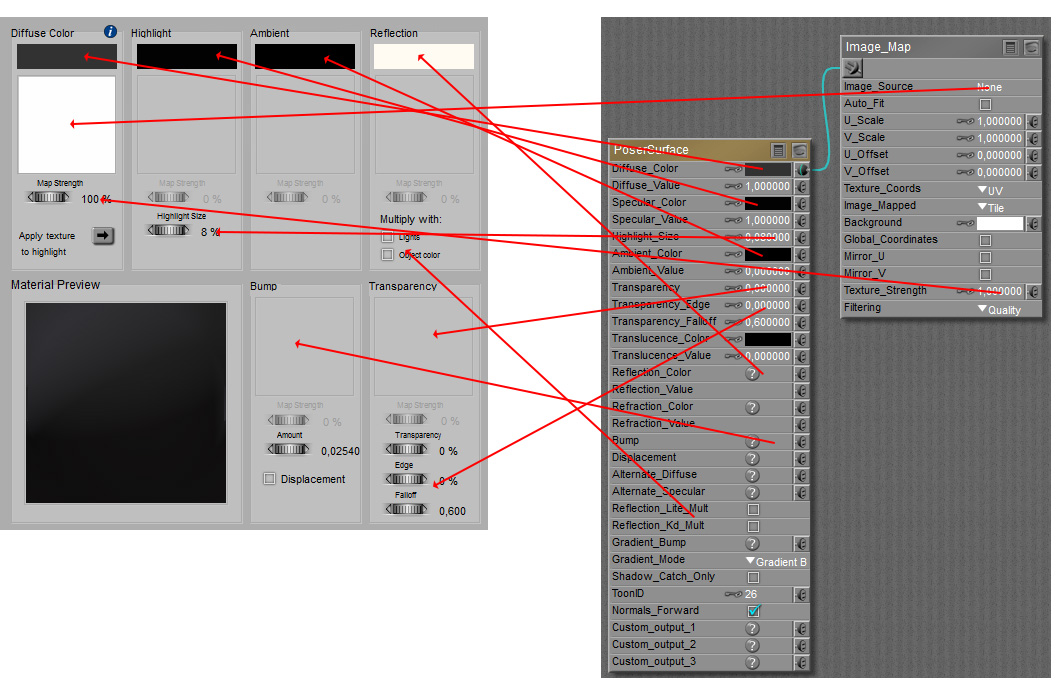
Material Room Simple and Advanced interface – how do these relate?

The Advanced interface to Material Room offers access to some more properties of the same material on one hand, and offers access to far more ways to define the details of all properties in the other hand. Creating and managing materials through the Advanced interface is considered Intermediate to Advanced level. While working from the Simple interface, one might wonder: “what do I miss?”.

Intermediate

The following features are / are not supported in the Simple interface:

  • Supported: Diffuse, Specular and Ambient Color, plus an eventual Image_Map or Movie node from which the Image_Source and the Texture_Strength properties are supported. For Specular, the Highlight_Size property is supported.
    Not supported: Neither the Diffuse/Specular/Ambient-Value properties, nor the Alt_Diffuse/Specular properties, nor any other node beside Image_Map and Movie are supported in the Simple interface. No Clay, no Subsurface Scattering (translucency). Translucency from the Advanced interface is not supported in any way.
    .
  • Supported: For Reflection, the Image_Map node as well as the Reflect (raytrace) node are supported, including the Color. Also the Light color and Object color multiplicators (Reflection Lite Mult and Reflection Kd Mult checkboxes) are supported.
    Not supported: Neither the Reflection Value property nor any other nodes beside Image_Map and Movie are supported.
    .
  • Supported: Transparency, with an eventual Image_Map, and including Edge and Falloff, is supported.
    Not supported: Refraction, Fresnel nodes and similar are not supported.
    .
  • Supported: Bump / Displacement, with a required Image_Map (no map, no effect), plus the Amount option are supported.
    But: the checkbox in the Simple interface forces me to choose between either Bump or Displacement, I cannot have it both.
    .
  • Not supported: Features like Gradient Bump/Mode which give access to Normal maps, and like ToonID and  Custom Output for advanced render pass handling, are not available in the Simple interface. The Custom_Outputs are available in Poser Pro only, by the way.

Next >